If you're looking to design the perfect leaflet for your business, you've likely already realised that you have quite a task on your hands. Compared to a lot of other marketing materials (e.g. flyers, banners, posters etc), leaflet design can often be quite time-consuming as unlike many of the aforementioned printed marketing materials, leaflets usually consist of multiple pages. Therefore, to an extent, they will have multiple designs and aims. Aside from the added workload of designing multiple pages for your leaflet, there's certainly no shortage of other important factors you'll need to take into account when it comes to the design process. You'll need to think about your overall aim/goal, your target audience, your desired message, the most appropriate format and much more.
We've designed hundreds and thousands of leaflets over the years at FastPrint.co.uk so as you can imagine, our design team is well-versed in the art of leaflet design. As it's such a complex subject, we consulted with our design team and asked them to point out the most important aspects of any successful leaflet design. After sifting through the pages of notes produced by our design team, we refined and compiled the information into the leaflet design guide below.
The Anatomy Of The Perfect Leaflet
Source: Behance
Before we start discussing the many different aspects of a successful leaflet design, it's important to understand a bit about the anatomy of a perfect leaflet.
Although every leaflet design is different to an extent, there is a proven formula that will ensure the creation of a successful leaflet, no matter what industry you're in. This formula was originally coined by Elias St. Elmo Lewis and is named: AIDA. It does apply to many different aspects of marketing but for leaflet design, it's the perfect formula to follow.
Here is a quick overview of the formula:
Attention: Your leaflet must grab people's attention and invoke their initial curiosity. You can use a variety of factors such as a bold headline, imagery, colour and white space (all of which we'll discuss later in this guide) to ensure your leaflet is eye-catching.
Interest: Once you've grabbed the initial attention of your target audience, you need to keep their interest. You do this by ensuring that you follow through on the promises made in your headline and also communicating your message in a way that your target audience will respond to.
Desire: It's not enough to just establish interest in your product/service, you need to ensure that your target audience actively desires what you have to offer. You can do this through the inclusion of persuasive copy and high quality imagery.
Action: The final step is to entice your audience into taking the appropriate action. You might want readers of your leaflet to visit your website, give you a call or email you; whatever it is, don't be afraid to let them know. This is generally known as a call-to-action.
Whatever leaflet you're designing, you should ensure that the design follows these four steps. Now, let's take a look at how to achieve all this in a bit more detail.
#1 - Figure Out Your Goal + Message
Source: Behance
The first thing you need to do is to figure out what the goal/aim of your leaflet actually is. The best way to do this is simply to ask yourself the question "what do I want my leaflet to achieve?".
There are many different answers to this question and clearly, your own personal response will depend on your own personal circumstances. A good way to answer this question is to complete the sentence: "I want my leaflet to....".
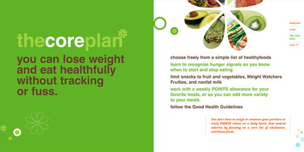
For example, the Weight Watchers leaflet above clearly aims to inform the audience about a particular product (i.e. Weight Watchers Core Plan). Therefore, you might complete the sentence as follows: I want my leaflet to inform potential customers about the Core Plan and to highlight the benefits of the product.
Here are a few common aims/goals for leaflets:
- I want my leaflet to inform people about my product (s)/service(s)
- I want my leaflet to inform my target audience why I stand out from the competition (i.e. your USP)
- I want my leaflet to inform potential customers/clients about a new product/service
- I want my leaflet to promote a special offer or event.
- I want my leaflet to entice potential customers/clients to visit my establishment and/or website.
Of course, you're not bound to one goal. In fact, you'll likely have multiple goals. For example, if you wish to inform potential customers/clients about a product, it's likely that you'll also want them to visit your website or take a particular course of action after reading that information. Just try to limit your goals to no more than three things, otherwise your design might end up a little confused.
Source: Behance
Once you've established your goal(s), you need to think about the actual message/information you want to communicate. To do this, it's best to simply write down everything you want to mention in your leaflet under bullet points/subheadings (like the Weight Watchers subheadings above).
Don't worry about writing too much, you can optimise your message/information later.
#2 - Identify Your Leaflet's Target Audience
Source: Behance
Identifying the target audience of your leaflet is the next big step when it comes to ensuring success. You need to know exactly who your leaflet is aimed at to ensure that the visual elements of your design appeal to that particular audience.
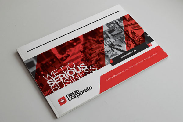
For example, it's clear that the leaflet design above ("we do serious business") has been designed to appeal to a corporate audience. This is clear by looking at the choice of colours, typography, imagery and other visual elements present in the design. If the aim of this leaflet was to attract a young, hip crowd, chances are that it wouldn't be very successful.
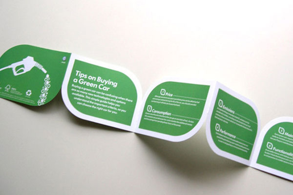
On the other hand, you can see that the small leaflet below from Volkswagen is clearly aimed at a 'green' and environmentally aware audience. This audience influences not only the message, but also the colour scheme and imagery used on the leaflet.
Source: Behance
To figure out the target audience for your leaflet, you can ask a similar query to the question asked in point #1. Ask yourself, "who do I want to pick up my leaflet?". Once again, you can complete the sentence: "I want my leaflet to appeal to....".
Here's a few possible answers:
- I want my leaflet to appeal to existing customers.
- I want my leaflet to appeal to current employees of the company.
- I want my leaflet to appeal to potential customers.
Whatever your answer may be, you then need to delve deeper into that target audience. For example, if you wanted your leaflet to appeal to potential customers, it's important to know who those potential customers are. Are they young or old? Male or female? What's important to them? The more you can refine your leaflet's target audience, the easier the actual design process will be.
#3 - Optimise Your Message
Source: Deviantart
At this stage, you should have produced a rough write-up of what your message will be (point #1) and you should know who your message will be aimed at (point #2). However, before you go any further with the design process, you need to optimise your message.
Optimising your message is all about ensuring that you choose the exact wording and layout for your leaflet. It's also about sifting through your original draft and identifying the most important points of your message that will appeal to your target audience (and also removing any points that are unnecessary).
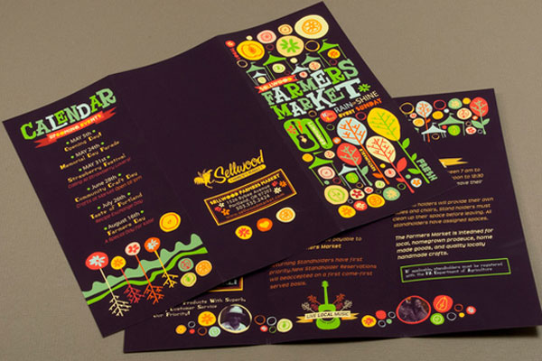
If you take a look at the farmers market leaflet above, you'll start to see how this comes into play. Clearly, the aim of this leaflet is to inform potential customers about a farmers market event. It also aims to inform those potential customers about the benefits of the produce sold at the market.
You'll notice that the message is simple and clear. The leaflet uses simple, down-to-earth language and short paragraphs to inform potential visitors about the event. This appeals to the leaflets target audience of down-to-earth people who care about local, fresh, seasonal, home-grown produce (no corporate 'mumbo jumbo').
Source: Behance
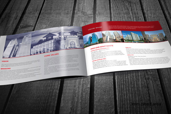
One the other hand, this leaflet from Vingroup communicates the message in a much more in-depth manner. It's clear that this is likely aimed at an information-hungry corporate audience who love to hear all the details.
The bottom line is that you need to optimise your leaflets message for your audience. Do they want a lot of in-depth information? Or perhaps just a few sentences? Will they appreciate an informal or formal approach?
You should also map out how your message will be divided up (i.e. different sections), as this will be important for the next stage of the process.
#4 - Choose The Most Appropriate Format + Size
Source: Behance
Now you know exactly what you want your leaflet to say, it's time to start thinking about the actual format and size you'll use for your leaflet. Leaflets come in a variety of shapes, formats and sizes (we offer a variety of different sizes and formats here at FastPrint.co.uk) and typically, this choice will rely on the quantity of information you want to convey along with the nature of that information.
As you already have your message mapped out, you probably know just how many pages/sides you're likely going to need to your leaflet to have. The quantity of information you wish to include on each page will likely also help you to decide what size and shape you'll need your leaflet to be (e.g. A5, square etc).
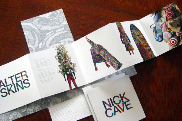
One other thing that you'll need to decide is the most appropriate format. Typically, leaflets are created in either an accordion-like format (like the Nick Cave leaflet above) or a brochure-like format. You'll need to decide which to opt for.
Usually, an accordion-like leaflet is most suitable for communicating information that doesn't necessarily need to be viewed in any particular order (e.g. restaurant/takeaway menu). This is because people sometimes read the back of these kind of leaflets before the front. They're also the best choice if you want to include large imagery or maps (e.g. a theme park or attraction map).
Source: Behance
If you want the recipient of your leaflet to read the information in a particular order (or if your information is divided into clear sections), it might make more sense to utilise a more brochure-like format like the Keenpac leaflet above.
Ultimately, this choice is down to you and you need to decide what works best for your particular leaflet.
#5 - Utilise A Bold + Eye Catching Headline (and subheadings)
Source: Behance
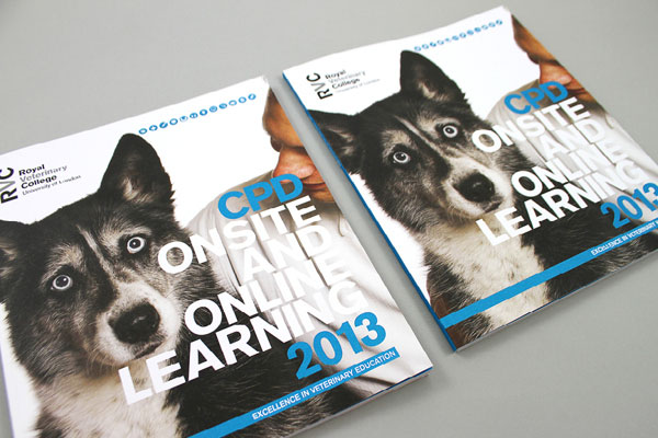
If you refer back to the AIDA formula near the beginning of this guide, you'll remember that the first part of the formula is "Attention". In order to ensure that your leaflet grabs the attention of your target audience, you need to utilise a bold, hard-hitting and eye-catching headline (and possibly subheadings too).
If you take a look at the CPD leaflet above, you'll see how a bold headline can be used to grab the attention of your audience. You can see that on the front of the leaflet, it simply says "CPD onsite and online learning 2013". This headline is written in a large, bold, uppercase, clean font which further helps to ensure that it grabs people's attention. What's more, it offers a brief insight into exactly what the leaflet is all about in just five words.
Source: Behance
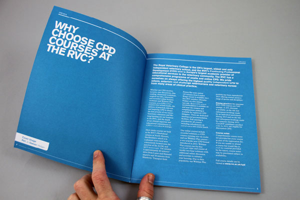
Even if your bold eye-catching headline manages to entice your target audience into picking up your leaflet, it doesn't necessarily mean that it's enough to hold their attention and pique their interest throughout. Because of this, it's a good idea to use subheadings throughout the pages/sides of your leaflet.
You'll notice that the CPD leaflet also does this well. You can see in the image above that on the first page of the leaflet is a subheading. It simply says "Why choose CPD courses at the RVC?". By using a question like this as a subheading, you can invoke the readers sense of curiosity further and ensure that they want to read on.
The key to creating successful headlines and subheadings is to use clean, bold, large text. You should also utilise colours that contrast with the background (e.g. the white and blue in the image above).
#6 - Utilise Imagery (but only where appropriate)
Source: Behance
Once you've utilised headlines and subheadings to capture the attention of your audience and keep them interested throughout your leaflet, you need to think of ways to create a desire for your product(s) or service(s).
One of the best ways to do this is by utilising high-quality imagery that will strike a chord with your target audience. To do this, you need to know exactly what your target audience desires (if you followed point #2 of this guide, you should have a good idea of this).
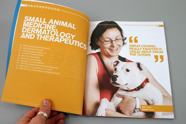
Let's take a look at another page from the CPD leaflet mentioned in the previous point. You'll notice that on this page, there is an image of a (happy) woman and her dog. There is also a quote from the woman.
As the leaflet is essentially advertising courses at the Royal Veterinary College, it's likely that this image will help to create a desire amongst the leaflets target audience (i.e. the readers). It shows a woman enjoying the course alongside a quote praising the course and tutors. It's likely that readers of the leaflet are looking to find a course that offers exactly what the woman in the image is portraying (thus creating desire).
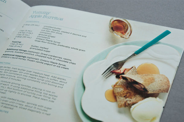
Source: Behance
Another example of imagery being used to create desire is in the leaflet from Foodland above. This was a leaflet showcasing some of the best Spring recipes and as you can see, beautiful imagery of the food is used to create desire. The food looks so appetising that readers are likely going to want to create the recipe for themselves.
One thing to note is that although images are great for creating desire, you should use them sparingly. Don't force too many images into your leaflet and never use low-quality images.
#7 - Choose A Professional + Readable Font For Your Information
Source: Behance
Often, when it comes to designing a leaflet, it can be tempting to utilise an overly complex and hard-to-decipher font. When you're designing your leaflet on a computer screen, these fonts can often look great as usually, your design will appear larger on a computer screen than it will on the finished produced.
However , it's important to remember that using a professional and highly-readable font is exceptionally important when it comes to leaflets. Not only will an overly-flamboyant font present an unprofessional image, but it will also make things difficult to read (especially from a distance).
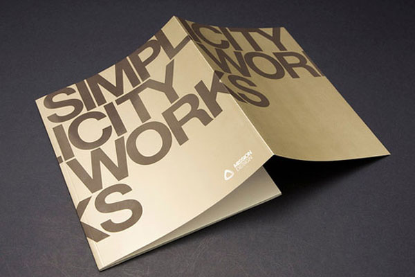
Typically, it's more important to use a highly-readable font for the bulk of the information on your leaflet (e.g. the paragraphs of text). The reason for this is because this text tends to be small and therefore, will be harder to read than a large bold headline. However, as you can see from the 'Simplicity Works' leaflet above, simple clean and readable fonts can be great for headlines too.
Fonts such as Times New Roman, Helvetica, Ariel and other similar typefaces are perfect for leaflets as they're highly-readable in both uppercase and lowercase formats.
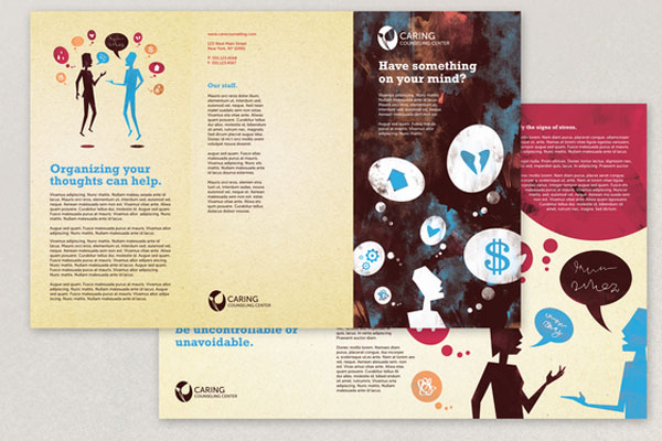
Source: Inkd.com
You're certainly not bound to these fonts though as there are a whole range of beautiful readable typefaces out there. You can see an example of one of these in the counselling leaflet template above. It's a highly-readable font, yet it still aligns with the overall visual nature of the leaflet and the brand it's marketing.
Note: If you're targeting an older audience, it may pay to choose one of the absolute most readable fonts and also print the type in a larger typeface.
#8 - Utilise Colour To Your Advantage
Source: Behance
Colour is one of the most powerful tools you can use when it comes to obtaining that initial attention for your leaflet. Often, leaflets are presented alongside other leaflets (i.e. in pubs, bars, shops or information centres) and therefore, you need to utilise every trick you can to ensure that your leaflet stands out from the competition.
Using colour is a great way to do this as more often than not, leaflets that utilise bright vibrant colours will demand more attention than dull boring leaflets. Just take a look at the leaflet above for example; you can see how this would stick out like a sore thumb no matter where it was placed. You can also imagine that amongst other leaflets, it would be this leaflet that most people's eyes were drawn to.
Source: Behance
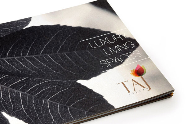
However, you shouldn't use bright colours just for the sake of it if doing so doesn't align with your brand and/or existing visual image. You should choose colours that will appeal to your leaflets target audience and also, reflect your brand in the most appropriate way.
For example, you can see that the Taj Villas leaflet above primarily utilises black and white on the front cover. Although this might not be as visually over-the-top, it reflects the brand in the best way possible as it creates a luxurious and upmarket feel to the leaflet. This is much more likely to appeal to the leaflets target audience.
If you're struggling to decide which colours to use in your leaflet, check out this guide on colour meanings.
#9 - Use Plenty Of White Space
Source: Behance
So far, we've covered headlines, subheadings, imagery, information (e.g. paragraphs of text) and colour, but what else should you be including in your leaflet design?
When you're designing a leaflet (or anything else for that matter), it can be all-too-easy to overcomplicate things and include too much imagery, colour and/or other unnecessary design elements. It often feels as though you need to fill every last bit of white space left on your leaflet.
This would be a big mistake and white space is a hugely important part of the design process. White space plays a pivotal role in the readability of your leaflet, as well as ensuring a certain level of professionalism.
If you take a look at the Minimal Eyes leaflet template above, you can see that there is a lot of white space. However, this leaflet design certainly doesn't look unprofessional or bland. It looks simple, minimalistic and overall, clean and clear. White space actually helps to accentuate the other elements of your design and helps readers to focus on what's important. In the example above, this would be the high quality imagery, subheading and paragraphs of text. It also helps to create a contrast between the information and the background.
Source: Behance
Here is another great example of white space being used to draw focus to the important points of the leaflet (in this case, the large subheadings). As you can see, it looks modern, minimalistic and clean.
The bottom line is that white space is important. Don't be afraid of leaving areas of your leaflet empty. It will help draw attention to important areas and ensure the reader doesn't feel overloaded with information.
Setting Up Your File For Print
Source: N/A
The last part of the process is actually setting up your file for print. If you fail to do this correctly, chances are that you'll experience some unintentional and undesired results when you receive your finished printed product, so make sure you take this step into account.
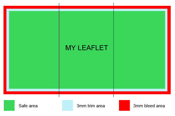
The most important step is setting up your bleed and trim areas correctly. Almost all printing companies (including ourselves here at FastPrint.co.uk) require a certain area of bleed and trim for submitted leaflet designs.
Essentially, bleed and trim ensures that your leaflets turn out as expected and that none of your message or design is unintentionally cut off. Here at Fastprint.co.uk, we require a 3mm bleed and 3mm trim (as pictured above). You should keep all important information confined to the safe area and you should ensure that your leaflet background extends throughout the bleed area.
Source: DesignThePlanet.com
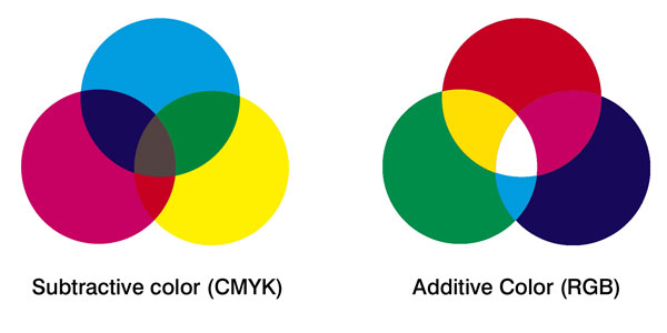
It's also important to ensure that you convert your file from RGB to CMYK before sending it off to your chosen printing company. Most printing companies use a CMYK colour process when printing and often, designs submitted in RGB can lead to unintentional results. You can read more about CMYK vs. RGB printing here.
Conclusion
Hopefully, after reading through this guide, you'll have a much better idea where to start when it comes to designing a leaflet for your organisation (or perhaps on behalf of a client). We recommend that you follow the steps above in chronological order and work through the process in stages.
It's never easy to design a hard-hitting, eye-catching leaflet but if you make sure to follow the steps above and apply each of the stages to your own individual project(s), you should be able to ensure that your design 'ticks all the boxes' and generates a good ROI for your business.
Are you considering designing other marketing materials to compliment your leaflet? If so, you may want to take a look at our other guides to designing a perfect sticker, a perfect banner and a perfect poster.