No matter what kind of business you’re running, you need a well-designed letterhead.
The problem is that although letterheads often look quite simple, actually designing one (especially without much design experience) can be quite tricky. In this guide, we’re going to run through the exact process you can use to design a letterhead for your business. To show how simple it is, we’ll also create an example letterhead for our company, FastPrint, in the process.
Here’s what the final product will look like:
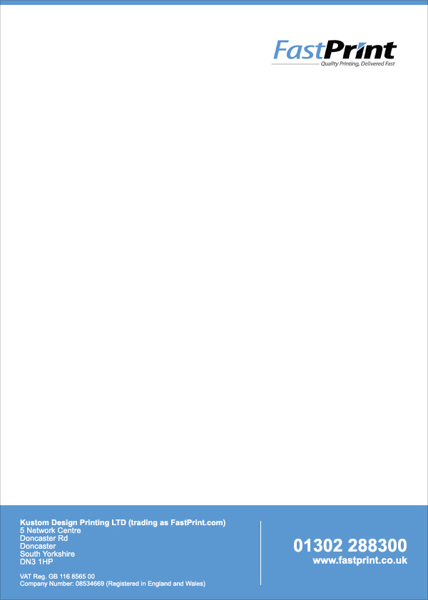
As you can see, it’s simple, elegant, fulfils its purpose, and above all, reflects our brand perfectly.
Let’s get stuck-in.
Knowing What Information to Include
Chances are that you already have a good idea what information you’d like to include on your letterhead, but unfortunately, it’s not 100% down to you. In fact, there are certain legal obligations that you’re going to have to adhere to when designing your letterhead (i.e. certain pieces of information that you’re legally bound to include).
This information varies depending on how your business is set up (e.g. sole trader, limited company, etc.), so here’s what MUST be included on your letterhead for each business type:
Sole Trader:
- Your own name
- Your business name (if you’re “trading as” something other than your legal name)
- Your business address
- VAT number (if registered)
Partnership:
- All requirements listed above under “sole traders”
- ALL partners must be named on the letterhead (it’s NOT acceptable to name just one partner, you MUST name them all. If you have a lengthy list of partners, an alternative is to simply state where a full list of all partners can be found (e.g. a website address).
Limited Company:
- Your full legal company name (this usually ends with “ltd” or “limited”)
- Your company registration number (if you’re unsure about this, you can find it here).
- Your place of registration (“England and Wales” or “Scotland”)
- Your company’s registered office
- Your VAT number (if registered)
- Details regarding any registered profession you’re a member of (e.g. The Institution of Engineering and Technology)
Other Information
Although you’re legally obligated to include the information listed above, there are a few other pieces of information that you’ll probably want to include on your letterhead. Remember, your letterheads will be used to write personal correspondence to clients, suppliers, etc., so after reading what you have to say, they may very well want to get in touch with you to ask questions or discuss anything they didn’t fully understand.
Keeping that in mind, here’s some other information you might want to include:
- Contact telephone number(s)
- Email address
- Logo (by including a logo, the recipient will instantly be able to identify who the letter is from)
- Website address (URL)
- Social profiles (e.g. Twitter, Facebook, etc.)
Making a List
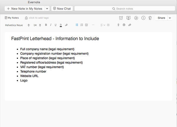
The easiest and most simple way to remember everything you need/want to include on your letterhead is to make a quick list.
You can do this on paper or with your favourite note-taking app.
Here’s a screenshot of our list from Evernote:
Now you’re ready to move on to the next stage.
Defining an Informational Hierarchy
At this stage, you should know every piece of information that you want (or are legally required) to include on your letterhead.
The next stage is to create an informational hierarchy of this information.
What Exactly is an “Informational Hierarchy”?
Although it sounds complicated, an informational hierarchy is basically just a fancy way of saying, “order your information by level of importance”. The reason for doing this is so that you can make sure to give each piece of information the prominence it deserves in your final design. Information that isn’t so important (such as some of the information that you’re legally required to include) doesn’t need to stand out as much as super-important information (such as the logo and contact number).
Here’s how to do it:
Step #1 – Sign up for Trello
Trello is a free application that essentially just allows you to organise information.
It’s 100% free to sign up and only takes a second. Just click the “Sign up” button to get stared.
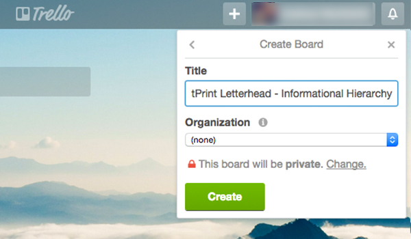
When you’re signed up, you need to create a new board. You can do this by clicking the “+” icon in the top right-hand corner.
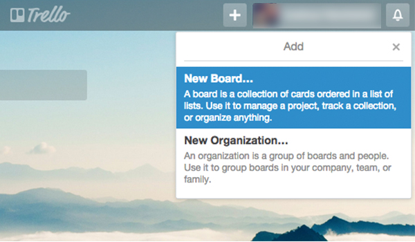
Name your board something simple but appropriate (e.g. “FastPrint Letterhead – Informational Hierarchy”)
Now you’ve created your new board, you simply need to add a list to the board and then add all of the information you listed in the previous step as “cards”.
Here’s a screenshot of what the finished result should look like:
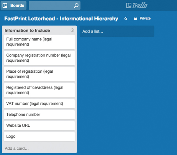
If you used Evernote (or another note-taking app), you can simply copy/paste the information across to Trello.
Don’t worry about the order just yet, that’s what we’ll tackle in step #3.
Note: If you’re feeling “old school”, it's perfectly acceptable to use paper for this step.
Step #2 – Think About What’s Important
Now you’ve got everything into Trello, the next step is to start thinking about which pieces of information on your list hold the most importance for your letterhead. Unfortunately, there’s no magic solution for doing this, as it will require a bit of thinking on your part.
Having said that, there are a few pieces of information that are extremely important for nearly all letterheads. These are:
- Logo
- Contact details (phone number, website address, etc.)
This is because: a) your recipient needs to be able to instantly recognise who the letter is from, and b) they need to know how to contact you if they have any questions.
The rest is up to you. You already know that everything on your list needs to be included on the letterhead, so the rest is down to personal preference.
Once you have a rough idea as to which information is the most important, move on to step #3.
Step #3 – Arranging the Information
The third and final step is to actually start arranging your list items in order of their importance. Trello makes this extremely easy, as you can simply drag and drop each card (i.e. each list item) and rearrange them as necessary.
Here’s a demonstration:

It’s best to arrange them from most to least important.
Here’s what the finished product looks like for our FastPrint letterhead:
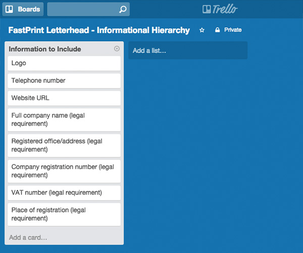
Here are the reasons for our decisions:
- 1.Logo – very important, as recipients need to know whom the letter is from instantly.
- 2.Telephone number – very important, as this is our preferred and easiest method of communication for any questions/queries.
- 3.Website URL – important, as for recipients that don’t wish to call us, visiting our website is their next port of call.
- 4.Full company name – quite important, as this further backs up whom the letter is from.
- 5.Registered office – somewhat important, for recipients that wish to visit in person or reply to our letter via mail.
- 6.Company registration number – not majorly important, but it does reinforce the notion that we’re a legitimate, legally registered company (which we are).
- 7.VAT number – not majorly important, but it does help to reinforce trust in our company.
- 8.Place of registration – not majorly important, but it is a legal requirement.
Those last five are all legal requirements so no matter how unimportant they might seem, they do need to be included.
Note: Your list may look a little different to this depending on your thought-process in step #2.
Keeping it “On Brand”
Now you’ve covered the informational structure and hierarchy of your letterhead, it’s time to start focussing on the more visual aspects. Before jumping straight into the design process though, it’s important that you define a list of rules to help keep your design on brand. As letterheads are generally quite simple, this is actually quite a straightforward process and comes down to two main design aspects: colour and typography.
Colour
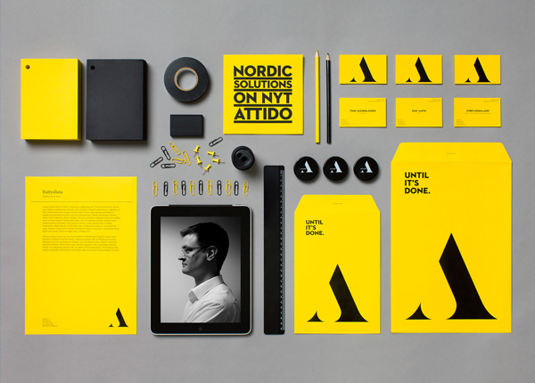
You’ll notice in the image above that every aspect of the person’s brand utilises the same colour scheme.
This should be the case for your letterhead too.
If you already have a colour palette for your company (such as the one above), you won’t really have to do much apart from stick to it.
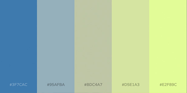
If, on the other hand, you’re unsure about your colour scheme (perhaps your graphic designer never forwarded the palette to you!), here’s a nifty trick for grabbing a colour scheme from your logo:
Paste your logo into Photoshop (or a similar application) like this:
Next, go to Filter > Pixelate > Mosaic:
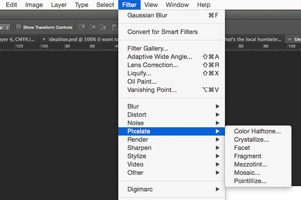
Select a cell size of about 50 and you’ll end up with something like this:

There you have it: a colour palette you can use for your letterhead.
You can see from the image that we mainly have blue, white and black in our FastPrint colour palette, so these are the colours we’ll be sticking to for our letterhead.
Typography (i.e. Fonts)
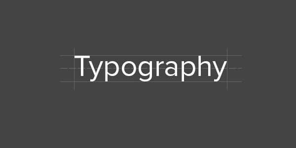
Source
Typography is the other aspect that you need to keep on top of when you’re designing your letterhead. Typically, most brands will utilise just 2 – 3 fonts (anything more looks cluttered) so you simply need to figure out what typography your brand makes use of and stick to them when designing your letterhead. If you’re unsure, the easiest way to find out is to ask your graphic designer.
Otherwise, you can use this nifty trick to determine your typography from your website:
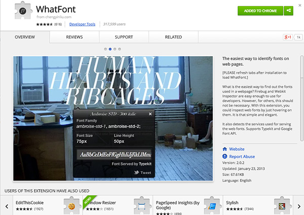
Install the “WhatFont” extension for Google Chrome from here.
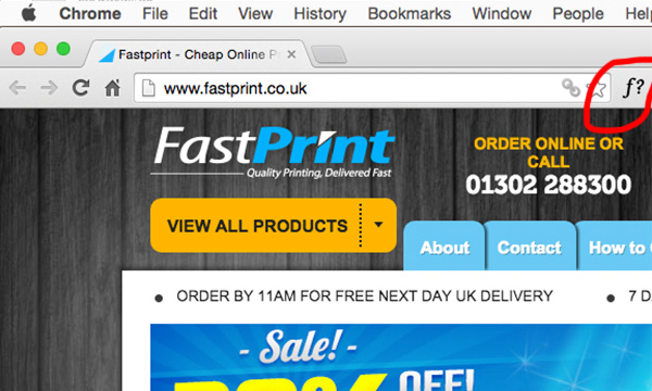
This will install a bookmarklet to your browser (circled in the image above). Now, all you need to do is navigate to your website, click the bookmarklet, then click on any font. It’ll then tell you exactly what font is being used.
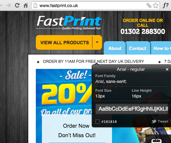
In our case, the main font is: Arial.
Note down the fonts your site mainly uses and you’re done.
Now you’ve got your colour scheme and typography figured out, it’ll be easy to make sure your letterhead stays on brand.
Designing the Letterhead
It’s finally time for the fun part: actually designing your letterhead. As noted at the beginning of this guide, we’ll be designing the FastPrint letterhead as an example, but you can design your letterhead based on your own personal information gathered from the previous steps.
Let’s get started:
Choosing an application (Photoshop, InDesign, Illustrator)
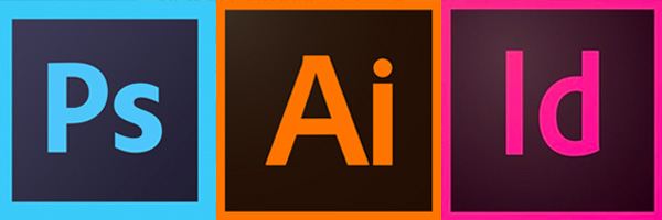
The first step is to decide upon the application you’ll be using to create your design.
Clearly, the three most obvious options here are: Photoshop, InDesign and Illustrator.
It’s up to you which application you use, but in our opinion, Adobe Illustrator or InDesign are perhaps the best options for letterhead design due to their built-in support for bleed, trim, etc.
Photoshop is a little harder to set up as support for these aspects is limited, but you can see how to set Photoshop’s bleed/trim up in this post.
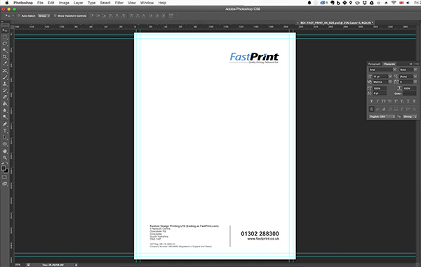
Setup for print (DPI, CMYK etc.)
Next, you need to actually set up a document for print. The simplest way to do this is to make use of the templates that almost every printing company offers (including ourselves).
These will set up a document in your chosen application that is 100% ready-to-go. It’ll be set up for bleed/trim and will also have the right dimensions.
You can find our templates here.
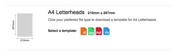
We have numerous templates for letterheads as you can see from the image above.
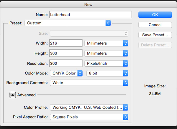
If this isn’t an option (or if you prefer to set things up yourself), you simply need to make sure that your document is set up as follows:
- A4 size (210mm x 297mm) + 3mm bleed on each side (this makes the total size: 216mm x 303mm)
- Account for 3mm – 5mm trim area inside the bleed area (setup guides to help with this if needed – here’s how)
- CMYK colour mode (not RGB)
- 300 PPI/DPI resolution (for most printing companies)
Here’s an example of the correct setup in Photoshop:
It’s a similar process in Adobe Illustrator and InDesign. Plus, it’s even easier to set-up the bleed areas in those applications.
Get Sketching
Before you begin your design digitally, it pays to draw a rough sketch of how your letterhead will be laid out, and where each piece of information will go.
To do this, all you need to do is grab the list of things to include from your Trello board and sketch out a rough design (making sure to include all of the items).
Note: Make sure to sketch our your letterhead roughly in accordance with the informational hierarchy you defined earlier.
Here’s a (very) rough sketch for our FastPrint letterhead:
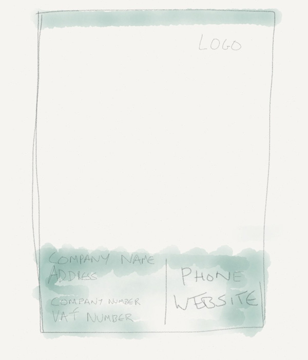
Don’t worry if it looks a bit rough and rushed, you just need a general idea of the layout so you can move on to the next step.
Arranging Your Information
Now you’ve got your sketch complete, it’s time to start translating that messy sketch into a proper letterhead design.
To do this, start by arranging your information on your letterhead.
Remember, you need to keep your hierarchy in mind when doing this, so utilise different font sizes and weights to create a sense of order and hierarchy for your information.
Here’s the basic layout for our FastPrint letterhead:
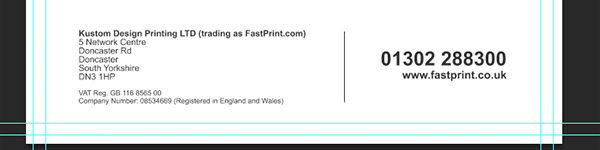
Here’s a zoomed image so you can see what the bottom actually looks like:
As you can see, there’s a sense of hierarchy to the information that conforms to how we arranged our items in Trello.
The logo is large, as is the phone number. Then, the website address is slightly smaller with the other information even smaller still (although bold text has been used to create hierarchy even here).
You’ll also notice that everything is written in the Arial font (this is what we discovered earlier in the guide) to ensure that the design is on brand.
Adding Colour + Brand Elements
All that’s left to do now is add some much needed colour and any additional brand elements to the letterhead.
We’re going to use the blue colour that we discovered earlier in the guide by creating a colour palette from our logo. We’ll add it to the top and bottom of the letterhead as represented in our sketch.
Here’s the final result:
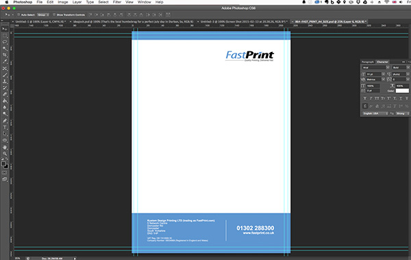
You can also add any other brand elements at this stage such as: mascots, imagery, patterns, etc.
Now, all that’s left to do is to save your letterhead and send it off to the printer!
Conclusion
That’s everything!
One final piece of advice that we’d like to give is that when it comes to letterhead design, you should always make sure that there’s plenty of white space. After all, the whole point of a letterhead is to hold the contents of a letter, so you need to make sure there’s space for it.
Therefore, keep things simple, minimalistic, and don’t add clutter!
Do you think we’ve missed anything from this guide? If so, give us a shout in the comments section below.