For most businesses, flyers are an indispensable marketing material and they often play a vital role when it comes to creating exposure for an event, product or service. If you're looking to create the perfect flyer for your business though (or on behalf of a client), it can be difficult to know where to start. Unless you're an experienced flyer designer, it can be all too easy to overlook extremely important design factors. The best flyers are able to convey your message quickly and extremely effectively; they do this through the inclusion of relevant eye-catching images and powerfully-persuasive written content that gets straight to the point. The thing is, balancing the visual and written content on a flyer can be tough, and it’s extremely important that one element doesn’t take prominence over the other.
It's important to remember that no matter how persuasive your words are, bad visual content can dilute your message and prevent people from getting on board with you. Similarly, flyers that look great but fail to offer high-quality written content can be incredibly off-putting and seem extremely unprofessional. When the words, graphics and images are all of an excellent standard and all employ the same tone, the results of your flyer can be fantastic and they can also have a remarkable effect when it comes to nurturing engagement with your brand. Our team here at FastPrint.co.uk knows this all too well, as we've designed flyers for hundreds (probably even thousands) of businesses over the years. We consulted with our design team and we've compiled their professional advice into this guide. It aims to inform you how to produce effective flyers that are fine-tuned to appeal to your audience.
By following the steps below, you can expect to gain better exposure for whatever you're promoting. Read on to find out how to produce the perfect flyer for your needs and requirements.
#1 - Figure Out Your Message

Source: DJbis.com
Knowing what you are trying to say to your audience is crucial. Are you advertising an event, service, product launch, offer etc? You need to know this before you start anything else.
Not only is your message important, but also the way it's phrased. If you are promoting a similar product, service or event to what is being offered by your competition, your flyer needs to convince your target audience that they should choose you over others. This is why it's so important to get your message/phrasing right.
The nature of your audience should determine what your message is and how it's conveyed. For instance, if you’re targeting a vibrant, young audience, you’ll benefit from choosing vivid, exciting words that exude energy. Take the flyer above for example, it uses words like "fusion" and "jam" yet the message is still clear; it's advertising an event/party.
If you’re targeting the older generations with your flyer (or perhaps just a more discerning crowd), a more toned-down approach will be beneficial. The overall tone should be more restrained or “sensible”, but the words should remain persuasive nonetheless.
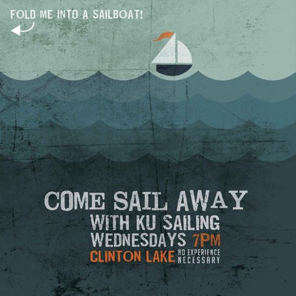
Source: Behance
Take the Kung Fu Sailing flyer above for example. The design is very contemporary but in a way that has universal appeal. Its message is extremely clear (i.e. come sailing with us on Wednesdays at Clinton Lake) and though the amount of words used is minimal, it leaves no room for confusion.
To get an idea of how to get your message across you could take an in-depth look at other promotional materials that are used by companies also chasing your target audience. What do you think works? How are they phrasing their message? What sort of language are they using?
It’s also wise to use terms like ‘you’ and ‘your’ as this makes your message more personal and helps your audience to feel as if they are being spoken to directly.
#2 - Simplify Your Information
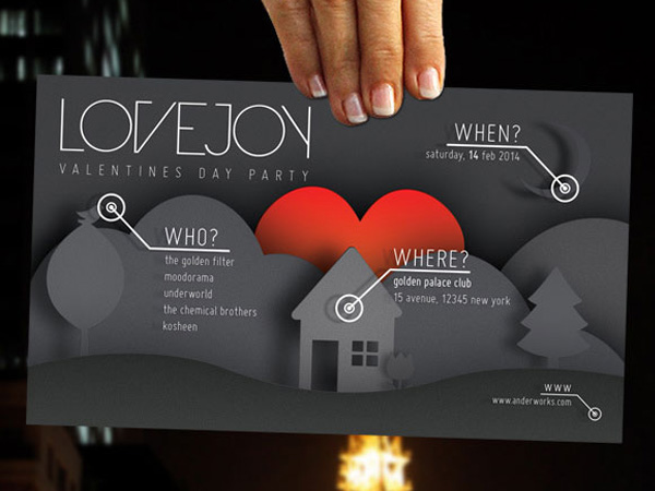
Source: Behance
Whatever your chosen message might be, the actual information featured on your flyer needs to be simple and straight-to-the-point. Your audience will need to be able to understand who you are, what you do and what message you're conveying within a few seconds of picking up your flyer. Now is not the time for long-winded examples of prose (leave that for brochures or other more in-depth forms of marketing materials).
You should try to put your message across as succinctly and as directly as possible. One way to do this is to use bullet-points and short headlines. For example, the Lovejoy flyer above makes use of bullet points (who, where, when etc) to keep things simple.
You also need to ensure that attention is drawn to your most important information right away, such as your flagship promotional offer (or whatever your primary message might be). You can do this by using bright colours, bold/large text etc to your advantage (more on these points later).
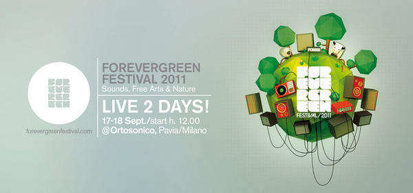
Source: Behance
A good example of a simple flyer is above. This flyer for the Forevergreen Festival tells us the key details about the event in just a few words. It tells us the name of the event, what it's all about, how long it lasts and when it is.
Flyers usually only have a matter of seconds to grab the attention, so points that you are trying to make need to be digested by your audience immediately. It's important to remember this.
#3 - Utilise Large High-Quality Images
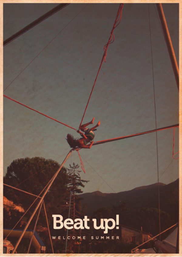
Source: Behance
Sometimes images can say much more than simple text. Large images can demand the attention from afar and showcase your selling points even without any content even needing to be read. Because of this, images that clearly convey who you are and what you do can be worth their weight in gold.
When designing a flyer, it almost always pays to use large images in your design. However, it’s essential that the images themselves are of the highest quality. If possible, you may wish to have images shot for you professionally (but this can be expensive).
You can see a fantastic example of the use of large high-quality imagery in the flyer above. This flyer advertises an outdoor party and as you can see, the text content is pretty minimal. This is because the image does all the work for you. It gives you a better visual representation of what the event will be like than words could ever do. Plus, it ensures that the flyer is extremely eye-catching.

Source: Instagram
Large images can also act as a focus point for your flyer, as is demonstrated in the rather vibrant Japanese flyer above. The photograph in the middle is what draws your attention.
Don’t attempt to stretch low-resolution images to make them larger as this will simply make them grainy or pixelated. Badly-taken or grainy images can again lead to instant associations with something that is lacking in quality and are unlikely to encourage your potential customers to want to do business with you.
While some flyers are actually distributed by hand to their recipients, others are often left around in offices and shops for people to pick up themselves. Attractive, clear pictures that can be seen from far away can be very effective in encouraging people to walk towards a flyer to find out more.
#4 - Ensure Your Headline Is Large & Bold

Source: TessRedburn.co.uk
An attention-grabbing headline is a must when it comes to designing a great flyer. You should choose your words carefully to ensure that they have the impact that they need to. Less is more when it comes to headlines so your message needs to be clear, concise and unambiguous. You should try and say what you need to say in as few words as possible.
This is a tactic often used in newspaper headlines (particularly those seen in the tabloid press). They tend to involve nothing more than a few words, and often employ techniques such as alliteration to get their message across in an extremely simple yet punchy way.
Your flyer headline should be newspaper-like, making passers-by should feel intrigued and unable to resist the temptation to find out more. Long headlines with too many words can weaken your message and confuse your potential customers.
A good way to draw people in is to ask a question (like the Hawes and Co flyer above). This asks "Are you thinking about a new home?". If the answer is yes, it's likely to pique your curiosity and you'll probably read on.
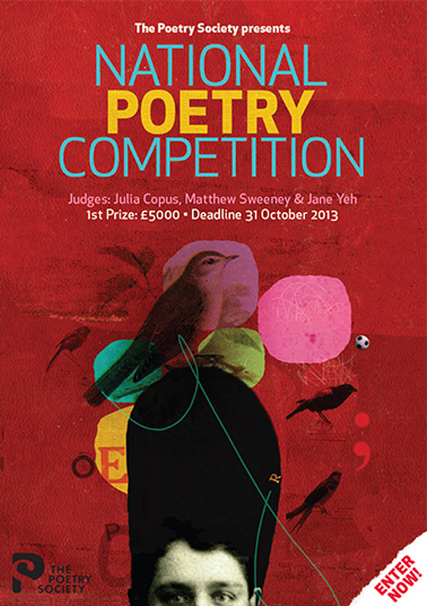
Source: npc.poetrysociety.co.uk
Here's another flyer with a beautifully simple headline from The Poetry Society. The headline is bold, simple and leaves no ambiguity around what is being promoted. The colours also work perfectly against those chosen for the background, making them appear incredibly contrasting. The words seem impossible to ignore (more on colour later).
It’s worth remembering that your flyer may be fighting for attention with other flyers, and a long, drawn-out headline that isn’t easy to read from far away may leave your flyer neglected. It’s certainly worth spending as much time as you can re-arranging your headline until you’ve come up with something as clear, concise, powerful and persuasive as you possibly can.
#5 - Divide Your Information into Sections/Paragraphs
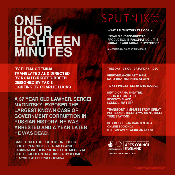
Source: SputnikTheatre.co.uk
Although less is more when it comes to content, there’s bound to be some written information that you simply cannot leave out of your flyer. Perhaps you need to go into more depth about the services hinted at in your main headline or maybe you have contact details to display.
To include written information in the most effective and concise way, you can split it into sections or paragraphs that are easy to read and understand. Extensive and unnecessary sections of written material are unlikely to be read to the end, so you should decide which information simply must-be featured on your flyer and what can be left out. Be brutal with your editing.
Typically, if you decide to opt for a two-sided flyer, it’s wise to send most of your written content to the back where you can explain your services in more detail, with the key points you need to make being outlined on the front. If you take a look at the back of the flyer above (the one advertising the play entitled: One Hour Eighteen Minutes), you'll see the information is clearly divided into paragraphs/sections which makes the content easier to read and comprehend.
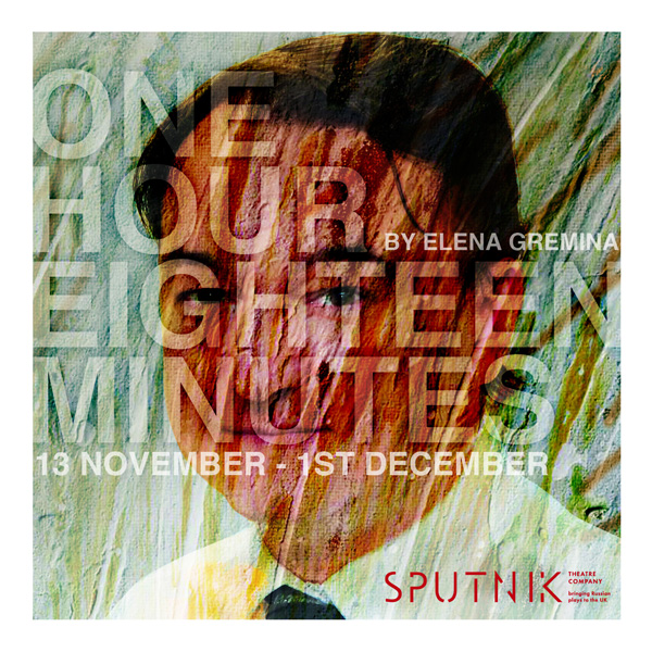
Source: SputnikTheatre.co.uk
At the same time, the front of the flyer is kept simple with a large bold headline (see previous point) and just a couple of pieces of other important information.
Splitting your information into chunks will make it easy on the eye and ensure that the main points of your message are understood perfectly. Flyers need to be as easy to read as possible, which is why bullet-points and short lists are such powerful options. Contact details are usually printed on the bottom of a flyer, whether you choose to print on one or both sides of it.
If someone makes the choice to turn your flyer over, this usually means that the front has made them eager to learn more about your services, so do feel free to go into more depth on the reverse while still keeping things as simple and easy to read as you can.
#6 - Keep Your Typography Simple
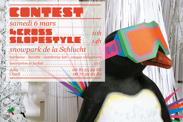
Source: ZimandZou.fr
Being sensible with typography is crucial, and selecting your fonts wisely can mean the difference between your flyers being read or cast aside instantly.
Fonts are used to convey certain emotions or bring to mind associations such as masculinity, femininity, authority, fun, maturity or youthful vibrancy. It's important that your fonts are easy to read and you should completely avoid complex, hard-to-decipher fonts that may compromise your message.
Take the flyer above for instance. You can see that the main font used might be quite stylish and trendy, but it's a little hard to read and looks a bit amateurish.
Most designers tend not to use more than two different typefaces on a flyer, so this is a good rule of thumb. It is possible to employ multiple fonts, but it takes a lot of hard work to ensure that they work coherently together.
Font size is important too. We’ve already discussed the importance of large, bold headlines but the other written information also needs to be large enough to read without difficulty. The fewer words you use, the larger your fonts can become without your flyer looking messy and cluttered.
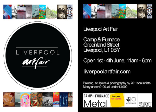
Source: Dot-art.co.uk
It is also possible to use just one font, as the Liverpool Artfair flyer above does. It uses different font sizes to create a hierarchy of information.
Remember, not all fonts that might catch your eye when you’re browsing digitally may look good on paper, so if you are just starting out in the world of flyer-creation, it may be wise to play it safe. Search engines can be incredibly useful when it comes to identifying the most suitable type of font for a certain type of business or product.
If in doubt, it’s best to stick to something tried-and-trusted with universal appeal.Novelty fonts may be amusing, but unless you’re running a nursery or a circus, they don’t tend to be synonymous with quality or integrity.
#7 - Use Colour to Your Advantage
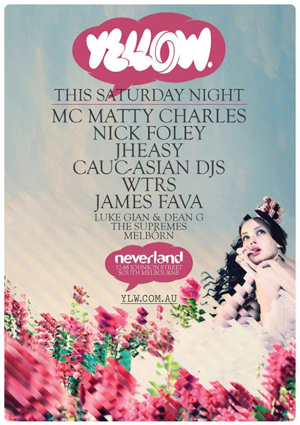
Source: Deviantart
Choosing the right colour scheme for your flyer is something that should never be overlooked, as colour can determine the entire tone of your printed material. The nature of your business is again an incredibly important factor to consider when it comes to colour. While vibrant primary colours are always likely to appeal to the young and carefree, older people may consider them to garish.
If you're looking to evoke feelings of sophistication and class, you might want to opt for cream or even a simple black-and-white colour scheme, perhaps offset by a rich colour image. If you already have a logo, you may consider using the colours that feature in it for your colour scheme or at least opting for colours that complement it (like the Yellow flyer above does).
If you have images that you are ready to use, you may wish to look closely at them to pick out colours that can be reinforced by the overall colour scheme of your flyer. It’s best to choose two or three strong colours to keep things simple and focussed.
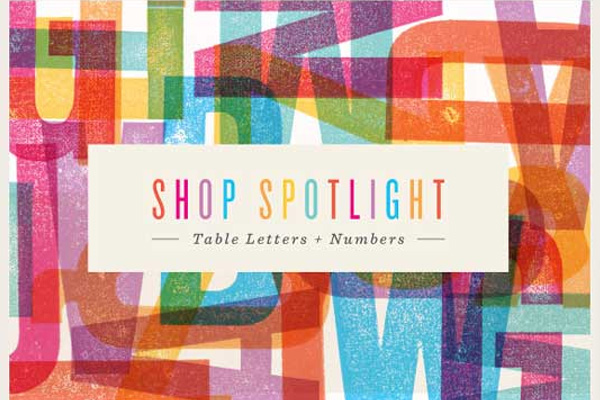
Source: BigCartel.com
You can also use bright vivid colours to your advantage to ensure that your flyer stands out from the crowd like the Shop Spotlight image above does.
#8 - Tell the Recipient to Do Something
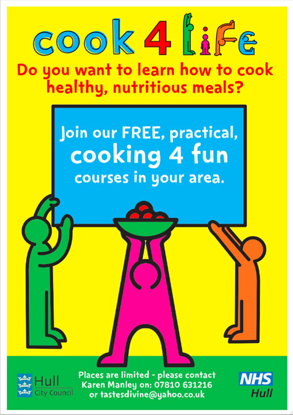
Source: ChrisCannon.co.uk
It's almost certain that the purpose of your flyer is to get your potential customers to perform a particular action. This could be anything from taking advantage of a special offer, attending an event or joining a scheme that you're operating. Literally instructing your potential clients or customers to do something may seem an obvious step, but many people fail to do this and end up missing out on business as a result.
A “call to action” is a final request or instruction that reminds the customer to take the steps that the rest of the flyer has been directing them towards.
Examples of a CTA might include phrases such as “why not get in touch today?”, "call to find out more” or “sign up now”. It's often the last piece of information given above the contact details and therefore, it will usually be located near the bottom of your design.
The purpose of your call-to-action is to ensure that your message is given one last opportunity to hit home. You may wish to type it out in a large bold font or even use a red/bright typeface to add extra weight to it.
The flyer above for the NHS and Hull District Council doesn’t waste time when it comes to its call-to-action. Not only is there a large call-to-action in the centre, there’s an additional CTA at the bottom to ensure the message has no chance of getting lost.
#9 - Avoid Lots of Small Images
Source: MalloCreative.com
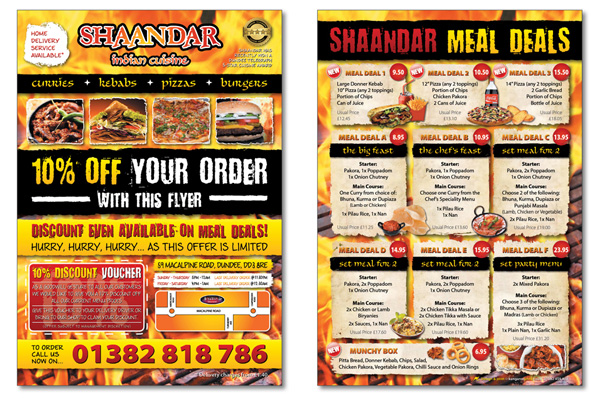
The size of your images is incredibly important. You don't want your audience to be squinting in an attempt to work out what an picture actually features. Therefore, it's wise to adopt a ‘less is more’ approach when it comes to choosing images.
Too many small images are also likely to lead to a confused and cluttered feel (as is evident from the flyer above) but one or two sizeable pictures can be incredibly effective in representing your services in a simple yet powerful way. If you do have more images that you wish to share with the public, you could instead use them on your website or on larger printed promotional materials.
Source: DaltonButler.co.uk
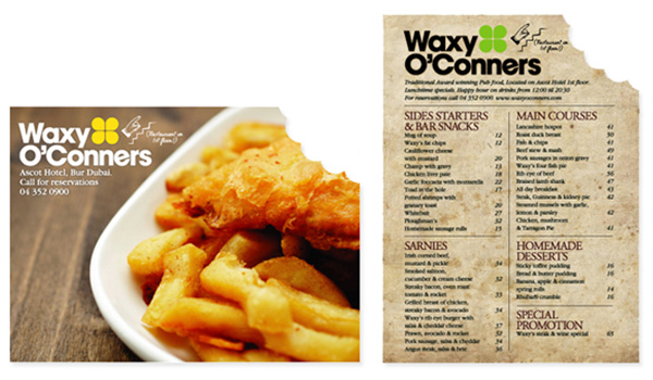
The flyer for a Dubai restaurant uses just one simple bold image to encourage potential guests to investigate further. It looks fantastic as the image used is large and extremely high quality.
How To Print Your Flyer
Now you've tackled the bulk of the design process, you're going to need to know how to print your flyer.
It's here that common mistakes are often made, even by the most experienced of print designers. Below are the couple of key aspects you'll need to focus on to ensure that your printed flyer looks exactly how you intended it to look.
#1 - Setup Your File Correctly
Source: N/A
Most printing companies will have certain requirements for the way you set up your file. It doesn't matter whether you're using Photoshop, InDesign, Illustrator or any other design application, you need to make sure to adhere to these requirements in order to ensure that your printed flyer turns out the way you expected.
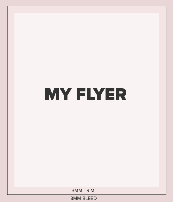
One thing that almost all printing companies will require (including ourselves here at FastPrint.co.uk) is a proper set-up of bleed and trim. Essentially, bleed and trim ensure that even with a small margin of error, your flyer will still turn out exactly as intended once printed.
Here at FastPrint.co.uk, we require both a bleed and trim of 3mm each (so 6mm total). For the 3mm bleed, you should ensure that your flyer background extends 3mm outside the trim line around the entire perimeter of your flyer. For the trim, you need to ensure that you keep all text and any important imagery within 3mm of the trim line. This is to ensure that none of your important content gets cut off during the trimming process.
#2 - Convert To CMYK
Source: DiscountPrinting.com.au
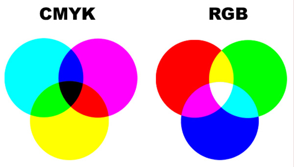
Similarly, almost all professional printing companies utilise a CMYK printing process as opposed to RGB. Therefore, you need to make sure to convert your flyer design from RGB to CMYK before sending it off to your chosen printer.
This will be required if you're using Photoshop as designs are produced in RGB by default. If you're using Adobe Illustrator on the other hand, your design might already be in the CMYK colour format. However, if you're using high quality images in your flyer design, these may need to be converted too.
To learn more about CMYK and RGB, take a look at our guide which goes into a lot more detail about the whole process. You can view it here.
Conclusion
If you've read through the bulk of this guide, you'll hopefully feel much more confident about designing a flyer for your business (or for your client). Obviously, the creative process is still very much down to you and although this post serves as a great guide for your project, there's no substitute for a keen eye for design.
It should also be noted that not every point in this guide should always be taken on board; it all depends on your exact project. For example, there are some stunning flyer designs out there that make use of many different types of typography. There are also some great black and white flyers (no colour at all) that work beautifully well and flyers that utilise absolutely no photographic imagery.
For the most part though, your flyer design should adhere to the bulk of the points made in this guide. You should have a clear headline, simple clear paragraphs of text, a call-to-action and most importantly, a clear message.
If you're looking to design other printed marketing materials alongside your flyer, you might want to take a look at our other guides for designing a perfect sticker, a perfect poster and even a perfect banner.