If you’re new to the task of designing for print, it can certainly be a confusing process. Not only do you have to actually prepare and create a design that works well on paper (a mammoth task in itself!), but you also have to ensure your project is properly set up for print, whilst making sure to somehow avoid the minefield of print design mistakes that oh-so-many beginners typically make. You’ll need think about colour profiles, resolutions, sizing, which type of black you’re going to use (yep, there’s more than one type!), your application choice (e.g. Photoshop, Illustrator etc.), and of course, bleed and trim. It can all sound pretty daunting and as you might have noticed, there’s a serious lack of information out there to help you get things right.
That’s why we created this guide.
No matter whether you’re designing a flyer, leaflet, poster, business card, banner, or any other printed material, this guide will walk you through the process, even if:
- You’ve never designed anything for print before
- You have limited Photoshop experience
- You’ve struggled in the past
Let’s get started.
Understanding RGB Vs. CMYK Colour Modes
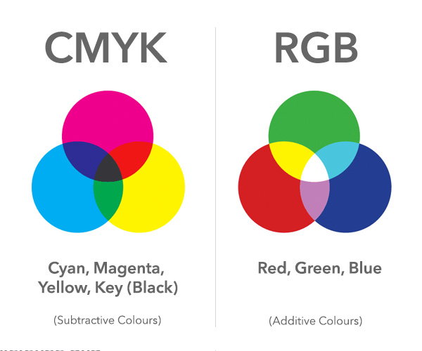
If you’re used to designing things for digital use (e.g. websites, blog post graphics, etc.), you’ll more than likely be used to the RGB colour mode. This is the default setting for most graphic design applications (e.g. Photoshop) so even if you’ve never heard of RGB, you’ll probably have been using it by default. However, when you’re designing for print, you’ll almost certainly need to use the CMYK colour mode as using RGB can lead to untrue colour reproduction during the printing process.
But what exactly are these colour modes? Let us explain:
RGB (Red, Green, Blue)
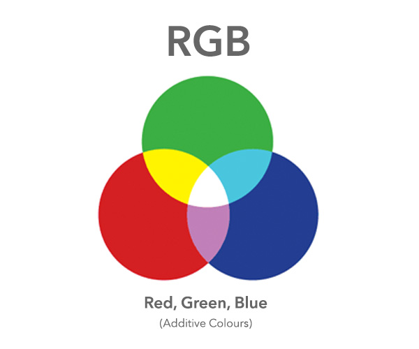
RGB is an additive colour system in which all colours are created from various combinations of Red, Green and Blue. Essentially, light is used to mix colours; as you add more light, the colour will get lighter, brighter and more vibrant. RGB allows extremely precise control over the colour you use. In total, there are almost 17 million (16,777,216 to be precise) possible RGB colour variations.
CMYK (Cyan, Magenta, Yellow, Key/Black)
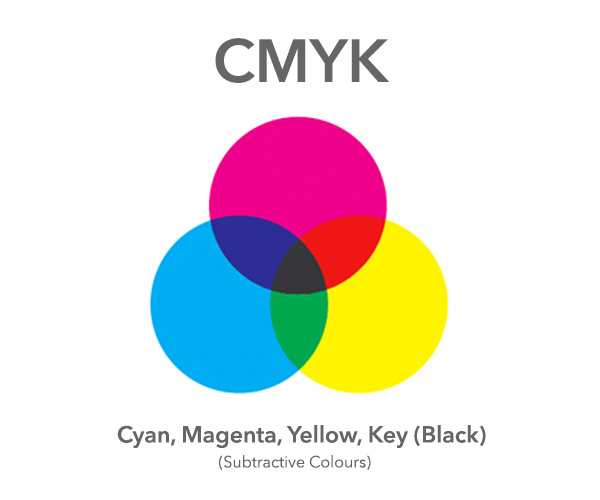
CMYK is a subtractive colour mode in which all possible colours are created from various combinations of Cyan, Magenta, Yellow and Black (Key). It works by adding various combinations of the inks together to create different hues. The more ink you use, the darker the colour gets.
RGB allows a wider spectrum of colours than CMYK. By making sure to design for print in the CMYK colour mode, you can make sure that your design is limited only to colours that are reproducible during the professional print process.
CMYK in Professional Printing
source: www.flickr.com/photos/greydragonclaw/2664978278/in/photolist-54uHcm
Professional printing companies use the CMYK process, so you need to ensure that you design for print by setting the colour mode to CMYK in whichever design application you’re using. Designing in RGB mode instead of CMYK is perhaps the most common mistake printing newcomers make.
Understanding Resolutions (DPI + PPI)
If you’ve ever seen a pixelated photo or image on your computer screen, you’re part way to understanding how resolutions work and why it’s so important to get them right when designing for print.
If not, it’s all explained below:
PPI (Pixels Per Inch)
source: cdn2.knowyourmobile.com/sites/knowyourmobilecom/files/styles/gallery_wide/public/1/17/ppi.jpg?itok=ba_GL8h2
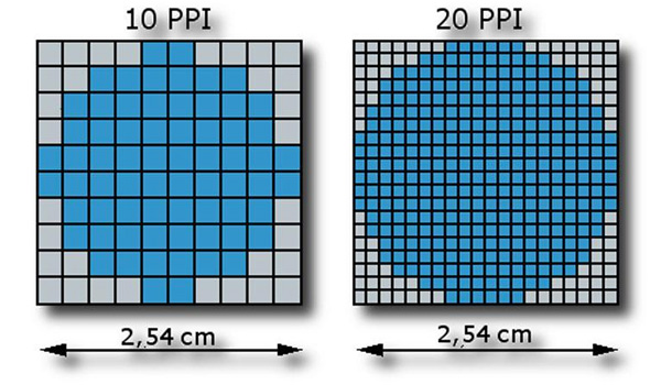
PPI (Pixels Per Inch) essentially refers to the amount of tiny dots (pixels) that make up an image on a computer screen. The higher the PPI, the higher quality the image will appear (as long as your computer monitor has a high enough resolution). The reason for this is simple: the more tiny dots (pixels) that are used to create one inch of an image, the more detail that can be squeezed into that image. This is the whole concept behind high-definition TV.
You can see a fantastic example of how this works in the image above.
It’s clear that the circle represented at only 10 PPI barely looks like a circle, whereas the circle represented at 20 PPI looks a lot more circular. Keeping in mind that some HD modern displays (such as the Retina displays on iPhones/iPads) have as many as 250+ PPI, you can start to understand why everything looks so clear on these devices.
DPI (Dots Per Inch)
source: www.silvergriffininc.com/uploads/2/0/7/1/20710150/7919061_orig.jpg
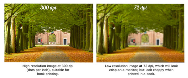
DPI is essentially the same as PPI, only translated into the real world of printing rather than the world of a digital computer screen. When you send your digital design off to your chosen printing company, every pixel will be printed as a tiny dot (using the CMYK printing process). This means that it’s extremely important to ensure that the PPI of your design is directly aligned with the DPI that your printing company uses.
Most printing companies print at 300 DPI, which means that a total of 300 dots will make up every square inch of the final printed design. The reason most printing companies print at 300 DPI is simply because printing at a resolution any lower would create a low-quality finished product.
You can see an example of this in the image above.
It’s best to double-check with your chosen printing company to see the exact DPI they print at before setting up your project. If you can’t get in touch with them however, it’s best to assume 300 DPI.
Understanding Bleed, Trim and Safe Area
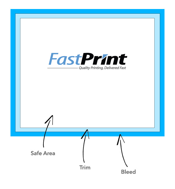
The terms “bleed” and ”trim” might sound like overly complicated technical jargon but in reality, they’re extremely easy to understand.
It’s extremely important that you account for bleed and trim when designing for print, so here’s a simple explanation of each:
Trim
The outer edge of the trim serves as the cut line where the product will be trimmed when it comes out of the printer. In theory, anything outside of that trim line will be cut off and anything inside will remain. However, things aren’t always 100% accurate down to the millimetre, which is why you leave a trim area to account for any small discrepancies.
The idea behind the trim area is to ensure that no matter what happens, no important content is ever trimmed from the design by accident.
Bleed
Just as it’s possible for there to be small discrepancies in the trimming process which may eat into the trim area slightly, it’s also possible for those same discrepancies to go the other way (i.e. the actual trim line is slightly outside the trim area). Without a bleed area, you’d be left with random ugly white lines around your finished product if this happened. The bleed area is there as insurance, to prevent your design from looking ugly no matter what happens.
Bleed varies between printing companies but it’s typically around 3mm in the UK.
Safe Area
The safe area is the area in which all of your important information and design elements should reside. It’s called the safe area because no matter what happens, everything inside this area is 100% safe and will be included in the final printed product. No important part of your design (aside from the background) should extend outside of the safe area and into the trim area.
Trim varies between printing companies but it’s typically around 3mm in the UK.
How to Set Up Photoshop, Illustrator or InDesign
Now you understand the basics required for the design process, it’s time to get things set up. You can use just about any problem you like to design for print but some of the most common include: Adobe Photoshop, Illustrator, and InDesign. While you may be familiar with these applications, it’s important to understand that the setup process when designing for print varies slightly compared to the setup process when designing for a digital medium.
Don’t worry though; it just involves changing a couple of settings.
You need to ensure that your file is setup as follows:
- CMYK Colour Mode (not RGB)
- 300dpi (double-check with your chosen print company)
- Account for bleed and trim
Here’s how to set things up with the correct settings:
Use the Templates Provided
The most simple way to set things up in Photoshop, InDesign or Illustrator (or any graphic design application) is to make use of the templates on offer from most printing companies. These will usually be set-up with the correct resolution, sizing, colour mode (CMYK) and of course, bleed and trim areas.
If these aren’t available from your chosen printing company however, here’s how you can set things up yourself:
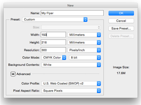
Step #1: Create a New Document
Open Photoshop, InDesign or Illustrator (or your chosen application) and navigate to: File > New.
You’ll then be presented with all the options to set up your file.
You need to make sure you select the following:
- Colour Mode: CMYK
- Resolution: 300 Pixels/Inch
You also need to make sure that you enter the dimensions correctly (i.e. the dimensions of your flyer + 3mm bleed on each side.
For example, here are the settings we’d need for an A5 flyer:
- 153mm x 216mm (including 6mm bleed – 3mm on each side)
Here’s the correct setup:
And here’s what the result will look like:
Step #2 – Adding Guide Lines for Bleed + Trim
Next, you need to add grid lines for the bleed and trim areas. This will help during the design process, as you’ll be able to see exactly where your safe area resides.
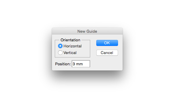
For our example, we need to add 8 guides in total: 2 (one for bleed, one to mark the safe area) on each side of our flyer.
Most design applications (including Photoshop) require you to specify the locations for these guides in a “Distance from the edge” format (left edge for vertical guides, top edge for horizontal guides) and add them one-by-one.
So, we need to do a bit of math:
- Left trim line guide: Zero + 3mm = 3mm
- Left safe area guide: Zero + 6mm = 6mm
- Right trim line guide: Total width (mm) – 3mm = 150mm
- Right safe area guide: Total width (mm) – 6mm = 147mm
- Top trim line guide: Zero + 3mm = 3mm
- Top safe area guide: Zero + 3mm = 6mm
- Bottom trim line guide: Total height (mm) – 3mm = 213mm
- Bottom safe area guide: Total height (mm) – 6mm = 210mm
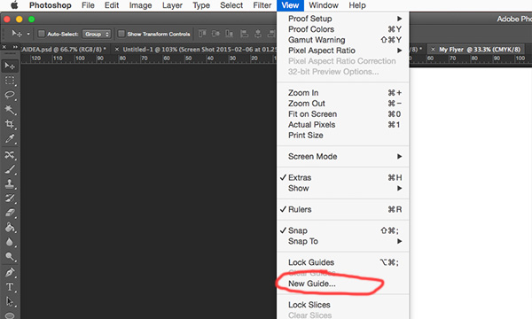
Now we’ve got the dimensions, we need to add them one-by-one. To do this, go to: View > New Guide.
Let’s add the first one:
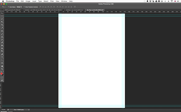
Now, you just need to add the other 7 for every one of the dimensions above (or whatever dimensions you figured out for your particular project).
Here’s the finished result:
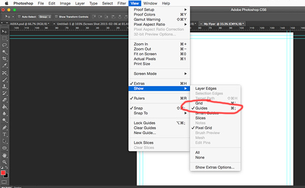
Note: If you can’t see the guides when you add them, go to: View > Show > Guides. Make sure it’s checked.
Setting up in Illustrator, InDesign and Other Applications
If you’re using Illustrator, InDesign or another application, the setup process should be almost identical to the one illustrated in the screenshots above.
Just make sure you select the right colour mode, dimensions (Inc. bleed) and resolution.
Here’s a nifty guide for InDesign and Illustrator.
An Important Note About Using Black
When designing for print using the CMYK colour mode, it’s important not to use the classic Photoshop black colour. Although it might look 100% black on your screen, it’ll likely appear more of a greyish colour when printed. The reason for this is down to the way the CMYK print process works.
It’s generally considered that anything with a CMYK value of 280% + will cause issues during the print process (due to the sheer amount of ink needed).
Here’s the CMYK value(s) of normal Photoshop black:
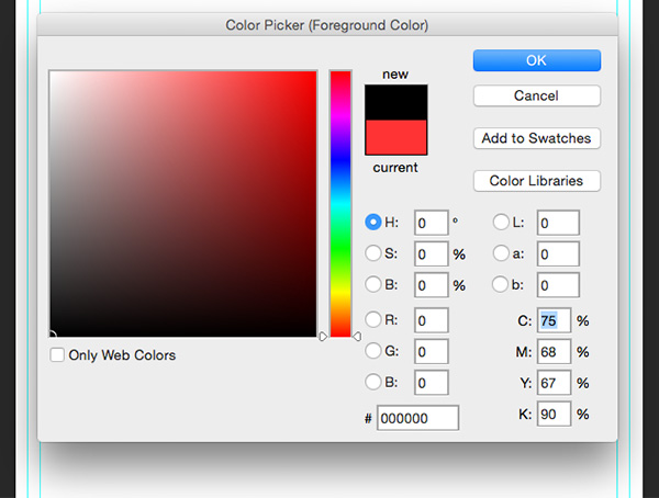
As you can see, it adds up to 300%.
To solve the problem, you simply need to adjust the CMYK values of your black manually.
Here’s the solution:
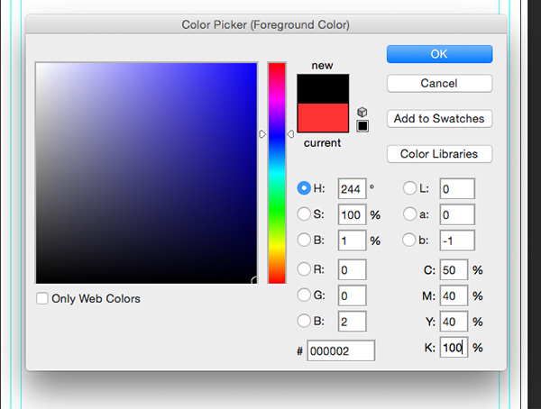
There are a few ways to create black within the CMYK colour mode, but this method (named “rich black”) is one of the most common.
Don’t Forget to Check Spelling
Lastly, just a quick reminder to check your spelling before sending it off to the printing company. It sounds obvious, but you’d be amazed at the number of costly spelling mistakes we’ve seen over the years.
See if you can spot the one above.
Conclusion
That’s everything! We hope you feel a bit more confident setting up your project and creating a design for print after all that!
Still got questions? Let us know in the comments section below and we’ll do our best to provide the answer.