Leaflet design is a complex subject, especially if you have little/no graphic design experience.
While there are a number of so-called “design guides” out there (just do a quick Google search), none of them cover the leaflet design process from start to finish; instead, most offer nothing more than vague pieces of advice and typically only cover a small part of the overall process.
Here at fast print we felt this was a problem, so we decided to put-together this mammoth guide (7500+ words!) to leaflet design – it’s broken down into multiple categories and aims to walk you through the leaflet design process from start-to-finish.
Here are the categories (click the links to jump to each section):
- Conceptual (Ob – Objective, Au – Audience, De – Demographic)
- Structure (He – Heading, Ac – Call-to-Action (CTA), Su - Subheadings, Pa - Paragraphs)
- Content (Cw – Copywriting, Be – Benefits, Us – USP, Cd – Contact Details, Ss – Short Sentences, Bu – Bullet Points, Qu – Quotes, Di – Discount(s), To - Tone, Ls – Long Sentences, Te – Text-Heavy)
- Design (Bc – Branding Colour(s), Im – Images, Lo – Logo, Re – Readability, Fo – Font(s), Ws – White Space, Co – Colour, Ii – Irrelevant Images)
- Pre-Print (Sp – Spelling, Cm – CMYK, Pr – Proof, Rg - RGB)
- Print (Fl – Folding, Si – Size, We – Weight, Fi – Finish, Sh – Shape, Uv – Spot UV)
We also put-together this simple infographic (inspired by this graphic on SEO), which distils the information outlined in the guide below into a much more “visual” format.
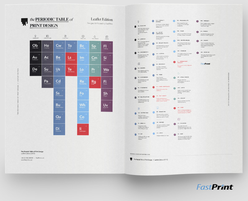
Click to enlarge
Let's get started!
Ob – Objective (Conceptual)
It’s important to define the primary objective/purpose of your leaflet.
Begin by asking yourself, “what do I want my leaflet to achieve?” or “what is the primary aim of my leaflet?”
There are a number of answers you could give here, including (but not limited to):
- Raise brand awareness
- Promote a specific discount/offer
- Promote a specific product/service
- Inform potential customers/clients about pricing (or any other issue)
- Educate your customers/clients/audience
Example #1: This leaflet entitled: “The Facts About Ecstasy” has a clear primary aim: to educate its audience about Ecstasy (i.e. what it is, the various forms of ecstasy, positive/negative effects, etc.).
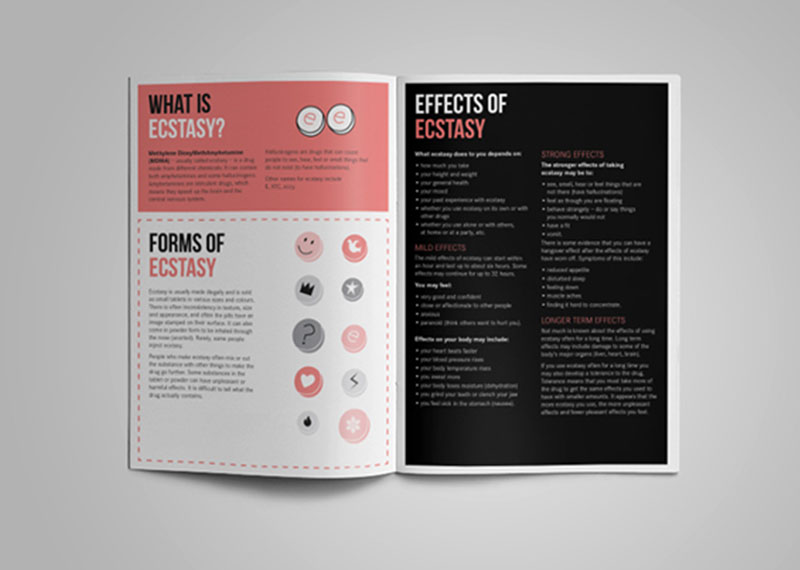
Source: behance.net/gallery/NSW-Health-Drug-and-Alcohol-Fact-Sheets/15532333
Example #2: Occupy Wall Streets’ “Agenda” leaflet aims to spread the word about upcoming events, with the primary objective being to promote said upcoming events and thus, increase attendance.
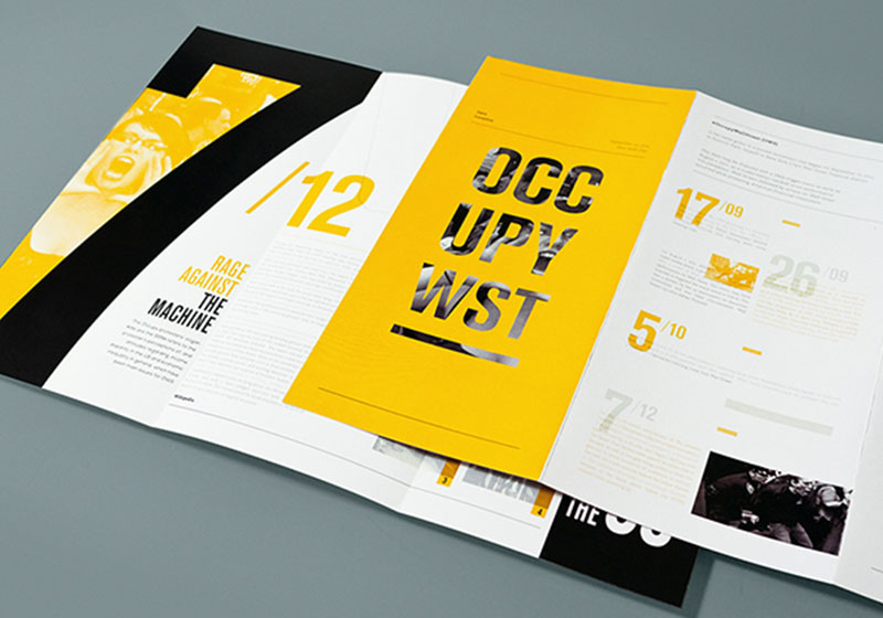
Source: behance.net/gallery/OCCUPY-Wall-Street-historical-booklets/14717315
Example #3: Topshops objective here was to promote a competition, where the winner will receive a years worth of shoes (adding people to their mailing list was a secondary aim, no doubt).
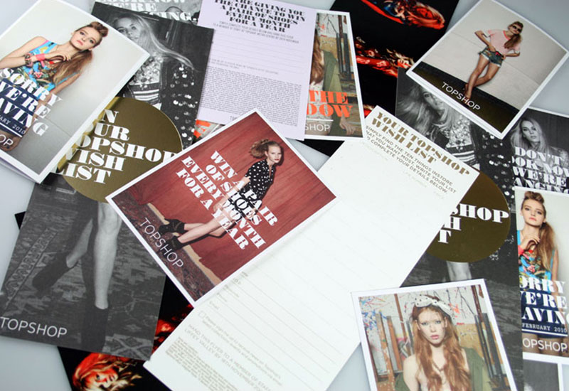
Source: danielclatworthy.com/projects/Topshop-Creative-Marketing
Note: Try to restrict your choice to only one primary objective, otherwise you run the risk of ending up with a confused design.
Au - Audience (Conceptual)
It’s important to consider the type of person you’re trying to reach with your leaflet.
Begin by asking yourself: “whom is my leaflet targeted towards?” or “what specific attributes does my target audience have?”
Again, there are a number of possible answers you could give, including (but not limited to):
- Existing customers (e.g. people who have purchased from you within the past 12 months)
- Potential customers (e.g. mailing list subscribers who have yet to convert to customers)
- People with an interest in [BLANK]
- Those who live/work in a particular geographical region (e.g. London)
Note: The more specific you can be here, the better.
Example #1: Taj Villas has a very particular audience: people who are currently looking to purchase a new home; have a relatively high budget; and an appreciation of luxury accommodation.
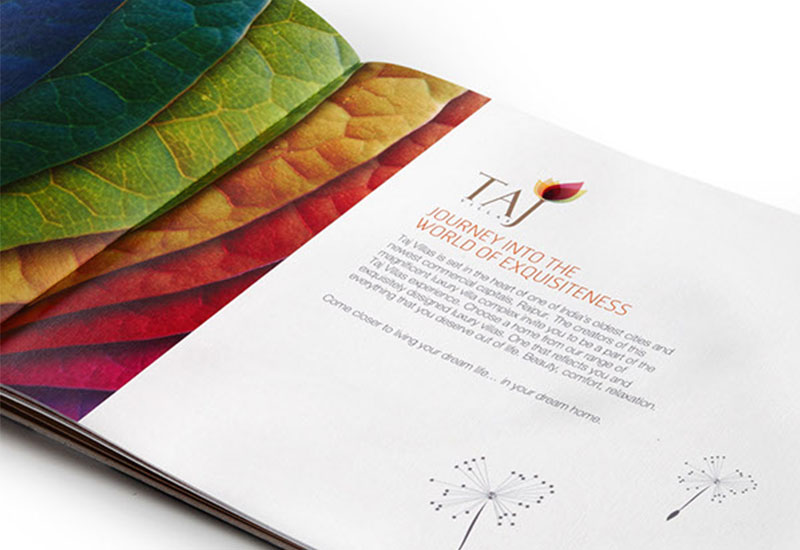
Source: behance.net/gallery/Taj-Villas/3207925
Example #2: Drop Inn has an audience of cash-strapped travellers who may be looking for budget accommodation in the near future (their audience are also likely to be wondering the streets, which is why the hostel opted for this eye-catching “letter O” design).
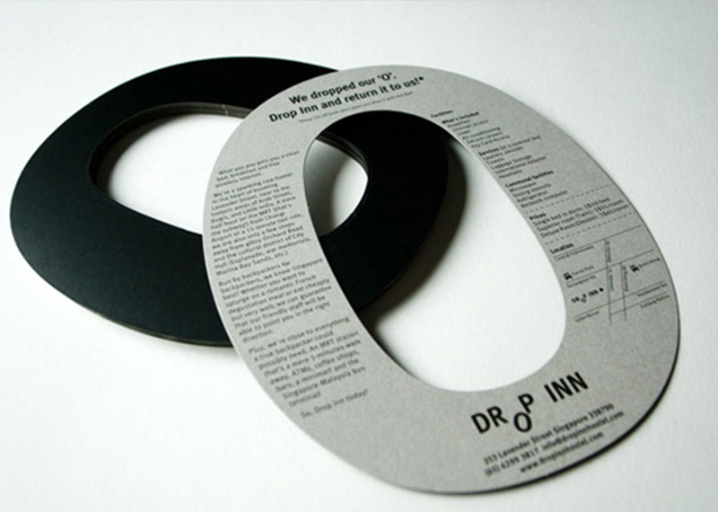
Source: bravocompany.prosite.com/
Example #3: Underground Cookery School has a super-specific audience: people who are interested in learning more about cooking; are willing to invest their time/energy/money into educating themselves; and have enough disposable income to do-so.
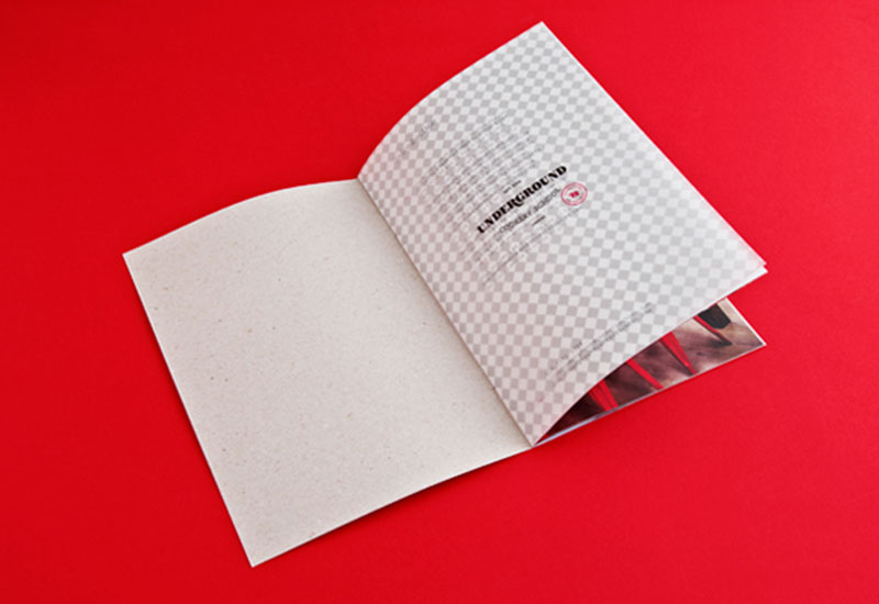
Source: behance.net/gallery/Underground-Cookery-School/6307501
De – Demographic (Conceptual)
Whereas defining your audience (see: Au – Audience) mainly involves noting down specific attributes your target audience may have (e.g. high income level, interests, etc.), defining your demographic delves deeper into the physical characteristics of said audience.
Begin by asking yourself questions such as:
- How old is my target audience likely to be? (E.g. 18 – 25)
- What gender are they likely to be? (E.g. male/female)
- Health/Fitness level (E.g. fit, average, overweight, obese, etc.)
Example #1: With HIV primarily affecting the male population, Ctrl+Alt+Shift has a clear target demographic of predominantly men (which is likely the reason the opted for a relatively masculine typeface and male imagery).
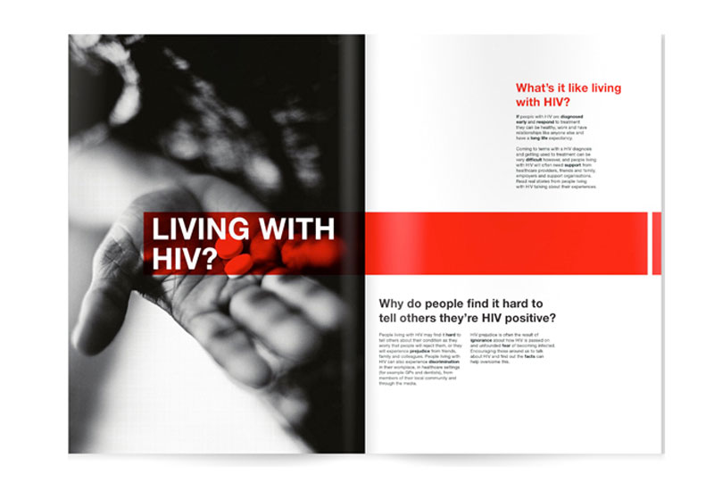
Source: behance.net/gallery/CtrlAltShift/520830
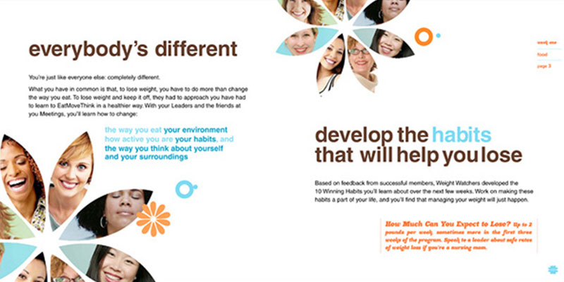
Example #2: Weight Watchers is an organisation with a predominantly female demographic (hence the inclusion of solely female photos in this leaflet), who have a desire to get fitter, healthier, and/or slimmer.
Source: behance.net/gallery/Weight-Watchers-360-program/1715273
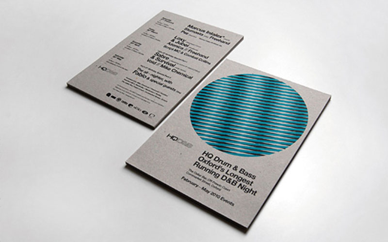
Example #3: HQ Drum and Bass is Oxford’s longest running D&B night – it has a target audience of young adults of both genders (hence the modern, minimalistic yet energetic design).
He – Heading (Structure)
Use a short, catchy headline to capture the attention of your target audience and make them want to explore your leaflet further.
Your heading should be big, bold and effectively answer your audience’s question: “what’s in it for me?” (i.e. “why should I bother reading any further?”).
Example #1: WWF uses distressing facts as their headline(s) for these two leaflets (i.e. “Land mammals at risk” and “All birds at risk”) – these facts make the reader want to know more about the situation, and it also prompts them to continue reading further.
WWF also uses a large font size to ensure the message grabs the attention of their target audience instantly.
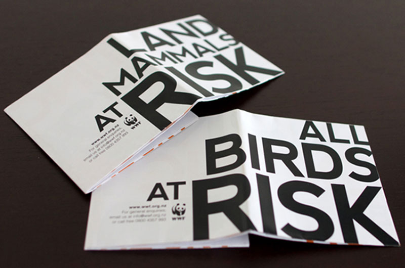
Source: behance.net/gallery/WWF-Climate-Change-Poster-Publication/1606577
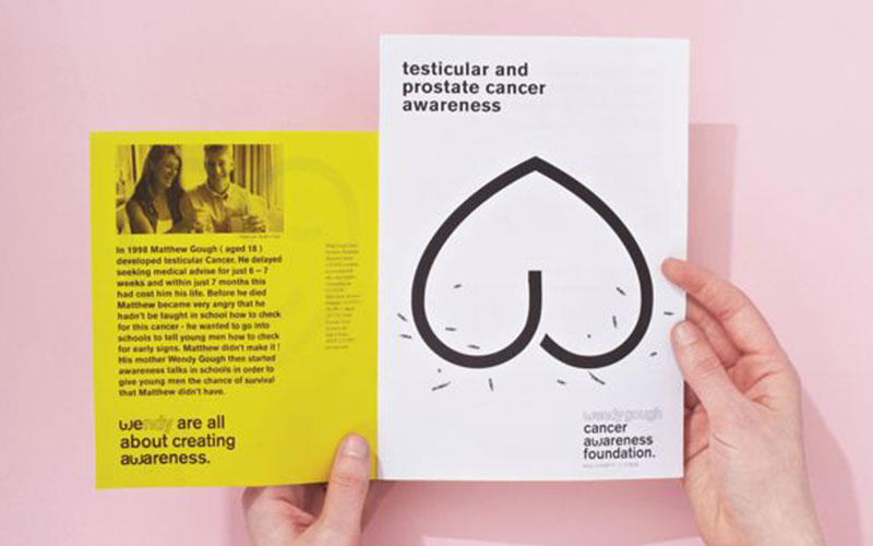
Example #2: The Wendy Hough Cancer Foundation may have a rather simplistic, somewhat understated design, but the headline employs the same tactic as the WWF leaflet to attract attention.
It reads “testicular and prostate cancer awareness”, which is short, catchy and straight-to-the-point.
Source: pinterest.com/pin/137289488615195493/
Ac – Call-to-Action (Structure)
Every leaflet should include a CTA (Call-to-Action).
Including a call-to-action involves nothing more than ensuring that the recipient is motivated to carry out a particular action, such as:
- Calling you
- Emailing you
- Placing an order
- Finding out more information
- Visiting your website
- Get involved (e.g. for a charitable organisation)
Your CTA should be clear, concise and as specific as possible (it’s best to leave no room for interpretation whatsoever).
Example #1: Joanna uses an extremely simple CTA to prompt the recipient to visit her website and find out more about her. It’s difficult to read on the image, but the leaflet says: “to find out more about what I do, follow the link below”, followed by her website address.
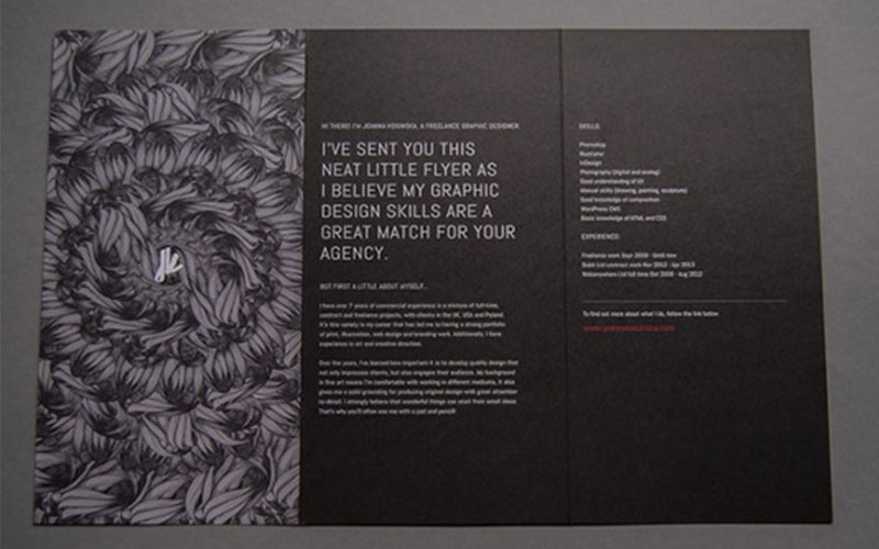
Source: behance.net/gallery/17665237/Flyer
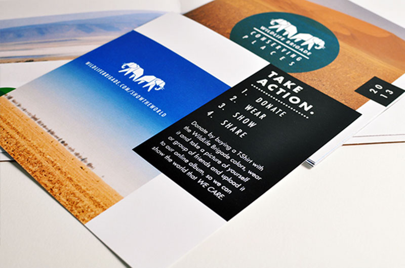
Example #2: Wildlife Brigade has a much more specific CTA, which prompts the recipient to donate by purchasing a t-shirt, wearing it, then taking a photo and uploading it to their online album.
Source: behance.net/gallery/WildLife-Brigade/5958931
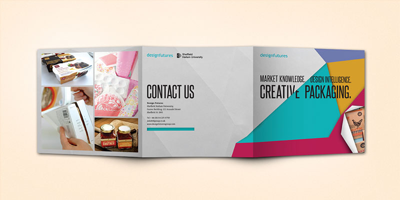
Example #3: The “Design Futures” leaflet from Sheffield Hallam University utilises the simple CTA of “Contact us”, followed by a plethora of contact information (e.g. address, phone number, email address, website, etc.).
If you’re struggling to come up with a specific CTA, using “Contact us” is usually better than nothing.
Source: behance.net/gallery/Design-Futures-exhibition-materials/4406721
Su - Subheadings (Structure)
Subheadings help to break down complex topics into bite-size pieces, thus ensuring your leaflet doesn’t overwhelm the recipient at first glance.
It’s especially important to use subheadings if your leaflet contains a lot of written information, or tackles a complex subject consisting of multiple subtopics.
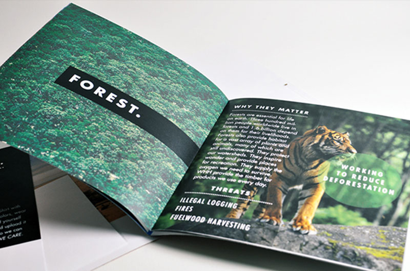
Example #1: Wildlife Brigade makes use of multiple subheadings to explore the various habitats that are under threat. Notice the “Forest” subheading on the left-hand page, with further sub-subheadings (i.e. “Why they matter” and “Threats”) on the right-hand page.
Source: behance.net/gallery/WildLife-Brigade/5958931
Example #2: The Royal Veterinary College utilises a number of subheadings throughout this multi-page leaflet to break down the topic into multiple, bite-size subtopics such as: “Why choose CPC courses at the RVC?” and “Quotes from Courses” (see examples below).
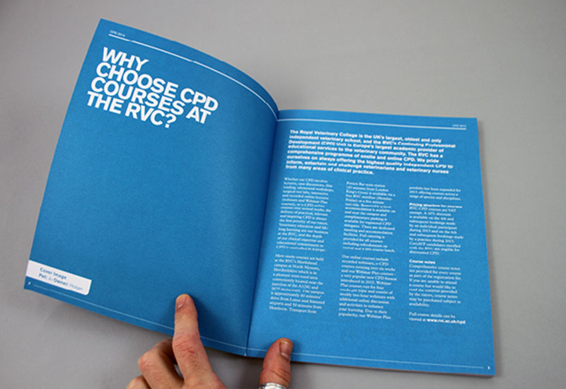
Source: behance.net/gallery/RVC-CPD-Brochure-2013/6440107
Pa - Paragraphs (Structure)
Use paragraphs to split large, complex topics into bite-size chunks and ensure the recipient doesn’t suffer from information overload.
Paragraphs can also be useful for maintaining readability and legibility.
Example #1: The University of Arts breaks down this relatively text-heavy leaflet into multiple paragraphs, thus ensuring that the information is easy to read and digest – you can imagine how overwhelming it would look as one large chunk of text.
Some paragraphs are also given more “weight” than others by utilising various font sizes and colours.
Source: alphabeticalstudio.com/projects/#-ual-bestpractice
Example #2: The Division of Industrial Design also uses paragraphs to break down this mammoth amount of text into bite-size chunks. Some paragraphs are given short subheadings to further improve legibility.
Source: behance.net/gallery/Division-of-Industrial-Design/1797058
Cw – Copywriting (Content)
It’s important to ensure that all written copy throughout your leaflet is consistent and on-brand.
You should also consider your target audience and demographic when writing copy (along with the subject nature of your leaflet) as certain audiences/demographics/topics all require very different approaches to copywriting.
The easiest way to ensure that your copy is consistent and on-brand is to hire a professional copywriter, although that can be costly.
Example #1: The Sandwich Factory is a brand that appeals to an audience of sandwich enthusiasts, all of whom support the business due to fact that they offer a personalised service, a high-quality product, and set of values that align with their own (i.e. a passion for quality produce).
Therefore, the Sandwich Factory opted for this quirky, light-hearted copy that aligns with their core values and speaks to their customer(s) on a personal level.
Source: behance.net/gallery/Sandwich-Factory-Creative-Direction-Branding/12403885
Example #2: Ctrl+Alt+Shift is a brand that tackles the sensitive subject of HIV, so it’s important that their copy is more direct, to-the-point and most importantly, highly factual.
It wouldn’t make sense for the organisation to opt for light-hearted copy (like the Sandwich Factory), as they’re targeting a different audience/demographic and tackling a much more sensitive subject (compared to sandwiches, at least).
Source: behance.net/gallery/CtrlAltShift/520830
Be – Benefits (Content)
It’s important to ensure that your written content is as benefits-focussed as possible.
This means making sure to highlight the beneficial qualities of your product/service/offer/etc., rather than simply listing facts/figures and hoping that the benefits are clear enough to the reader.
You need to make sure that the recipient understands how your offering will benefit them personally. For example, if you were selling a protein powder, you may want to say, “contains 30g to help you get the six pack you’ve always wanted” instead of simply, “contains 30g of protein”.
Example #1: This page of the leaflet from the Underground Cookery School talks specifically about Birthday, Hen & Private Parties, and you’ll notice that the copy lists many features of their offering (e.g. drinks, canapés, music, the ‘high-end brassiere”, etc.).
However, it’s important to note that these are nothing more than features and therefore, aren’t particularly benefits-focussed.
Luckily, the leaflet goes on to say how the event will be “a real night to remember”, which is much more benefits-focussed (and ultimately what any customer of theirs is buying from them).
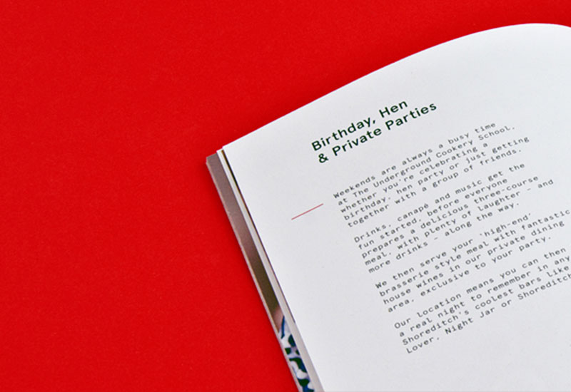
Source: behance.net/gallery/Underground-Cookery-School/6307501
Example #2: Elmwood Spa takes a similar approach with their leaflet copy; they list a lot of features, yet also keep things benefits-focussed.
For example, the “ElmLine Youth Facial” treatment lists features including, “…includes an ElmLine Purifying Cleansing Cream and ElmLine Purifying Day Protection Cream to take home”, but also talks about the benefits, including how the treatment helps to “combat excessive shine and prevent future blemishes for young skin prone to greasiness and breakouts”.
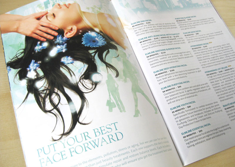
Source: behance.net/gallery/Elmwood-Spa/172063
Us – USP (Unique Selling Point) (Content)
No matter what the objective of your leaflet is (see Ob – Objective), it’s important to include your USP (Unique Selling Point).
By doing this, you’ll ensure that your leaflet appeals to the intended audience; it will also help to differentiate your brand from the competition.
Example #1: Foodland created this leaflet to offer their customers a selection of fresh, healthy recipes to cook, using ingredients bought from their store.
The cover says: “Fresh Season. Fresh Ingredients”, which is the USP of the store and its associated products. It also portrays imagery of fresh produce (e.g. basil, eggs, fruit, vegetables, etc.), which helps to further push their USP.
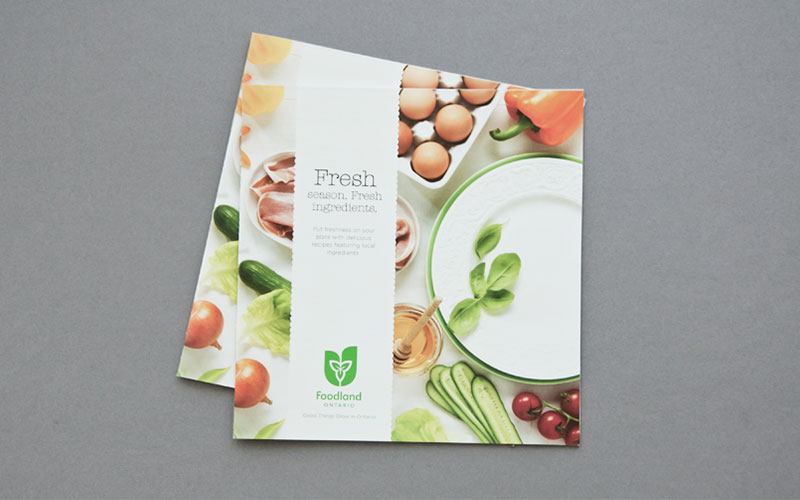
Source: behance.net/gallery/Foodland-Spring-Recipe-Book-2012/4371069
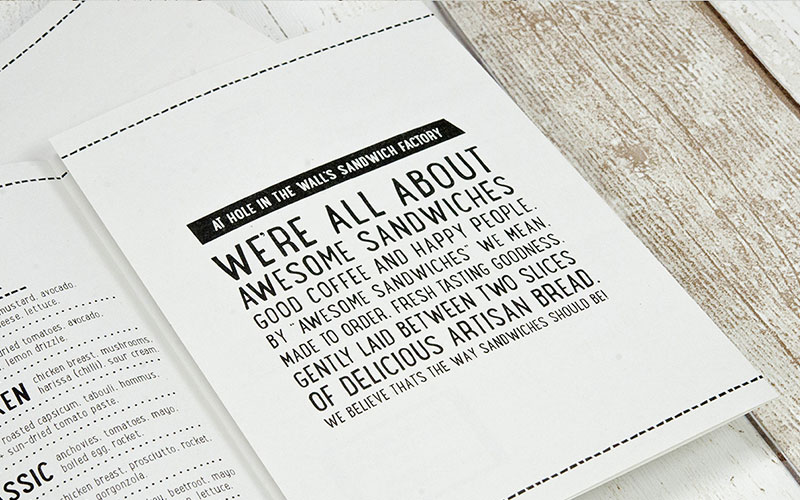
Example #2: Hole in the Wall’s Sandwich Factory takes a more direct approach to USP inclusion by simply stating exactly what the brand is all about, in plain English.
The cover says, “We’re all about awesome sandwiches, good coffee and happy people. By ‘awesome sandwiches’, we mean made to offer, fresh tasting goodness, gently laid between two slices of delicious artisan bread. We believe that’s the way sandwiches should be!”
This comprehensively describes the USP of the brand (i.e. freshness, quality, etc.) and also offers insight into the values the brand holds (read “we’re all about awesome sandwiches”).
Source: behance.net/gallery/Sandwich-Factory-Creative-Direction-Branding/12403885
Cd – Contact Details (Content)
No matter whether you’re a company, charity, non-profit, or any other form of entity, your leaflet should always include your contact details.
You don’t always have to include all your contact details, but typically, most leaflets will include the following:
- Address
- Phone number
- Website address
- Email address
You may also wish to include links to landing pages (for specific products/services/promotions/etc.), social profiles (e.g. Facebook, Twitter, etc.), or even a separate mailing address (e.g. P.O. Box number).
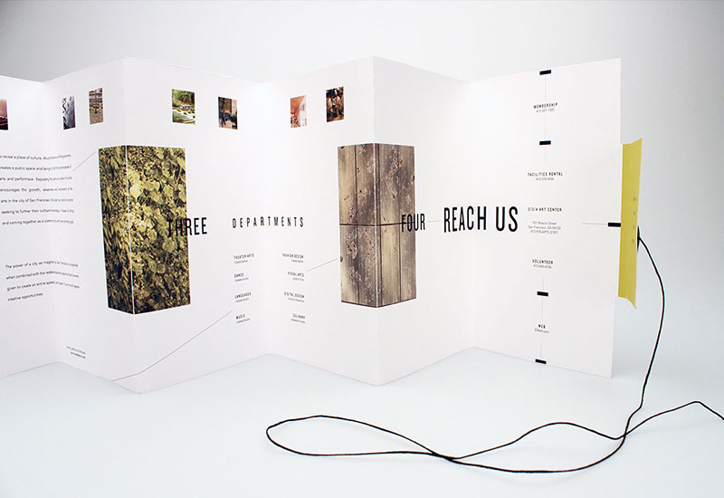
Example #1: This Arts Centre leaflet includes a plethora of contact information, including the website address, full postal address, and phone number.
It also includes a few additional contact details including: a membership-specific phone line; a facilities rental-specific phone line; and a volunteering-specific phone line.
Source: behance.net/gallery/234-Arts-Center-Brochure-Design/14420477
Example #2: The White House Project created this leaflet on behalf of “The Epic Awards 2010”; it contains only one piece of contact information: a person-specific email address, which can be used by the recipient reply to the “RSVP”.
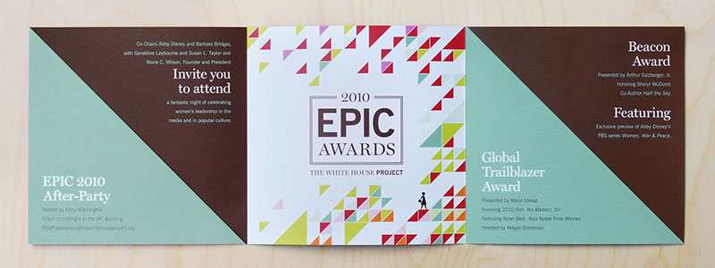
Source: hyperakt.com/items/epic-awards-2010/
Ss – Short Sentences (Content)
Use short sentences to help combat information overload and ensure that any written content is easily readable/digestible.
Short sentences also help to ensure that things are kept brief and straight-to-the-point, which can often save space (and therefore money when it comes to the printing process).
Example #1: The Wildlife Brigade makes use of extremely short sentences throughout this leaflet, thus helping to keep a complex topic easily digestible and “light”. None of the sentences on this page consist of more than 20 words.
Source: behance.net/gallery/WildLife-Brigade/5958931
Example #2: Pact also makes use of short sentences to keep things bite-size and digestible. None of the sentences on this page contain more than 25 words.
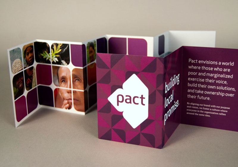
Source: behance.net/gallery/Pact/3688849
Bu - Bullet Points (Content)
Using bullet points allows the recipient to quickly identify and comprehend any important points throughout the leaflet.
They can also be useful for highlighting specific facts/information/points that you wish to draw particular attention to, like this:
- This is an important point
- This, too, is an important point
- Here is yet another important point
According to the Oxford Dictionary, there are no set rules as to when you can/can’t use bullet points, so be creative.
Example #1: “The Facts About Alcohol” is an educational leaflet that aims to inform people about the various effects (positive and negative) of alcohol.
You’ll notice that on the right-hand page, the leaflet lists in excess of 35 facts (using bullet points). This format allows the reader to quickly skim and digest the information, without having to read paragraphs of text.
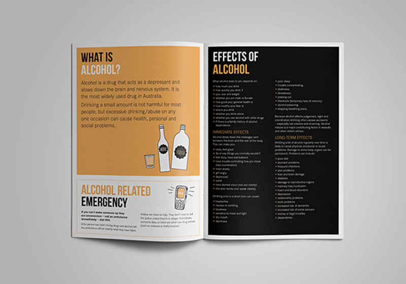
Source: behance.net/gallery/NSW-Health-Drug-and-Alcohol-Fact-Sheets/15532333
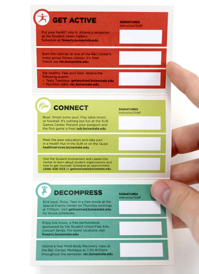
Example #2: Strive uses a bullet point-style arrangement here, consisting of three main bullets: “Get Active”, “Connect”, and “Decompress”.
While these may not be “traditional” bullets (i.e. word processed “dots”), the way the leaflet is designed has the same overall effect – it draws attention to the most important points and allows the reader to quickly identify the three main subject areas.
Source: behance.net/gallery/STRIVE-Passport/15266671
Qu – Quotes (Content)
By including quotes from previous customers/clients (or sponsors, competition winners, etc.), you’ll be able to provide the recipient with “social proof”, thus allowing you to prove that what you’re offering is actually something worth buying/getting involved in.
Quotes essentially help to reassure the recipient about the product/service/offer you’re promoting.
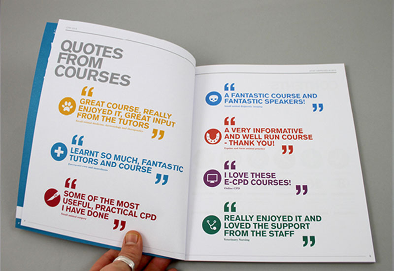
Example #1: The Royal Veterinary College uses quotes from previous students throughout their leaflet, with the aim of reassuring potential future students that the college is the right choice for them.
These quotes also help to answer questions potential future students may have about the course before committing, such as, “will this have any real impact on my practical work?” – the quote: “made a difference to my practical work from the first week…” helps to overcome this barrier.
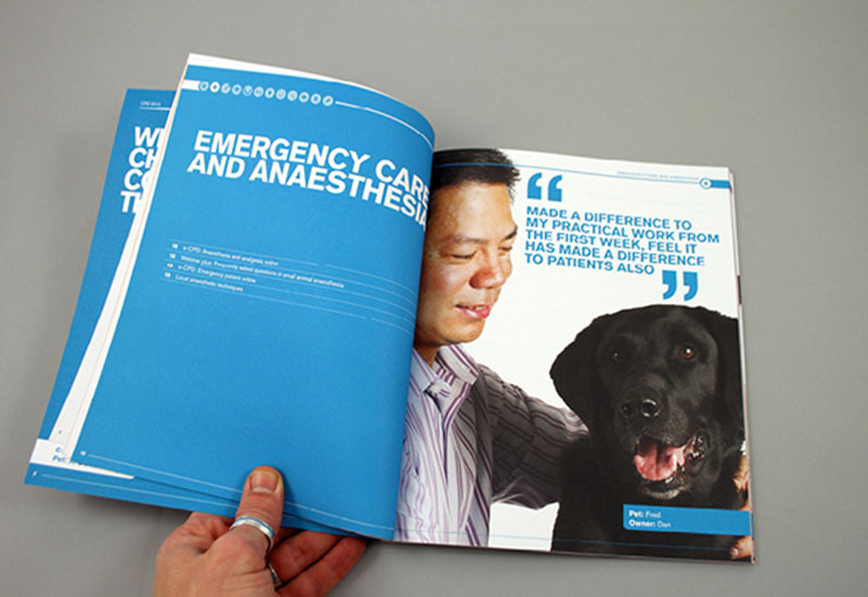
Source: behance.net/gallery/RVC-CPD-Brochure-2013/6440107
Example #2: The University of Arts makes use of quotes to overcome issues potential students may have about forming (and working in) groups.
You may notice that all of the quotes from previous students primarily talk about the level of freedom the University of Arts offers when it comes to forming groups, which is clearly a common worry that many potential students have.
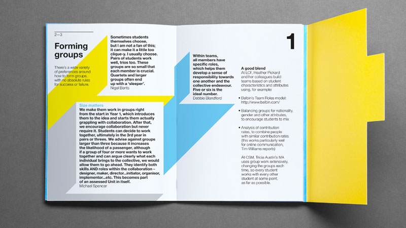
Source: alphabeticalstudio.com/projects/#-ual-bestpractice
Di – Discount (Content)
Consider including a discount (or coupon) to incentivise the recipient to take action (e.g. to prompt them to make a purchase).
It works particularly well when promoting a new product/service, or marketing to existing customers/clients (as they will probably be the most likely to spend their money with you again).
A discount or coupon can be used as a CTA (Call-to-Action), although you should never neglect a written CTA altogether.
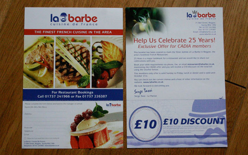
Example #1: La Barbe – a French restaurant in the UK – included a coupon for a £10 discount on the total bill for anyone booking between Sunday and Friday.
This gives the recipient the incentive to call the restaurant and make a booking (as per the call-to-action on the adjacent page of the leaflet).
Source: knibbs.co.uk/print_leaflets.html
Example #2: Dominos goes one-step further by including a number of coupons on this leaflet; with the aim of incentivising repeat custom. All of the coupons are valid for two-weeks only, prompting the recipient to take action within a relatively short space of time.
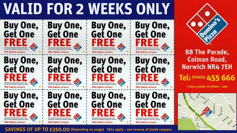
Source: stopjunkmail.org.uk/blogs/royal-junk-mail/2011/12/dominos-pizza
To – Tone (Content)
You should keep things conversational when it comes to the overall tone of your leaflet.
By doing this, the recipient will feel a more personal connection towards your brand (i.e. they’ll feel like they’re having a conversation with you, rather than being marketed at). This often increases engagement.
Example #1: Wendy Gough’s leaflet promoting the awareness of testicular and prostate cancer keeps things conversational, despite the serious nature of the topic.
It does this through the use of storytelling; the leaflet tells a personal story about the founding of the Wendy Gough Cancer Awareness Foundation from the founders’ perspective.
Source: pinterest.com/pin/137289488615195493/
Example #2: Joanna Kosinska keeps things light and conversational throughout by utilising first person dialogue (i.e. using words like “I” and “you”).
The result is a leaflet that feels as though Joanna is speaking directly to you, which helps establish a connection between Joanna and yourself (the recipient of the leaflet).
Source: joannakosinska.com/
Note: A conversational tone isn’t suitable for all brands (e.g. corporate-facing, government bodies, etc.), but it does tend to work for most.
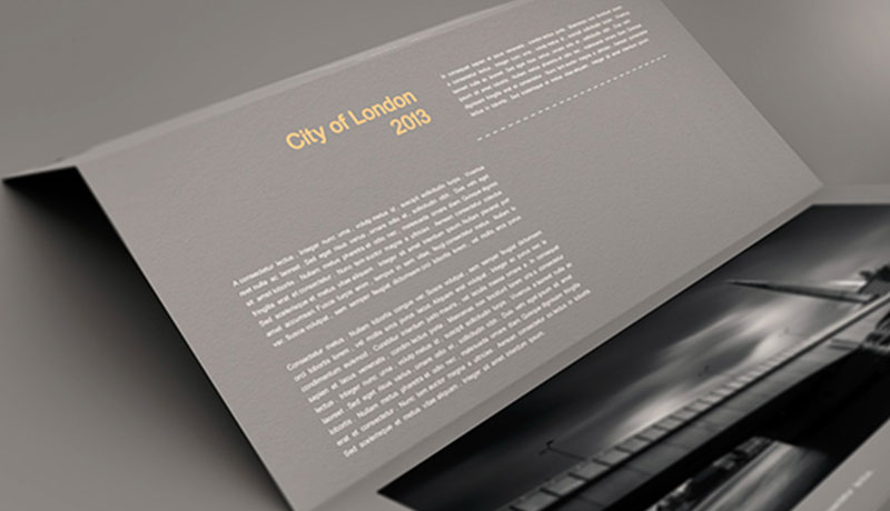
Ls – Long Sentences (Content) - AVOID
Using long, complex sentences can often be detrimental for leaflets – they decrease readability/legibility and can easily overwhelm the recipient.
It’s typically only wise to use long sentences when targeting a well-educated audience with a passion for your leaflets topic (e.g. corporate audiences, healthcare professionals, etc.)
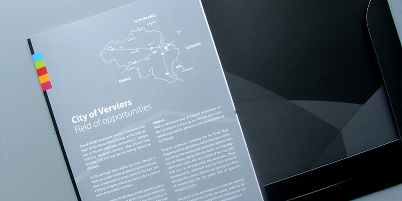
Example: Villa De Verviers uses long, complex sentences in this leaflet/guide, which gives information about the City of Verviers. Some paragraphs contain only a couple of sentences, each consisting of 40+ words.
Using this structure gives the content a “heavier” feel, and given then subject nature of the leaflet, it’s likely that shorter, more refined sentences would have been a better choice.
Source: designfirst.be/wordpress/?portfolio=ville-de-verviers
Te – Text Heavy (Content) – AVOID
While most leaflets should contain a good quantity of written information, it’s important not to overload your leaflet with too much text.
Text-heavy leaflets are not only overwhelming for the reader, but are also much more difficult to skim, read and comprehend.
You should only opt for a text-heavy leaflet under a few circumstances, including where:
- Your leaflet is aimed at the corporate/business market
- You have a target audience of people with a passion for your brand
- You’re marketing a high-end product that involves a lot of decision making on behalf of the buyer
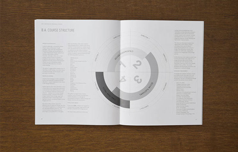
Example #1: This leaflet – created by “The Division of Industrial Design” – outlines the course structure for a B.A. degree programme, and is extremely text-heavy.
Typically, those considering University-level education are not only spoilt for choice (it’s a highly competitive industry), but are also investing significantly in their choice (both financially and personally).
A B.A. degree typically lasts 3-4 years, so a person is likely to need a good amount of information before they make such a mammoth personal investment.
Source: behance.net/gallery/Division-of-Industrial-Design/1797058
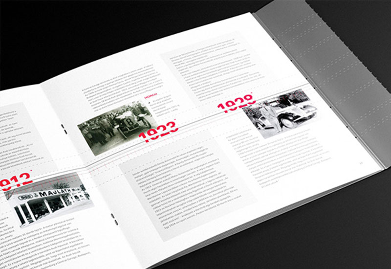
Example #2: Audi created this leaflet to offer their customers a glimpse into the history of the company; it features a visual timeline, which takes the recipient through the decades as the company grew.
It’s text-heavy, but the leaflet is predominantly aimed at Audi owners with a certain level of passion for the brand (i.e. those with a high attention-span for anything Audi-related).
Source: behance.net/gallery/Audi/939424
Bc – Branding Colours (Design)
While it makes sense to use bright colours to attract attention (see Co – Colour), it’s also important to ensure that your colour scheme is kept on-brand.
Most brands make use of just a handful of colours throughout their marketing materials (e.g. blue and white for Facebook), so it’s important that you keep things consistent when it comes to designing your leaflet.
Keeping your colour scheme consistent will help ensure that those who are already familiar with your brand can instantly, recognise, identify with, and relate to your leaflet.
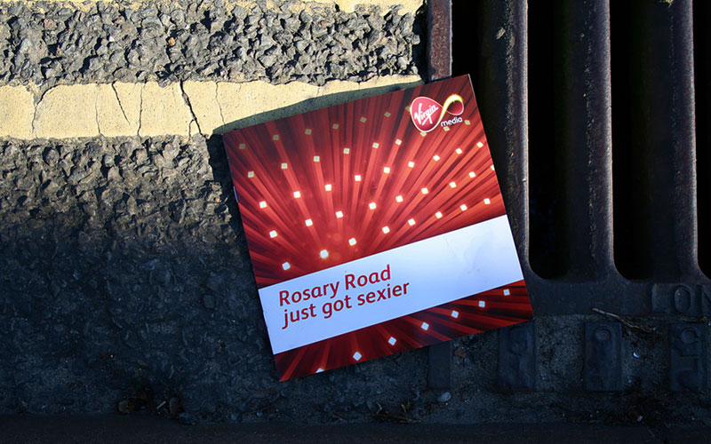
Example #1: Virgin is a brand synonymous with the colour red and this leaflet (which advertises broadband services) from Virgin Media utilises red to keep things as on-brand as possible.
It’s important to note that while red is the primary colour here, the leaflet also makes use of a few other colours (i.e. white, yellow, black); Virgin Media tends to make use of these colours in other marketing materials too, so utilising these colours in the leaflet further helps to keep things consistent and on-brand.
Source: flickr.com/photos/thorpehamlet/418841297/
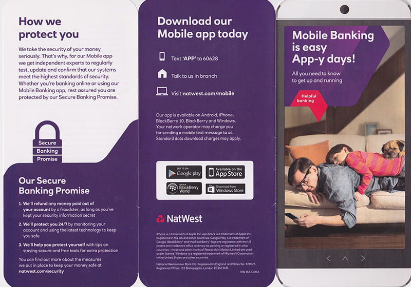
Example #2: Natwest is a UK-based bank that primarily makes use of purple throughout their marketing campaigns and this leaflet is no different, which helps to keep things on-brand.
You’ll notice that the leaflet also makes use of the colour red in small quantities; if you take a look at Natwest’s website (natwest.com) or any other Natwest marketing material, you’ll see that the same shades of purple and red are used.
Source: akbrodie.wordpress.com/2014/12/27/natwest-self-promotional-piece/
Im - Images (Design)
Including images in your leaflet can help in a number of ways, such as: helping to make your leaflet more eye-catching; helping to illustrate certain points; and also, helping to overcome certain objections your customers/clients may have.
It’s important that you only use high quality, high-resolution, and highly relevant images in your design; otherwise the inclusion of images will likely have a negative (rather than positive) impact (see Ii – Irrelevant images).
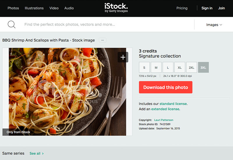
You can purchase such images (like the one pictured below) for just a few dollars from stock photo websites, such as iStockPhoto.com.
Source: istockphoto.com/photo/bbq-shrimp-and-scallops-with-pasta-74121589?st=d65fa35
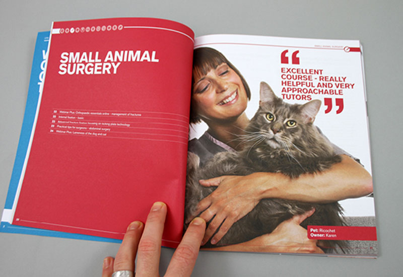
Example #1: The Royal Veterinary College uses beautiful, high-quality photographs of previous students to help illustrate the positive impact that partaking in the course will have.
Here, the image (i.e. of the smiling woman holding a cat) helps to paint a picture of an improved life/career after taking the course. The quote also helps with this too (see Qu – Quotes).
Source: behance.net/gallery/RVC-CPD-Brochure-2013/6440...
Example #2: This leaflet – entitled “Don’t Meth Up Your Life” - uses imagery to convey the extremely negative effects that “meth” can have on your life (i.e. death).
It shows an illustration of a needle (used for injecting the drug), combined with a suicidal male who appears to be committing suicide. It’s this kind of imagery that really helps to attract attention and emphasise the point(s) being made.
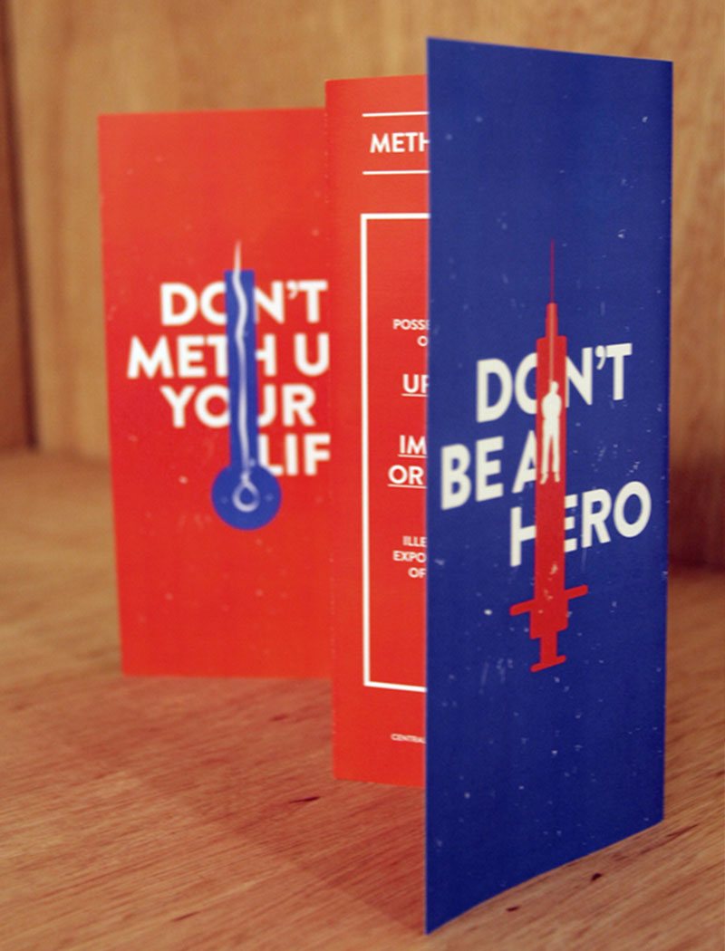
Source: behance.net/gallery/A-Project-for-the-Singapore-Central-Narcotics-Bureau/6373099
Lo – Logo (Design)
You should always include your company/organisations logo within your leaflet, as this will help raise brand awareness, even if that doesn’t happen to be your primary objective (see Ob – Objective).
It also helps to ensure that the recipient understands who created the leaflet and therefore, helps to increase trust between your organisation and the recipient (as long as your brand is well-respected, that is).
Note: You don’t have to plaster your logo all over your leaflet, but you should make sure to include it at least once throughout the design.
Example #1: StudioR7 created this beautifully minimalistic design, which includes the full logo only once throughout the entire leaflet (i.e. on the cover).
However, StudioR7 has chosen to use the shape of their logo (i.e. the bubble design) in other aspects of the design, which helps to keep the overall look and feel of the design consistent throughout.
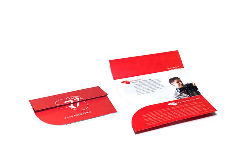
Source: alexball.deviantart.com/art/Studio-R7-Brochure-37963084
Example #2: The White House Project has taken a relatively subtle approach to their design in terms of logo inclusion, as it isn’t visible on the front cover at all.
Instead, the logo is located in the lower left-hand corner on the back of the leaflet (alongside the contact details), which ensures the information is there if needed; yet the brand isn’t unnecessarily plastered all over the leaflet.

Source: hyperakt.com/items/epic-awards-2011/
Re – Readability (Design)
You should always utilise a relatively large font size for all written content throughout your leaflet, as it’s important that your content is easy to read and digest by your target audience.
Using a large font size can also help draw attention to specific pieces of information throughout your design (e.g. headings, facts, quotes, etc.), and using a font size hierarchy (e.g. largest font for headings, second largest for subheadings, third largest for paragraph text, etc.) is always good practice to keep things highly readable.
Note: Never go lower than a 10pt font size, as this can often be difficult to read (perhaps even higher with some typefaces).
Example #1: Manage Your Day-to-Day was a leaflet created by 99u – a Behance project – and made use of large typography throughout, thus making for a highly readable design.
It also uses various font sizes to create a clear hierarchy throughout the design, with the main message (e.g. It’s not enough…etc.) receiving the largest font size (thus ensuring an eye-catching design), the title (“Manage your Day-to-Day”) receiving the second largest, and so on.
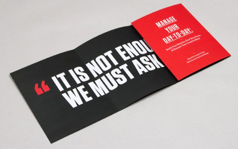
Source: 99u.com/book/manage-your-day-to-day-2
Example #2: This AIA leaflet is a prime example of typography that is likely a little too small (although this leaflet did double as a poster, so it works).
It’s relatively difficult to read and although the overall design is great, it would be much easier to read if the typography was slightly larger (and possibly not at such an odd angle).
Source: theryanford.deviantart.com/art/AIA-Brochure-Back-25825724
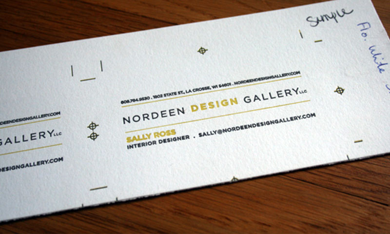
Fo - Font (Design)
Typically, you should use only 2-3 typefaces (maximum) throughout your design in order to keep things readable and consistent.
Using too many fonts simply serves to create a cluttered design and also dilutes the branding.
It’s also wise to stick to the same typefaces you use throughout your other branded marketing materials, and this will help keep things consistent and on-brand.
Example #1: F-Menard – an online retailer of pork meat – has opted to use only two typefaces here, which keeps the overall design extremely clean and on-brand.
The use of various font sizes, cases (i.e. uppercase/lowercase), and styling helps to create an informational hierarchy that helps to keep things organised and highly readable.
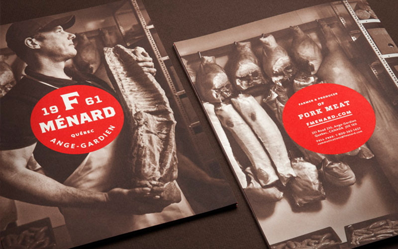
Source: lg2boutique.com/en/work/391/we-innovate-for-quality-a-family-tradition-branding
Example #2: The University of Arts (London) has used only one typeface on the front cover of their leaflet, but you’ll notice that they use various font sizes and weights to create an informational hierarchy.
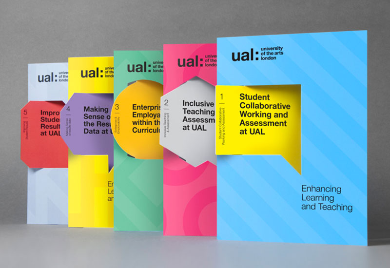
The headline (see He – Headline) is written in large, heavy (i.e. bold) type, whereas the subheading is written in a similarly large – yet much lighter – version of the same typeface.
Source: alphabeticalstudio.com/projects/#-ual-bestpractice
Wh – White Space (Design)
You should always use plenty of white space when designing your leaflet, as this helps create a clean, clutter-free, and highly readable design.
White space can also be useful for breaking up various sections of content, as well as any of the various different subtopics your leaflet may cover.
Note: If your leaflet has a different background colour (i.e. not white), then the colour of your background will be considered as “white space”.
Example #1: The University of Arts (London) uses plenty of whitespace here, which helps to break up the various sections of content.
You’ll notice that almost all of the text is placed on a white background, which improves the contrast between the text and background, thus making it easier to read.
The most important text is also written in a heavy font weight (i.e. bolded) to improve the contrast even further, and to draw attention to specific areas of content.
Source: alphabeticalstudio.com/projects/#-ual-bestpractice
Example #2: Nishma Healthcare has made use of a lot of white space in this leaflet, which helps to create a clean, clutter-free and minimalistic design.
It also helps to draw the readers’ attention to the high quality imagery (i.e. the tablets) and the written content. Orange is used to ensure the leaflet is kept on-brand (see Br – Branding).
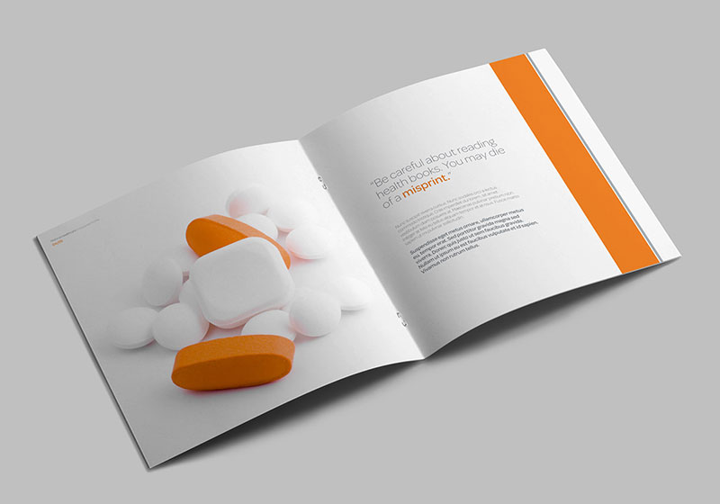
Source: behance.net/gallery/11386527/Medical-Healthcare-Profile-Brochure
Co – Colour (Design)
You can increase the chance of your leaflet getting noticed by utilising bright colours throughout your design.
Even if you keep things relatively dull or monotone on the actual pages of your leaflet, it typically pays to make use of bright colours for the cover, as this will help to ensure that your leaflet attracts the attention it deserves.
However, it’s important not to use too many bright colours (no more than 2-3 colours in total, aside from black and white) as this will simply lead to a cluttered, off-brand design.
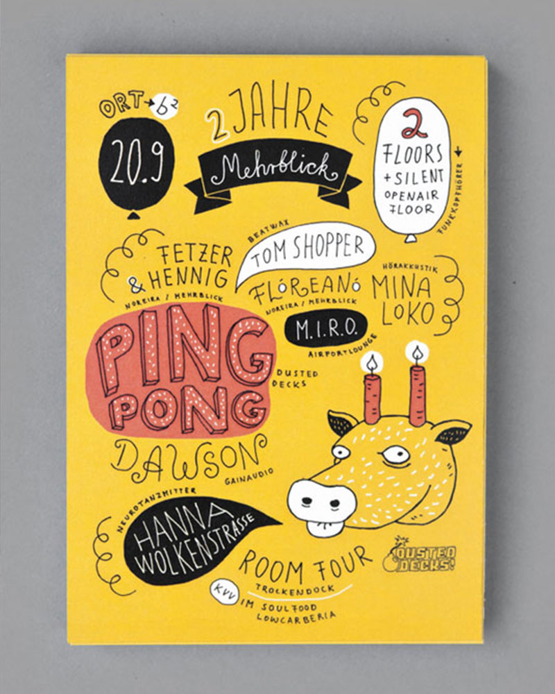
Example #1: Advertising a music festival in Germany, this leaflet makes use of bright colours (primarily yellow) to attract the attention of the intended audience.
You’ll notice that although this leaflet appears colourful and bright, it only makes use of a handful of colours (yellow, red, black and white), which helps to keep the design simple and consistent.
Source: alexandraturban.de/
Example #2: Ann Sacks has produced an exceptionally beautiful leaflet here that makes use of bright colours to stand out from the crowd.
You’ll notice that – once again – the leaflet only utilises a handful of colours (orange/yellow, black and grey), with only orange being a particularly bright colour.
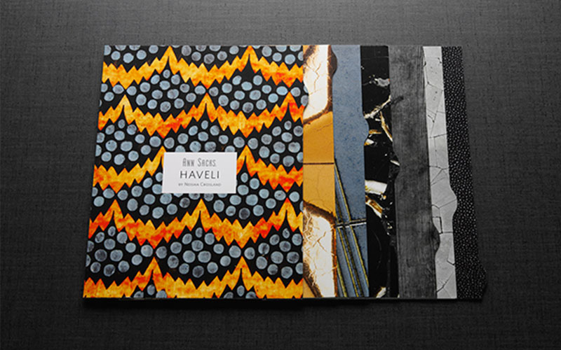
Source: behance.net/gallery/Ann-Sacks/5006279
Ii – Irrelevant Images (Design) – AVOID
You should never include images that are irrelevant to the subject nature of your leaflet.
If you can’t find images that fit in with the topic of your leaflet (or if you simply feel that including images/illustrations adds nothing to the overall design of your leaflet), then it’s usually best not to include them at all.
Many leaflets can still be eye-catching and hard-hitting without the use of images/illustrations.
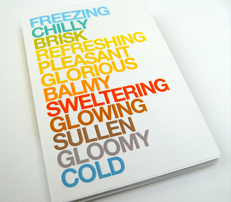
Example: Here’s a great example of how eye-catching and colourful a leaflet can be without using any form of imagery whatsoever.
It features nothing but text, yet the colours that have been chosen – along with large, uppercase typography – help to ensure that the leaflet attracts the attention it deserves (especially with the bright colours set against the plain white background).
Source: webneel.com/i/design/6-colorful-brochure-design/08-2013/d?n=8794
Sp – Spell Check (Pre-Print)
It’s important to check your design for spelling errors before sending your leaflet off to the printers, as unfortunately, spelling errors are common.
If designing your leaflet in Photoshop, Illustrator or a similar design application, chances are that spell check isn’t available (unlike in Microsoft Word and/or other word processing applications).
Because of this, spelling errors are rarely highlighted and are often missed, which can lead to extremely costly mistakes by choosing to bypass the spell checking process.
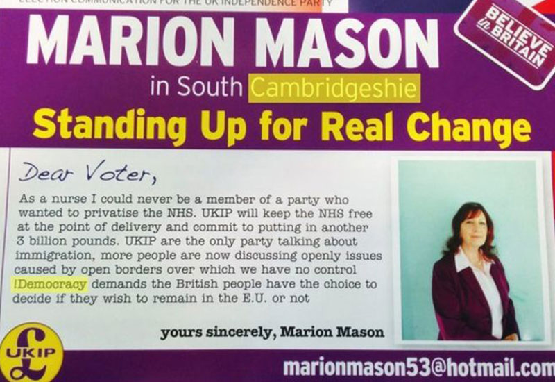
Example: UKIP – a political party in the UK – created this leaflet during a recent election campaign; it’s packed with spelling mistakes.
Source: bbc.co.uk/news/election-2015-england-32449663
Not only is the country spelled incorrectly (i.e. “Cambridgeshie” instead of “Cambridgeshire”), but there is also a grammatical error before the word, “Democracy” (i.e. a misaligned exclamation mark).
It might seem as though these errors would be almost impossible to miss (even without a thorough spell check), but unfortunately, blatant errors like this are more easily missed that you might imagine.
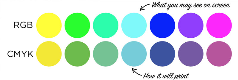
Cm – CMYK (Pre-Print)
You should always ensure that your design is in the CMYK colour format before sending to print, as almost all professional printers utilise a CMYK print system (as opposed to RGB).
It’s typically best practice to design your leaflet using the RGB colour mode (i.e. using Photoshop, Illustrator, or your application of choice), before converting to CMYK prior to print.
It should be noted that colours aren’t always reproduced accurately when converting from RGB to CMYK (especially the colour, black), so this is something to be aware of.
Note: We wrote a full, in-depth guide to CMYK vs. RGB: you can view it here.
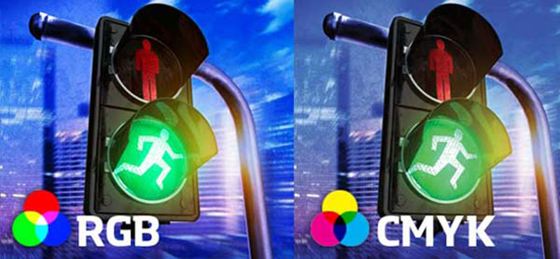
Example: You can see the differences in colour reproduction between RGB and CMYK here:
Source: fastprint.co.uk/blog/cmyk-vs-rgb-printing-what-is-the-difference-when-designing.html
Notice that the colours on the right (i.e. CMYK) are slightly less vivid when compared to the colours on the left (i.e. RGB).
Black is one of the most problematic colours when converting from RGB to CMYK, as it tends to be converted to a standard CMYK black (i.e. C – 0, M – 0, Y – 0, K – 100), which typically looks grey-ish when printed.
You can overcome this issue by converting to true black (i.e. C – 75, M – 68, Y – 67, K – 40); here’s
a guide on how to do this.
Pr – Proof (Pre-Print)
No matter how large/small your print run is likely to be, you should always order a printed proof prior to committing to (and paying for) the full print run.
A printed proof allows you to check that everything is replicated as intended on paper; there are often small visual discrepancies between the digital and printed version of a design (usually colour related). It also allows you to check readability and spelling.
It’ll cost a few pounds/dollars to order a printed proof; this may seem like an unnecessary and avoidable expense, but it can save hundreds (if not thousands) of pounds in the long run.
Example: Here’s an example of a printed proof; it’s essentially a one-off print of your design without trimming/folding applied (as this would be an unnecessary step).
Source: 13thirtyone.com/always-get-a-printed-proof/
When you receive your printed proof, you should check for correct colour reproduction against your digital design (especially when it comes to the colour, black), spelling errors, readability, and alignment (i.e. across multiple pages of your leaflet).
If everything looks good, you can go ahead with the full print run; if not, make sure to correct any errors before ordering another printed proof in order to double-check that your edits are correct.
Rg – RGB (Pre-Print) - AVOID
You should (almost) never send your leaflet to print without converting to CMYK, as any designs printed from an RGB file will often have inaccurate colour reproduction.
Converting to RGB is a simple process (and is laid out in our guide,
here), but you should always consult with your chosen printing company if you are still unsure (we’re always happy to help – give us a shout).
Example: Here’s a great example of how colour reproduction can vary between RGB and CMYK.
The colours you see along the top row are examples of colours you’re likely to see on your screen during the design process; along the bottom, you can see how said colours would look when printed by a professional printer (i.e. a company with CMYK-based printers).
Clearly, this is not ideal, as it means that the final printed result (i.e. leaflet) won’t look exactly as intended, as the colours will differ from the colours you saw on your screen.
Fl – Folding (Printing)
There are a variety of different folding styles available for your leaflet, and it’s important to consider which folding style will be most appropriate for your particular design.
Some of the many fold styles available include:
concertina; bi-fold; tri-fold; gatefold, and letterfold.
The most appropriate fold type will depend on a number of aspects, including: target audience (see Au – Audience), quantity of information to be included, order of content, and so forth.
Example #1: This leaflet – designed by MCA – gives a great example of how concertina-style leaflets should/could be used.
You’ll notice that the design of the leaflet has a certain pattern; there’s a large colourful image on one page, followed by a page of predominantly written information.
This makes for a simple, consistent and easily readable design.
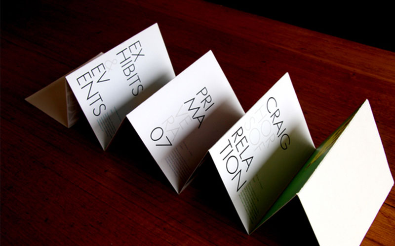
Source: behance.net/gallery/MCA-A5-Brochure-Design/209902
Example #2: Even if you opt for a simple tri-fold (or bi-fold) design, you can utilise various different shapes to add a unique style to your leaflet, much like this design created by “The White House Project”.
You can see that although this is predominantly a typical tri-fold design, there’s an additional half-page (i.e. triangular) fold that adds to the uniqueness of the leaflet; it also aligns with the existing branding.
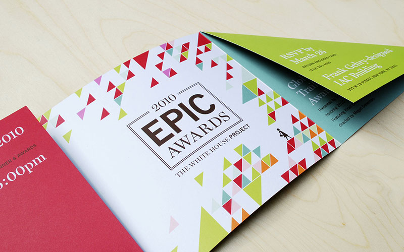
Source: hyperakt.com/items/epic-awards-2010/
Si – Size (Printing)
It’s extremely important to choose an appropriate size for your leaflet, but with so many sizes available, it can be a confusing process.
Available sizes include:
A4; A5; A6; DL; and many others.
While price is always going to be a concern during the sizing stage (larger sizes typically cost more as they require more ink and paper), you should always choose the most appropriate size for your leaflet based predominantly on the quantity of content you need to include.
However, layout is also a concern, so if your design would benefit from a lot of white space (see Wh – White Space), opting for a larger A5/A4 size may be the best option.
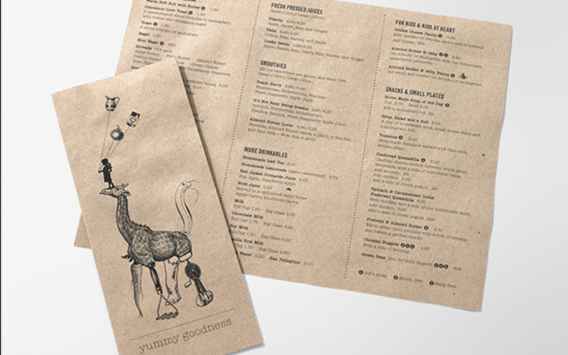
Example #1: Moomah have opted for a traditional tri-fold DL leaflet (i.e. A4 divided equally into three sections) as this best suits the layout of the overall design.
Each section of the leaflet is wide enough for a single column of information, which keeps the menu items highly readable.
Source: behance.net/gallery/Moomah/5232957
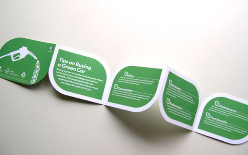
Example #2: Volkswagen has opted for a unique size here (i.e. sub-A5), which allows room for only a small amount of content/information on each section.
This is purposely done, as the leaflet gives bite-size pieces of information (i.e. quick “tips) on the topic of buying a green car.
Source: behance.net/Gallery/Volkswagen/132045
We – Weight (Printing)
The thickness of the material used for printing your leaflet makes a big difference to the finished product.
Typically, the thicker the material (i.e. the higher the weight), the more “premium” and “upmarket” the leaflet will look and feel; similarly, the thinner the material (i.e. the lower the weight), the cheaper and more mass-produced it will feel.
Most printing companies offer a range of material weights, usually ranging from around 100gsm to 300+gsm.
Example #1: It’s clear from the way this leaflet stands that it has been printed on extremely high-quality (i.e. high weight) material; it’s probably close to 300gsm.
Each page is extremely thick and the weight of the material is more akin to a high-grade card than paper.
Because of this, the leaflet looks and feels premium and high quality. Without even reading the leaflet, you would assume that it had been created by a well-known brand.
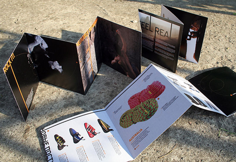
Source: behance.net/Gallery/Vertex_-Climbing-store_/191981
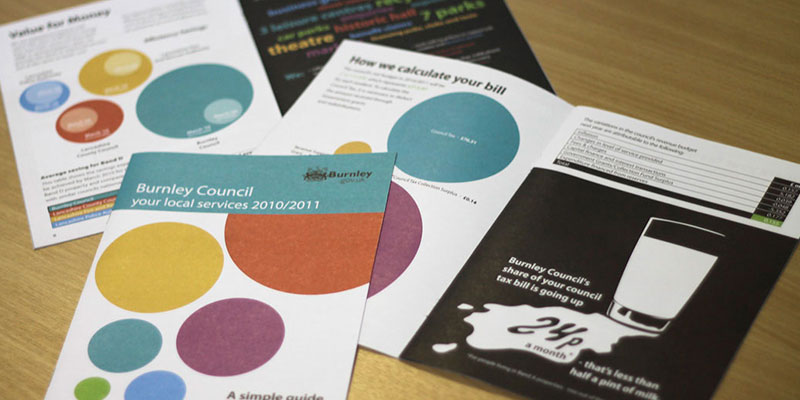
Example #2: Burnley Councils leaflet is clearly printed on a much thinner (i.e. lower weight) material when compared to the Vertex leaflet (above).
It looks much more like a low-grade paper (probably around the 135gsm mark).
Source: creative-council.net/work/design/council-tax-leaflet-2011/
Fi – Finish (Printing)
Similar to the weight of the material on which your leaflet is printed, the overall finish also makes a huge difference to the overall look and feel of the end product.
Most printing companies allow you to choose from either a “gloss” or “matt” finish. Gloss is typically somewhat shiny, whereas matt is much less shiny.
Most high-end brands opt for a matt finish, as it typically looks more “premium” when compared to a gloss finish; however, it’s down to personal preference more than anything.
Example #1: This leaflet – created by Vulture Labs – shows how a matt finish typically looks and feels.
You’ll notice that there’s virtually no shine to the leaflet; it also contributes significantly towards the minimalistic design and also gives the leaflet a “premium” look and feel.
Source: behance.net/gallery/Vulture-Labs/10246457
Example #2: Canon (a popular manufacturer of professional cameras) has opted for a glossy finish for this leaflet, which appears to be marketing the latest model of their EOS 500D digital SLR camera.
You’ll notice that there’s much more of a shine to this leaflet (compared to the Vulture Labs leaflet above).
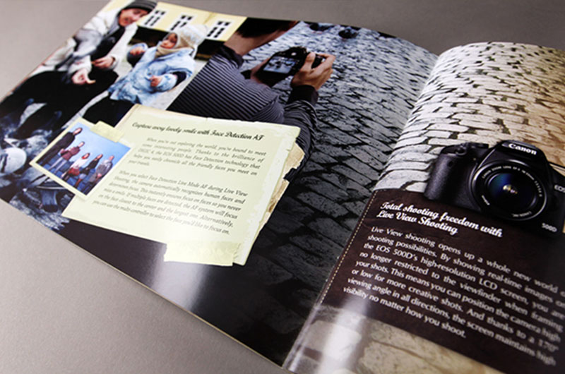
Source: behance.net/gallery/Canon-EOS-500D-Brochure/875710
Sh - Shape (Printing)
Most leaflets are a similar shape (i.e. rectangular, square, etc.)
However, it often pays to think outside the box here, as this can help you to stand out from the crowd and make more of an impact with your target audience (see Au – Audience).
While most printing companies typically offer a range of standard shapes (predominately various rectangular or square sizes), it’s usually possible to arrange a unique custom shape if you contact them directly.
Note: This will usually cost a little more, but the added expense is often well worth it considering the increased exposure.
Example #1: TVNZ7 created this exceptionally creative leaflet, which showcases just how far a bit of creative thinking can go when it comes to the shape of your leaflet.
When folded, it starts out as a simple triangular shape, but as the leaflet unfolds, the shape is transformed into a “number 7”.
Not only is this design extremely eye-catching, but it also fits in with the overall brand (i.e. TVNZ7).
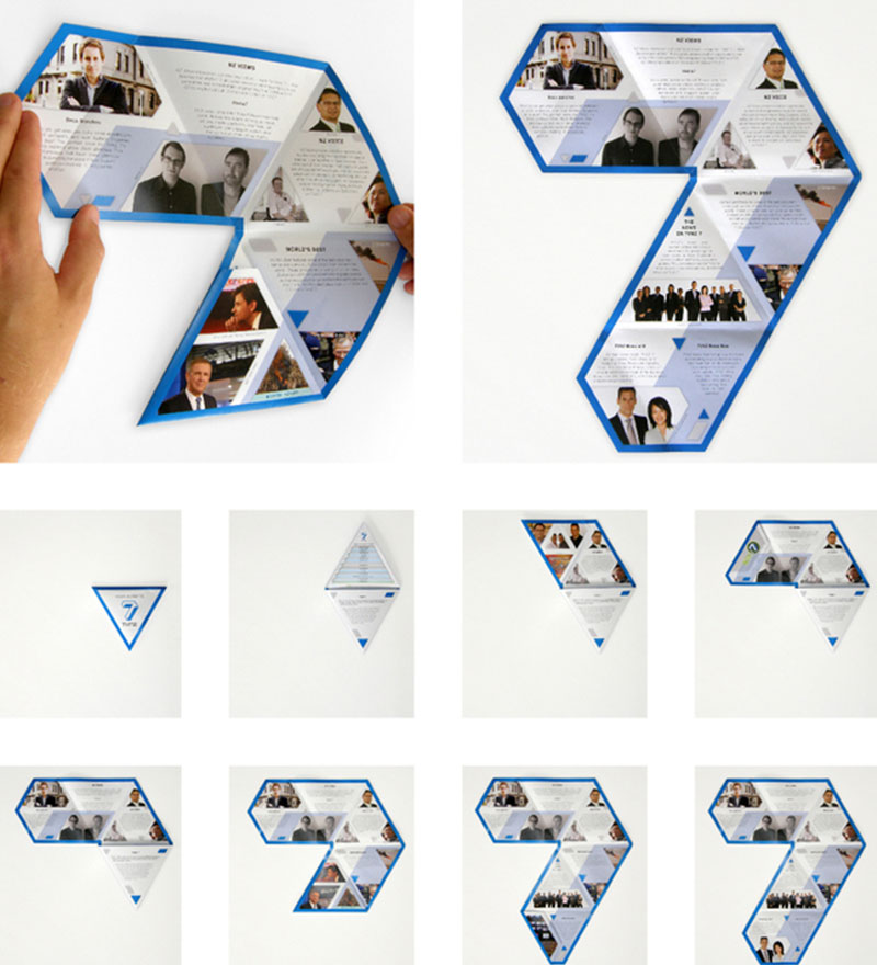
Source: behance.net/Gallery/TVNZ-7-TRIANGULAR-FOLDING-BROCHURE/314290
Example #2: Volkswagens leaflet shows that you don’t always have to think too far outside the box when it comes to creating a unique shape, as the shape of this leaflet is nothing more than a rounded rectangle.
Despite the simplicity, it works extremely well, especially considering the subject nature of the leaflet (i.e. green cars). The roundedness of the rectangle helps to illustrate the lower impact green cars’ have on the environment.
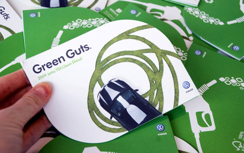
Source: behance.net/Gallery/Volkswagen/132045
Uv – Spot UV (Printing)
Utilising spot UV printing can add a unique and eye-catching aspect to your leaflet that will almost always help you to stand out from the crowd.
Spot UV printing is the process of strategically applying a UV coating to your design; it can be applied to a whole page, or only to certain areas (most common).
The UV coating essentially deepens the colour of the page (wherever it’s applied), allowing you to highlight and/or draw attention to certain parts of your leaflet in a subtle and classy manner.
Example #1: Here, The Kitchen has utilised spot UV printing to add a new dimension to the cover of their leaflet, allowing them to create additional written without the addition of another colour.
You can see that the highlighted areas (i.e. spot UV) deepen the natural black of the page, giving way to highlighted lettering.
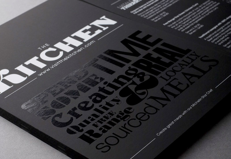
Source: flickr.com/photos/bobeightpop/3269276161/in/photostream/
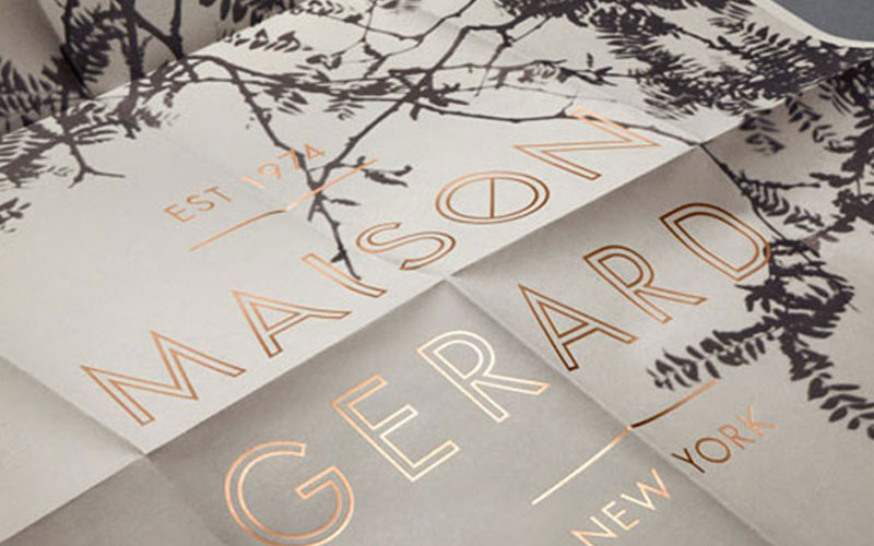
Example #2: Maison Gerard has utilised spot UV printing in a similar way to The Kitchen (above), but you’ll notice that they’ve also combined it with the addition of another colour (i.e. gold).
The end result is highlighted gold lettering, which really stands out from the page. It also gives the lettering a somewhat luxurious look and feel, which couldn’t be achieved with the addition of colour alone.
Source: printingdeals.org/design-ideas/business-cards/spot-gloss-printing.html
Ready to Order Your Leaflets?
Check out our
leaflets and folded leaflets.