When designing for print, there are a whole host of things you need to consider. You need to think about the design itself, the type of paper you're going to use, the best printing company for the job (we certainly hope you'll consider us!) and also, any costs associated with the project. Unfortunately, there is another thing you need to add to that list; colour modes.
If you're designing for the web, you don't really need to worry about colour modes as colours look pretty similar on all computer monitors (they're all capable of displaying a range of colours in the RGB colour mode). However, it's wrong to assume that when designing for print, the colours you see on the screen when creating your design (be it a business card, flyer, banner etc) will remain true-to-life when printed.
As one of the UK's leading printing companies who are privileged enough to regularly work with many great clients, we know how important it is to know the difference between RGB and CMYK colour modes and also, when you should/shouldn't be using them. As a designer, getting this wrong when creating a design intended for print will likely result in one unhappy client.
But what exactly does RGB and CMYK mean and when should you be using these various colour modes? Well, we don't want to see you make the common mistakes that most designers do so we've created a complete guide to the differences between RGB and CMYK below.
What Is The RGB Colour Mode?
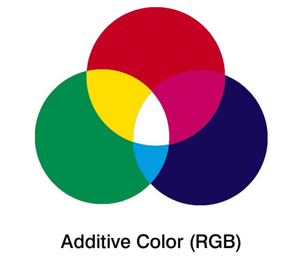
Source: DesignThePlanet.com
RGB stands for Red, Green and Blue. The RGB colour mode uses these base colours to form just about every other colour you can imagine as red, green and blue are additive colours. Essentially, this means that the RGB colour mode creates other colours by combining (or 'adding') different quantities of red, green and blue.
For example, if you wanted to create a yellow colour, you would simply combine green and red. If you wanted to create a light blue colour, you would add green and blue. Obviously, it's a little more complicated than this and modern-day printers know exactly how to combine these colours in varying amounts to ensure that you end up with the exact colour you want. This is the same for computer monitors too.
Source: PetaPixel.com
RGB is the colour mode that is usually associated with computer monitors and other displays. LCD/LED TV's use the RGB colour mode, and so do the old-fashioned CRT televisions. Most cameras and digital scanners also use RGB.
The reason that RGB is the standard colour mode throughout most applications is that it offers the widest selection of colours. By combining the primary colours (red, green and blue) in varying amounts, you can achieve any colour you like with great accuracy. Most photo-editing programs use RGB as standard (including Photoshop) which is why you need to be extra careful when designing for print (more on this later).
What Is The CMYK Colour Mode?
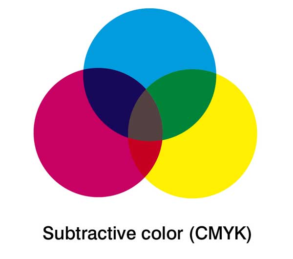
Source: PetaPixel.com
CMYK works in an entirely different way to RGB as instead of using 'additive' types of colour, it actually uses subtractive colours (i.e. Cyan, Magenta, Yellow and Key). Key is simply another name for black.
The main difference is this; when you combine all the colours of the RGB colour mode (red, green and blue) in varying amounts, you end up with the colour white (i.e. the most pure combination). With the CMYK colour mode, all of the colours are subtractive and therefore, the more colours you add together, the darker the colours are going to be.
For example, if you add magenta and yellow together (or more precisely subtract yellow from magenta), you end up with a bright red colour. If you were to subtract yellow and cyan, you would end up with the colour green.
Clearly, this works in an entirely different way to RGB as the colour combinations are essentially opposite. Plus, CMYK works with four colours rather than three.
The reason the CMYK process works is that as you add colours together, light is absorbed or removed to create various colours. For example, if you add cyan, magenta and yellow together, you end up with a dark brown colour. It's only when you add the 'key' colour (i.e. black) that the full amount of colour is completely removed from the image.
Source: LargeFormatReview.com
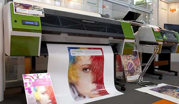
CMYK isn't used too often these days as many home printers are actually able to print using the full RGB spectrum. However, CMYK is still used by most professional printing companies so if you're looking to get something printed professionally, you need to be aware of this.
The Common Mistake
We've printed thousands of projects for hundreds of clients during our time in the printing industry and one of the most common mistakes we see is the lack of differentiation between RGB and CMYK.
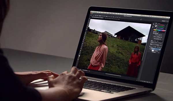
Many clients will create their designs (intended for print) in an application such as Photoshop which by default, uses the RGB colour mode. This is because Photoshop is mainly used for website design, image editing and various other forms of media that usually end up on a computer screen. Therefore, CMYK isn't used (at least not as default).
The problem here is that when an RGB design is printed using a CMYK printing process, the colours appear differently (if not properly converted). This means that although a design might look absolutely perfect when the client views it in Photoshop on their computer monitor, there will often be quite distinct differences in colour between the on-screen version and the printed version.
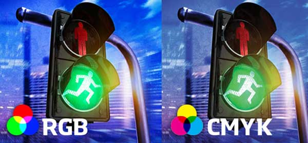
Source: ZevenDesign.com
If you take a look at the image above, you'll start to see how RGB and CMYK can differ. One of the most noticeable differences between the two colours modes is the way that they present the colour blue. You'll notice that on the image above, the main blue colour looks different on each image, this is due to the colour mode.
Typically, blue will look slightly more vibrant when presented in RGB compared with CMYK. This means that if you create your design in RGB and print it in CMYK (remember, most professional printers use CMYK), you'll probably see a beautiful bright blue colour on the screen but on the printed version, it will appear like a purple-ish blue.
The same is true for greens, they tend to look a little flat when converted to CMYK from RGB. Bright greens are the worst for this, duller/darker greens aren't usually as bad.
So Should You Use RGB Or CMYK When Designing?
This is the question that we get asked a lot and truthfully, it depends upon what you're designing and it's intended use (i.e. print or digital). If you're designing for digital mediums, you'll pretty much always want to use the RGB colour mode. If you're designing for print however, there are times when you will want to use the CMYK colour mode.
Most of the time though, you should simply work in RGB and convert your project to CMYK near the end of the design just before you send it off to the printing company. By doing this, you'll be able to create your design with the full RGB spectrum which will give you a lot more freedom colour-wise.

Source: Trashness.com
However, there are times when you should embark upon the entire design process using the CMYK colour mode. If your design is largely 'grey' in colour (not entirely but largely), you might want to consider designing in CMYK. The reason for this is that in RGB, grey is created using red, green and blue (in mostly equal quantities). In CMYK on the other hand, it will be printed using cyan, yellow and magenta.
During the printing process, grey is one of the hardest colours to properly control. Using the RGB colour mode will often result in the printed version of the image looking rather pink. However, with the CMYK process, you have the 'key' colour (black) which can be used to control the process and ensure that grey is printed as it should be.
How To Colour Correct For Print
Source: N/A
In some cases, you don't need to convert from RGB to CMYK for the printing process, it all depends on the complexity of your design and the colours you're using. Clearly, if you're using a lot of grey or black, you're going to want to convert to CMYK for print. But how exactly do you do this?
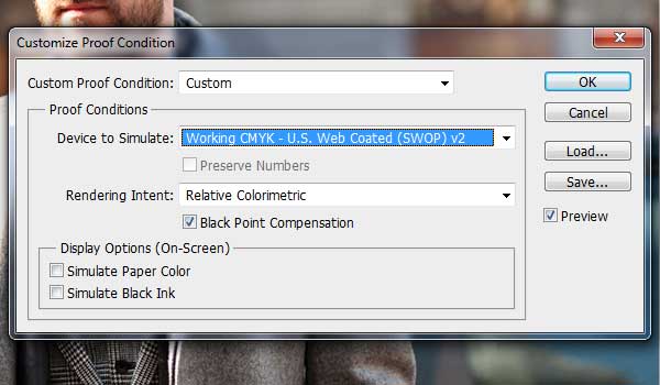
If you're using Photoshop, it's pretty straightforward. If you navigate to the 'View' menu, then choose the 'Proof Colours' option, Photoshop will show you what the design is likely to look like when it's been converted to CMYK. For most designs, you'll probably notice a few differences in colours, particularly between blue and green.
If you notice that the blues are looking a little different, the best thing to do is to use a 'Selective Colour' adjustment layer. When you do this, you can remove some of the magenta and replace it for extra cyan and black. This will help to stop blues turning purple during the printing process.
If you notice that your greens are appearing slightly different, use another 'Selective Colour' adjustment layer but this time, remove a little cyan and replace it for a little yellow. When doing this, you should notice the greens return to normal.
What Application Should You Use To Design For Print?
Source: N/A
Perhaps the most common and most widely used design application for both print and the web is Adobe Photoshop. As we mentioned earlier, Photoshop uses the RGB colour mode as default, but it does have a lot of options for converting to CMYK and previewing how your design will look when printed using the CMYK process.
However, Photoshop documents are usually created in a raster format, which means that although the images might look crisp and clear when printed on a small flyer, they don't always look that great when printed on a large billboard (depending on the resolution of your images of course).
Source: N/A
Adobe Illustrator can often be a better alternative when designing for print as it is a vector-based graphics editor (see our post on raster vs. vector images for more information). This essentially means that images created within the application will scale much better. This makes them perfect for use on billboards or other large-scale media that will often see raster images getting pixelated.
What's more, Adobe Illustrator defaults to the CMYK colour mode, which means that any designs created in the application will be perfect for sending to a professional printing company without any colour correction at all (in most cases).
As a result, Adobe Photoshop is often the application of choice for digital media whereas Illustrator is often used for printed media. Of course, there are other applications to choose from too.
Conclusion
Essentially, designing for print is quite straightforward. So long as you're aware of the differences between RGB and CMYK along with the potential colour variations between on-screen media and printed media when RGB designs are printed in CMYK, you'll be able to ensure that you take the necessary steps to avoid catastrophe.
If you've created your designs in the RGB colour mode, you need to remember to convert the design to CMYK before sending it off to print. You may also need to colour correct the design manually by adjusting the cyan, magenta, yellow and key colour variations.
If you prefer to design in CMYK and intend to use your design for large printed media (e.g. billboards), Adobe Illustrator or a similar vector-based application might be the best option.
Either way, it's always wise to run your designs past your printing company before committing to a full-print run. Most printing companies will be happy to give design advice and although many charge a small fee for the service, it can save you hundreds (or perhaps even thousands) of pounds in wasted printing costs.