If you've been given the task of creating a poster (either for yourself or for a client), you might have very little clue where to begin. It's easy to assume that designing a great poster will be no different to designing a business card or leaflet but in most cases, this couldn't be farther from the truth.
Even if you're an experienced designer, creating a great poster can be a mammoth task and if you don't have any prior experience with posters, it can be seriously tricky to know where to start. What's more, demanding clients with increasingly tight budgets (usually with hugely-optimistic deadlines to match) certainly don't make your job any easier.
The biggest problem is that most designers simply assume that a poster has to be 'pretty' and nothing else. This is a fatal error. There are actually a number of factors you'll need to consider when designing a poster and to be brutally honest, a lot of designers don't take half of these into consideration.
Even once you've got past the design stage, there's still the highly complex issue of actually printing your poster(s). It's here that even the greatest of designers start to get confused.
We're fortunate enough to work with a great team of talented designers here at FastPrint.co.uk who are well-versed in the art of poster design and print (they have years of experience!). So, we consulted with them and compiled all of their expertise into one of our infamous guides to help you guys through the entire process, all the way from design to print. Here it is:
#1 - Know The Aim + Demographic Of Your Poster
Source: Sebdesign.deviantart.com
As a designer, it's easy to view each new project as 'just another design job' when you're commissioned by a client but you need to remember, every design always has a purpose/aim.
The aim of any poster is essentially to communicate a desired message to a particular group of people. It has to inform its target audience about a movie, event, product launch, campaign or whatever it may be. It also has to do this in the most simplistic and visually enticing way possible (that's where your expertise as a designer comes in).
It's easy to get 'carried away' when designing a poster and without a clear and definite plan, things can get out of hand. Therefore, the first thing you need to do is figure out the aim of your poster and understand the target demographic. Ask yourself these questions:
·What is the desired message?
·Who is the target audience?
·What information MUST the poster give?
·What is the overall aim of the poster?
By deciding this early-on, you'll be able to eliminate the possibility of a cluttered design packed with pointless information/words. You'll also start to understand how to communicate effectively with the intended audience.
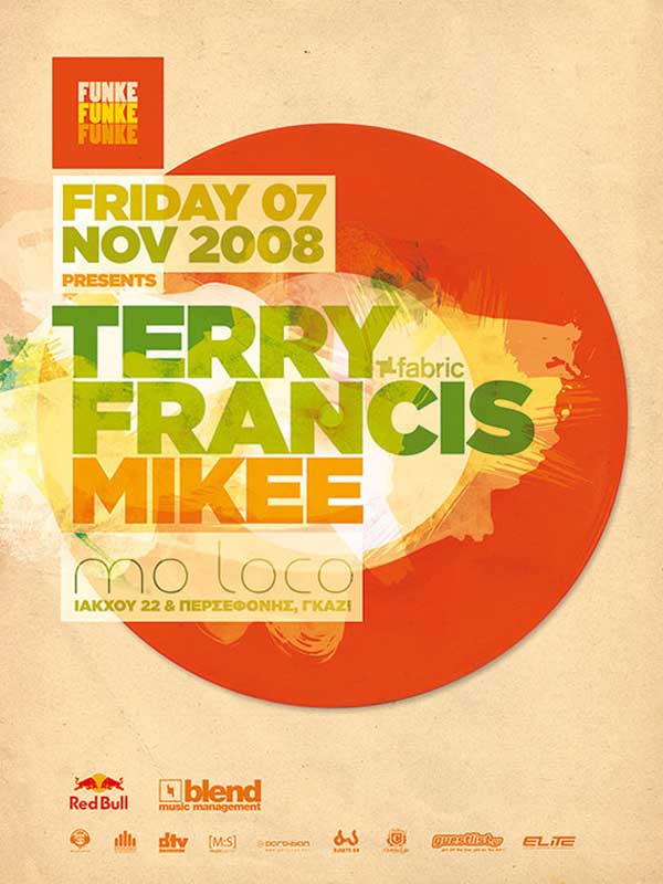
Take the poster above for example. It has a clear message (to inform viewers about an event) and it's vibrant colour scheme combined with modern sans-serif typography targets the intended demographic (a young and energetic crowd). It also includes only the required information and nothing else.
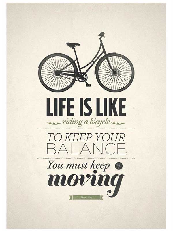
#2 - Find A Focus Point
Source: Flickr.com
Every poster should be designed around a main focus point and that focus point should help to communicate the message/idea behind your poster in a visual manner.
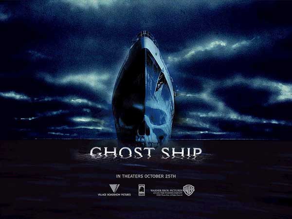
If you take a look at the Ghost Ship poster above for example, you'll start to see how this works. The 'ghost' shop is the main focus point of the poster and cleverly, it manages to communicate the bulk of the posters message in a visual format (i.e. the nature/subject of the movie). The 'ghost ship' image ( the ship combined with the skull) tells the audience what the movie is about, without them even having to read a single word.

Source: Behance.net
Similarly, this poster promoting 'Life', a programme by the Discovery Channel, also has a clear focus point. In this case, it's the central image of various species of animal which depicts a clear image of 'life'.
Whatever the subject matter of your poster, it always helps to create your design around a single focus point such as this.
#3 - Make It Eye-Catching
Source: Gmcdonalddesigns.blogspot.co.uk
Posters are usually used to catch the attention of passers-by and to communicate a desired message. The thing is, it doesn't matter how great your message is, if your poster doesn't catch the eye of your target demographic in the first place, it's rendered pretty useless.
Obviously, a clear focus point and a simplistic design are both attributes of an eye-catching design but there are other factors too.
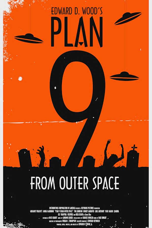
Contrasting colours and bold typography can also help to create an extremely eye-catching poster (as is demonstrated by the Plan 9 poster above). The orange and black complement each other yet also contrast to create a visually enticing design. You'll also notice the use of large bold typography which further helps to grab the attention of the target demographic. The number '9' is used as a focus point to some extent.
You should also take into account the hierarchy of the design. Essentially, this is just a fancy word for ensuring that the most important point features most prominently in the design, followed by the second most important point and so forth. Sizing variations, colours and typography can be used to achieve this.
Source: Makesigns.com
If you take a look at the poster above, you'll see how not to create an eye-catching poster. Unnecessary information, poor colour choices and a cluttered design all combine to create a poster that quite frankly is difficult to read and is far from the most visually appealing (or professional) design.
#4 - Pay Attention To Detail And Consistency
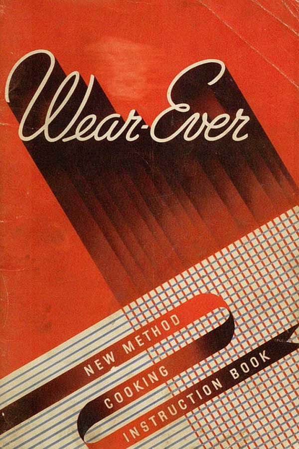
Source: Artdecoblog.tumblr.com
Attention to detail (and consistency) is an important part of any design, but perhaps even more so with large printed materials such as posters.
When printed, posters are usually pretty large and thus, any inconsistencies and/or lack of detail are easily spotted. You need to be crafting pixel perfect poster designs or you're likely going to have a pretty unhappy client.
To keep things consistent, you should use a limited colour palette (no more than 2 - 4 colours ideally), keep a consistent style throughout the design (e.g. masculine or feminine) and also, use consistent shapes and/or typography. If you look at the 'wear-ever' poster above, you'll notice how it incorporates all of these factors.
Similarly, you need to pay attention to detail. This means ensuring pixel perfect font spacing, borders and font sizes throughout your design.

Source: Soapybubblesha.files.wordpress.com
The poster above is an example of an inconsistent, cluttered and detail-lacking design. There are too many (non-complimentary fonts) being used, too many colours and too many shapes/objects. The font styles are also inconsistent.
You'll also notice that the poster doesn't really have any kind of focus point and thus, the design struggles to appear eye-catching.
#5 - Utilise Multiple Fonts
Source: Weandthecolor.com
Typography is one of the most difficult aspects of design in our opinion and it probably comes as no surprise that so many designers get it completely wrong.
It's for this reason that a lot of designers tend to play it safe and rather than incorporate multiple typefaces into a design, they opt for just one (or perhaps two if they're feeling adventurous).
Truthfully, there's nothing really wrong with using just one or two typefaces as it can often help to create a consistent design but if you know what you're doing, using multiple typefaces can really bring a design to life. It's also especially great for posters.
You can see evidence of this in the poster design above. It looks as though there are five or six different typefaces used in this design and theoretically, it probably shouldn't work. Clearly however, it does work and we're sure you'll agree, it adds a whole new dimension to the design.
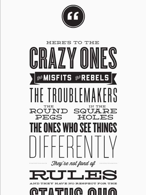
Source: Designyoutrust.com
Here's another good example of a poster which uses multiple typefaces (click the link above for the full image). Any Steve Jobs fans out there will likely recognise the quote and as you can see, the multiple typefaces work brilliantly together.
It's not always easy to pull-off but as a poster designer (or aspiring poster design), you should be willing to experiment with typography.
#6 - Take Regular Breaks

Source: Graphicdesignersalaryguide.net
It doesn't matter whether you're designing a business card, flyer, leaflet or in this case a poster, it's important to take regular breaks from the design process.
It's pretty easy to grow accustomed to the design you're working on and after countless hours slaving away in front of your computer screen, it gets increasingly difficult to differentiate a poor design from a great design.
By taking regular breaks, you'll be able to give your mind chance to rest and often you'll find that when you return, you'll see your design in an entirely different light.
It almost always pays to turn off your computer and completely neglect your poster design for a day or two (yes, that means not even a quick glance). A fresh pair of eyes can work wonders when you're trying to perfect the poster design for that all-important client.
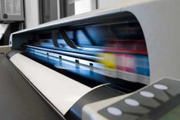
How To Print Your Poster
Source: Inktechnologies.com
Although we've tackled the poster design process above, there is still a lot to think about when it comes to actually printing your poster. Even if you have the most perfect design on the planet, you could still end up with a low-quality printed product if you don't prepare properly for the printing process.
It's this process of converting digital designs into real-world printed products that stumps most designers, as it can be a highly complex process when compared with simply designing for the web. Without proper preparation, you could end up with a seriously unhappy client and could see thousands of pounds going 'down the drain'.
So, if you're planning on opting for a print run for your poster design, make sure to follow the steps below. You'll soon know exactly what to do.
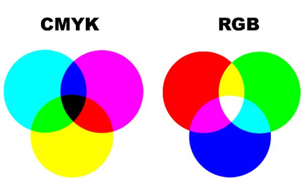
#1 - CMYK Vs. RGB
Source: Discountprinting.com.au
If you're planning on creating your poster design with the intention of having it professionally printed, then it may pay to work in the CMYK colour mode rather than RGB throughout the design process.
The reason for this is that most professional printing companies use the CMYK colour mode rather than RGB. If you send your poster design to the printing company in the RGB colour format, it's likely that at least some of the colours within your design will not be reproduced properly during the printing process, leaving you with unexpected and unintentional results.
Note: You can read a full explanation of the differences between CMYK vs. RGB here.
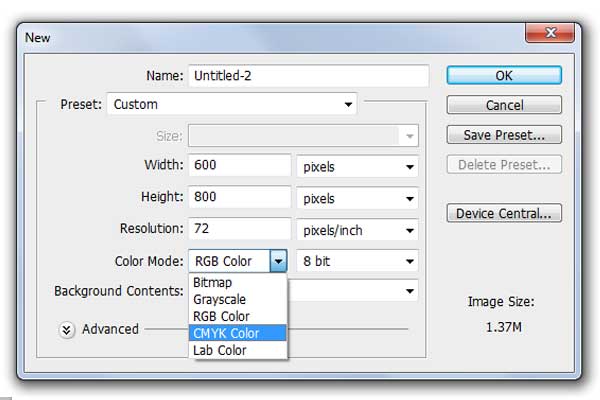
Adobe Photoshop
Source: N/A
If you're using Photoshop, you can setup your initial project to use the CMYK colour profile by changing the colour mode using the drop-down menu on the 'New' project window (pictured above).
Source: N/A
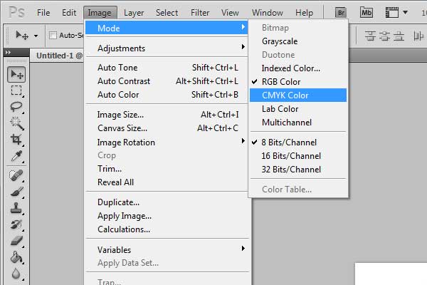
If you prefer to create your design in RGB and convert to CMYK at the end of the design process (recommended for most designs) you can switch to CMYK by navigating to the 'Image' menu, then 'Mode' and then 'CMYK colour'.
If you prefer, you can also navigate to 'Edit', then 'Convert to Profile'; this method allows you a lot more control over your project and also allows you to see a preview of the converted colour mode too.
Adobe Illustrator
If you're using Adobe Illustrator, the process is exactly the same when setting up a project in the CMYK colour mode initially, as it can be changed using the drop-down on the 'New' project window.
Source: N/A
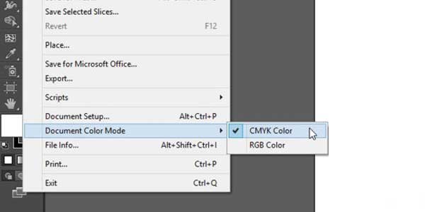
To convert your design to CMYK in Illustrator (if you've been working in RGB), navigate to 'File', then 'Document Colour Mode' and check the 'CMYK colour' box (pictured above).
Adobe InDesign
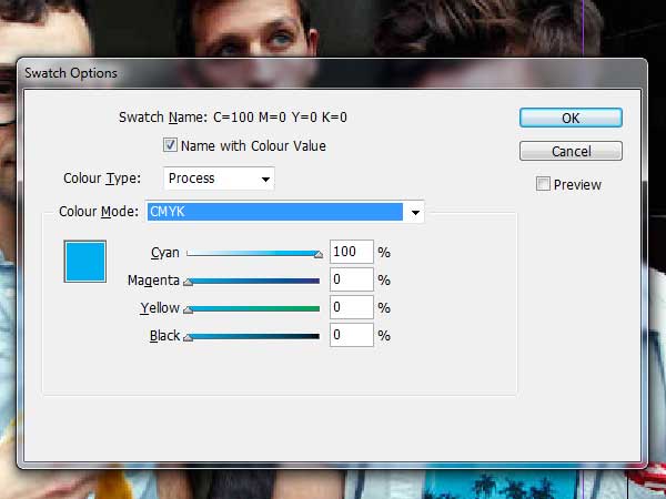
In Adobe InDesign, CMYK is the default colour mode so by default, your designs will be created in CMYK. To double-check your design is using CMYK, navigate to the 'Window' menu and ensure that there is a tick beside the 'Colour' item. If not, click the 'Colour' menu item to open the Colour panel.
In here, you should see values such as 'C=100, Y=76, Y=20, B=30'. If you don't see these but instead, you see RGB values, you're working with images in RGB rather than CMYK.
Source: N/A
To convert to CMYK, click the 'Window' menu, then 'Swatches'. When the 'Swatches' panel is open, you'll need to double-click any swatch that isn't currently using the CMYK colour mode. Click the 'Process' button and when the 'Colour Type' menu appears, select 'CMYK' and click 'OK'. Simply do this for every swatch that doesn't use CMYK (pictured above).
Any JPEG's or images used within InDesign should ideally be converted to a CMYK colour mode in Photoshop prior to use within Adobe InDesign (see above instructions on how to do this).
During the conversion process, you might notice that some of the colours within your poster design become rather lifeless and/or dull (particularly greens, blues and blacks). If this is the case, you may need to perform a few colour corrections before sending your design off for print. Again, you can view more about colour correction when converting from RGB to CMYK here.
To learn more about setting up posters for print, check out our full in-depth guides for Adobe Photoshop, Illustrator and InDesign where we cover everything you need to know including colour modes, typography and much more.
#2 - Set The Correct Size + Resolution
Source: N/A
One of the most common mistakes designers make when sending posters off for print is the resolution of the print file.
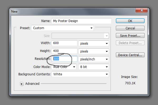
All files that are intended for print (including posters) should be set to a minimum resolution of 300DPI (Dots Per Inch). Anything below 300DPI is likely to result in a rather blurry or low quality end-product as quite simply, the more 'dots' the image is made-up of, the higher quality the reproduction will be (think megapixels in a camera).
If you're using Photoshop, you can change the DPI of the document by navigating to 'File', 'New' and then entering '300' in the 'Resolution' box (as pictured above).
There have been countless times where we've had to send a file back to the designer simply because of a low-resolution print file, so make sure to double-check this before sending your poster off for print.
Using a DPI of 300 will make your file size significantly larger, so if your file is extremely small, that's usually a tell-tale sign that you've created your design using a lower resolution instead of the required 300DPI.
Source: Architectkata.blogspot.co.uk
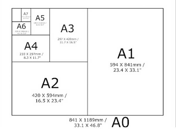
You also need to ensure that your poster is sent to the printer in the correct size. Most printing companies print posters in A4, A3, A2 and sometimes even A1/A0, so make sure you get the dimensions right.
You can use this website to check the dimensions for various paper sizes.
#3 - Add Bleed + Trim
Source: Copycraft.com
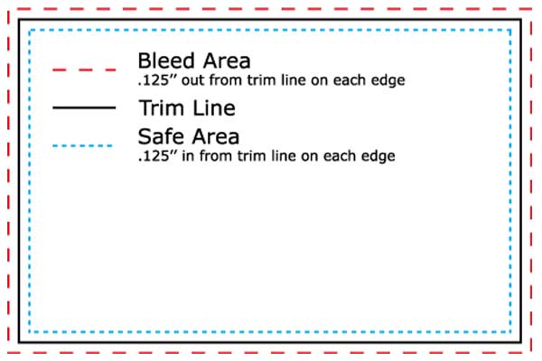
As well as getting the measurements correct for your poster, you also need to consider bleed and trim.
Bleed and trim are required for almost every print run, whether it be a poster, business card, banner or flyer etc. The diagram above shows a good visual example of how both bleed and trim work (and why it's required), but we've included a brief explanation below too:
Trim: The trim line acts as the edge of the final printed product. When you're designing your poster, all information should be kept well within the trim line to ensure that it isn't accidentally cut-off during the printing process.
It's generally recommended that you leave a minimum 1/8th inch breathing space within the trim line.
Bleed: Essentially, bleed is a few extra millimetres outside of the trim line and gives you a little extra 'room for error'.
Although the final printed product will trimmed at the trim line, this isn't always accurate to the millimetre. Therefore, the bleed area ensures that even if the trimming process isn't 100% accurate, you're not left with an ugly white line around the edge of your poster.
Trim and bleed areas vary depending on the printing company you're working with, so it always pays to ask how large the bleed/trim areas should be beforehand. Many printing companies offer templates to use in Photoshop or InDesign too.
#4 - Spellcheck + Font Check
Source: Solopress.com
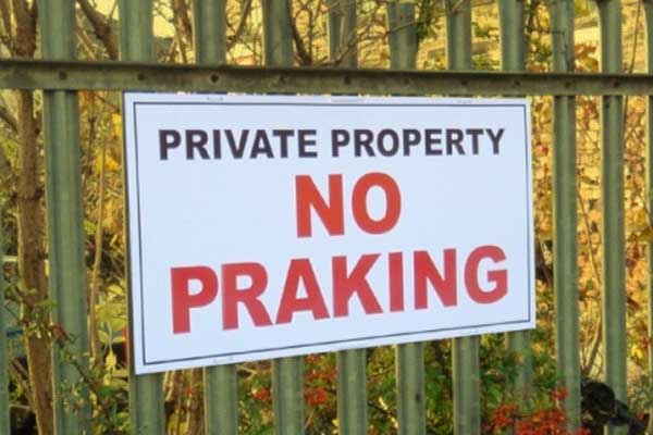
Poster printing isn't a particularly low-cost process and there's nothing more soul-destroying than a small error ruining the entire print run. This is why it's extremely important to spell-check your poster and also, ensure that you're using embedded fonts.
Spelling mistakes can be easy to miss, especially as Photoshop and InDesign don't usually highlight spelling mistakes (unlike Microsoft Word). If you look at the sign above for example, it might take you a few seconds to realise the fairly obvious spelling mistake.
The best thing to do here is to get multiple people to spell-check your poster before sending it to the printing company. If possible, you can also copy/paste your posters text into Microsoft Word as that will highlight any obvious mistakes.
You also need to ensure that you've included any font(s) your design utilises within your print file. This is especially important if you're using custom fonts that only you have on your computer (as they'll default to other fonts if not included).
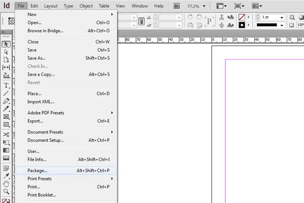
Adobe InDesign
Source: N/A
In Adobe InDesign, you can do this using the 'Package' function. This packs up your print file and any required links into one folder which can then be sent to your printing company. You can do this by navigating to 'File' then 'Package' (as shown in the image above).
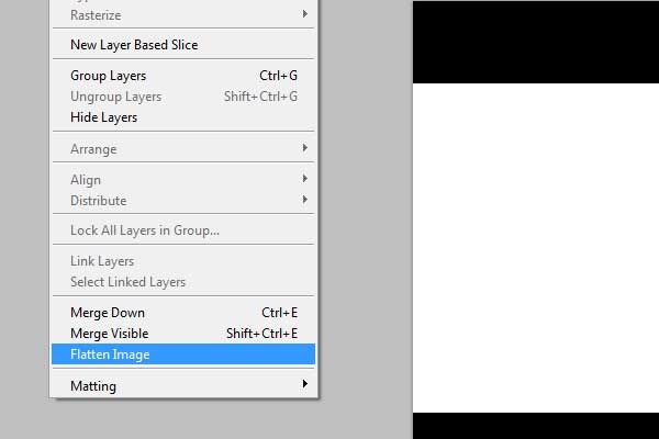
Adobe Photoshop
Source: N/A
In Photoshop, you'll need to use the 'Flatten' function. To do this, simply navigate to the 'Layer' menu and select 'Flatten Image' (pictured above). This will flatten all of the elements/layers of your project into one flat image.
You can also navigate to 'Layer', then 'Type' and select 'Convert to Shape'. This will convert your text to a shape which will ensure that exported files (e.g. PDF's) don't have to worry about actual fonts. It also keeps the text in a vector format so scaling is still possible without quality loss.
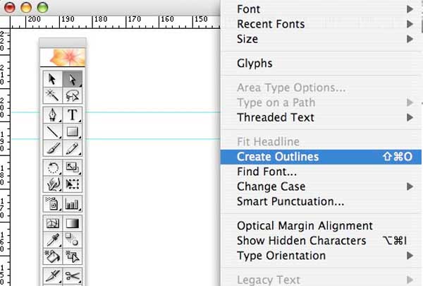
Adobe Illustrator
Source: N/A
In Adobe Illustrator, you need to use the 'Outlines' option. To do this, select only your font, right-click and select 'Create Outlines'. You can also access this option by navigating to the 'Type' menu then selecting 'Create Outlines' (pictured above). Make sure to save the file after you've done this.
#5 - Supply Your File In The Right Format

Source: N/A
We've rejected poster design files countless times due to file format they were submitted in, so it always pays to ensure that you're submitting your file in the preferred file format for your chosen printing company.
This preferred file format can vary between printing companies but usually, files will need to be submitted in either a PDF or TIFF format. If you're submitting your poster design as a PDF file, you'll need to ensure that the print resolution is set to 300DPI and if you're submitting it as a TIFF file, you need to make sure not to compress the file at all (meaning that the DPI remains at 300).
It is sometimes possible to submit files as PSD's or even JPEG's but you should check this with your chosen printing company if you're looking to utilise one of these file types.
Note: We personally would never recommend JPEG files for a poster design as JPEG's often lose quality and the colour reproduction will suffer for most projects.
#6 - Digital Vs. Lithographic Printing
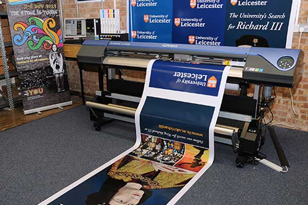
Source: www2.le.ac.uk
There are two options when it comes to printing your poster design; digital or lithographic printing.
Digital printing works much like your home printer; a computer controls the flow of ink from an inkjet to form the completed image on paper. Lithographic printing on the other hand utilises a series of 'plates' that are pressed to a piece of paper in order to create the image in layers. These 'plates' are custom made for each print job.
Lithographic printing is the best option if you're looking to create a poster in a large format (e.g. A1) and/or if you're planning a large print run. This is because lithographic printing will typically offer a slightly higher quality print/finish than the digital printing process. However, lithographic printing is much more expensive.
Digital printing is the best option for most print projects as it's relatively low-cost and the finished product is still very high quality. It is the perfect option if you're on a relatively tight budget or if you're only printing a small run of posters. It's also usually the best option for smaller posters (i.e. A3 or smaller).
Conclusion
It might seem like a complicated process at first glance but we can assure you, once you've designed and printed a poster a couple of times, the process gets a lot simpler.
One last thing to note is the choice of printing company for the job. Even if you've optimised your design perfectly following all of the steps above, your design could still suffer if left in the hands of an inexperienced or low-quality printing company.
Make sure to shop around and check online reviews before committing to a print-run and handing over cash. If possible, opt for a printing company with a significant amount of expertise in poster printing.
If you haven't done so already, don't forget to check out our full in-depth guides for setting up a poster for print in Adobe Photoshop, Illustrator and InDesign.