Google Fonts contains hundreds of free, open-source fonts and although they're primarily optimised for the web, they're equally great for use in print projects.
While many of the fonts aren't the most visually attractive (honestly, you'd probably be better off using Comic Sans in some cases!), there are some absolute gems and in particular, some of the more popular additions are exceptionally well designed. When used correctly, these fonts can breathe a whole new lease of life into a previously dull and uninspiring project.
For most designers, spotting a great font that is perfectly suited to a particular project is easily done; the difficulty lies in combining multiple typefaces that look great alongside each other. This can also be an extremely time-consuming process and when you're charging clients by the hour, it's time you simply can't afford to lose.
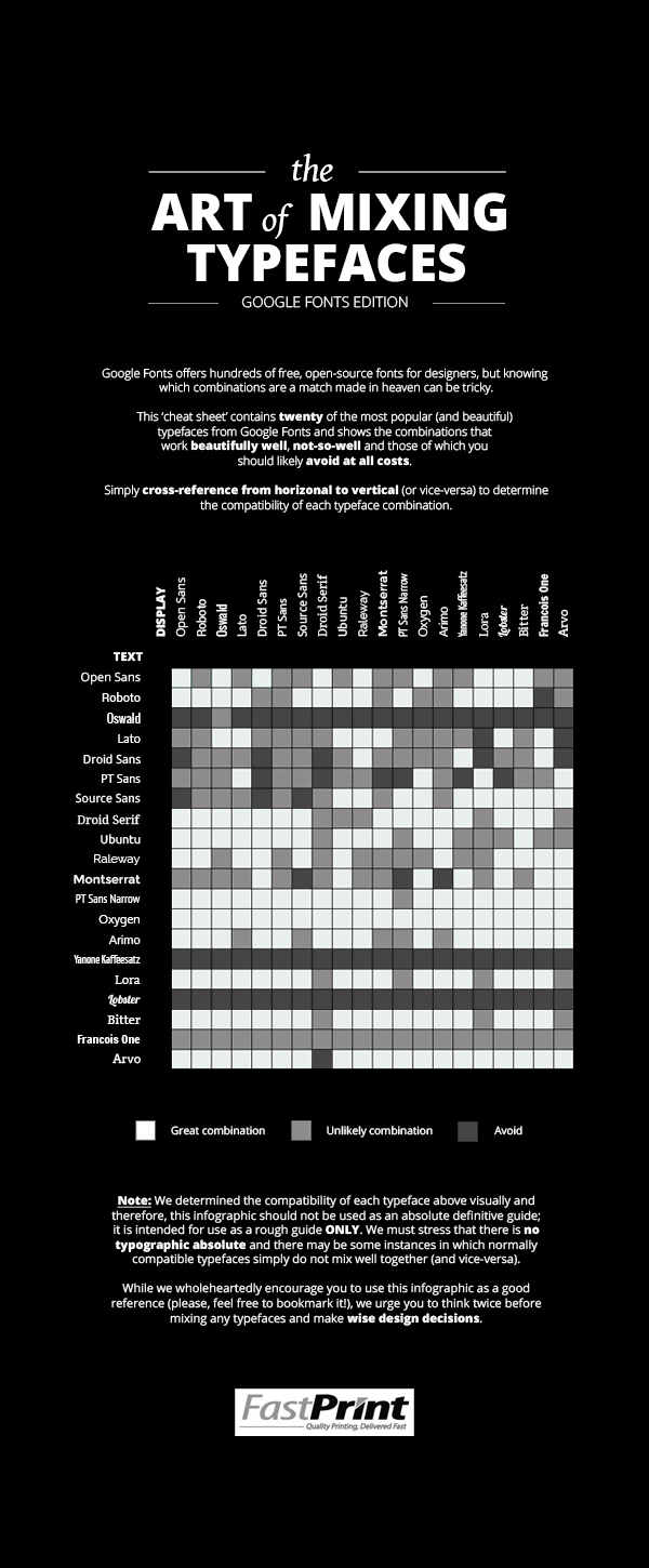
To help solve this problem, Fastprint created a typography 'cheat sheet' for Google Fonts, presented in an infographic format below. It contains twenty of the most popular typefaces from Google Fonts cross-referenced to decipher which typeface combinations work well, not so well or not at all. There are 400 unique typeface combinations in total.
Using the infographic is as simple as cross-referencing from horizontal to vertical (or vice-versa) to determine the compatibility of each unique typeface combination.
Note: We originally drew inspiration for our infographic from this handout created by the International Journal of Typography in 1992.--
