Business cards are utilised by just about every company on the planet and if you've ever been to a business networking event, it's likely that you'll have been handed a good few dozen business cards by various companies. I've done this a few times and each time, I look at the business cards I receive, often thinking about the first impression that I receive of the company as a result of obtaining that business card. A lot of the time, the first impression is a good one. However, there are always some business cards that seem to be poorly designed and cluttered. I always think that if a business can't even manage to create a great business card design, what hope do they have of doing anything else?
The problem is that a lot of businesses simply don't care about their business cards and therefore, don't put enough time and effort into creating them. However, it's Our belief at fastprint that your business cards are one of the most important marketing materials that your business will utilise, so it needs to be simple, to-the-point and most of all, eye-catching.
To give you a bit of inspiration for your business cards, We've rounded up a few of my all-time favourite beautiful, yet minimalistic business card designs.
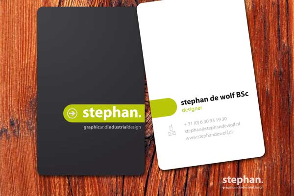
#1 - Stephan De Wolf
Source: deviantart.com/art/Business-card-01-110198402
You'd imagine that being a designer automatically means that you have a great business card design but unfortunately, this isn't always the case. I've been handed tonnes of business cards in my time from so-called graphic designers, yet they've been some of the worst business card designs I've ever seen. This certainly isn't the case for the designer; Stephan De Wolf as his business card looks fantastic. The business card has a well thought out colour scheme that actually uses opposite/opposing colours for each side of the card (black and white). Despite this, the design is brought together by a simple green stripe which helps to ensure that both sides of the card are related.
The business card gives you all the information you need. It gives you the name of the designer, the type of design he does (graphic and industrial design) and also, his contact details. Nothing else is needed as you can tell from the actual business card design that he certainly knows his stuff.
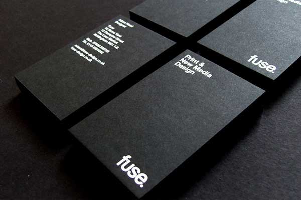
#2 - Fuse
Source: www.flickr.com/photos/fusedesign/3024737502
I absolutely love these business card designs from Fuse, a print and new media design agency based in the UK. Fuse have really gone back to basics with the design of these cards and their simplicity is simply astounding. Fuse have opted for a bold and colourless design that again, uses opposing and contrasting colours to help the design to stand out. The use of white text on a jet black background is always going to be eye catching but with these designs from Fuse, the typography and spacing of the text compliments the design even further.
Again, the business card has all of the information that you'd expect from a business card; the name of the company, what they do and the name/contact details of the designer within the company. The texture of the business card also adds to the design and helps to give the card a more luxurious feel. A nice touch (literally!).
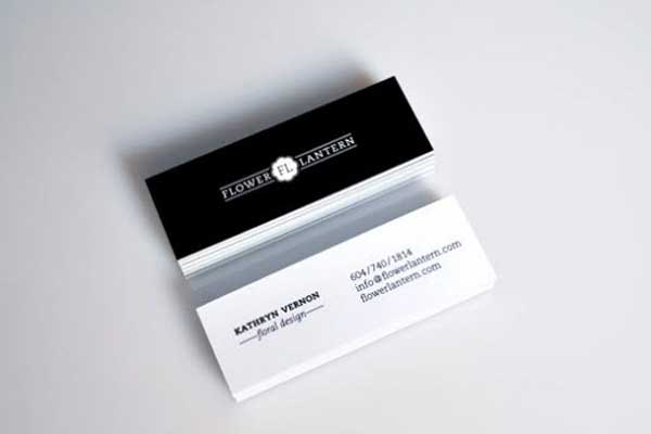
#3 - Flower Lantern
Source: www.flickr.com/photos/ariasdavid/4619282682/
I wanted to include these Flower Lantern business cards as I wanted to point out not only the great design, but also the use of a relatively non-standard business card size/shape. Most business cards are a standard size and shape (i.e. rectangular) and although these business cards are also rectangular, you can see that they are actually more elongated than most traditional business cards. Because of this, the cards stand out straight away but then, the great design just adds to the beautiful and simplistic nature of the cards. Once again, contrasting colours (black and white) have been used but I particularly like the typography choices in the design.
If you look closely, you'll notice that varying font faces and sizes have been used for various part of the design. You'll notice the name (Kathryn Vernon) is the most eye-catching part of the card, as it has been printed in a Bold font. The contact details are also beautiful, yet use a different (but complimentary) size and style. The beautiful and simplistic logo also adds to the gorgeous card design.
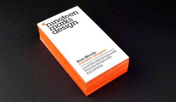
#4 - 19 Marks
Source: www.flickr.com/photos/19marksdesign/4799714590/
19Marks is a design agency and as you can see, they're the creators of one of the few simplistic and minimalistic business card designs that actually use colour! Colour can be a fantastic way to really draw attention to your business cards but you need to use it creatively and sparingly, as has been demonstrated by this card design. What you might not be able to see right away from the image is that the use of colour has actually been applied to the outside edges of the business card. This helps the cards to stand out when they're stacked in a pile (as they are in the image).
Not only this, but the vibrant orange colour has also been used in the actual card design, but sparingly. In fact, it is only used for the words "Creative Designer" and the asterisk that is part of the logo. Aside from this, the business card is primarily white and black. Again, all three of these colours (white, black and orange) are contrasting which helps to create a simple and bold design.
Conclusion
Business cards can be beautiful and usually, the simplest ones are the best. As you can see from the business cards featured in this list, there is no exact rule to creating a bold and minimalistic business card, but the use of colour and typography is extremely important.
You might choose to opt for a monotone black and white approach, or you might choose to add in some vibrant colours (such as the 19Marks design). Either way, remember to use typography and colour sparingly and creatively. Don't try to pack too much information into your card design either.