Logo design is a complicated process. Many companies spend hundreds of thousands (if not millions) of pounds creating the perfect logo design but often, all they receive is a negative backlash.
Below you will find what fastprint think are the 16 worst re-brands we have found.
Take the 2012 London Olympics logo for example:
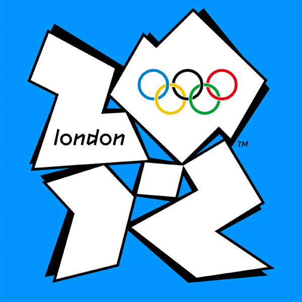
It might have cost £400,000 and took a year to design, but it received its fair share controversy, with some saying it was terrible and looked like a “kids competition entry”. #fail
For many, it goes down as one of the worst logos ever, but we think we’ve found some that are even worse.
Take a look at the list below:
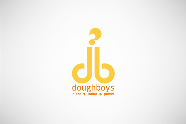
According to Behance.com, Doughboys is a “contemporary fast-casual restaurant, offering a fresh and healthy menu with items consisting of gourmet wood-fired pizzas, pastas and panini’s”.
That may very well be the case but judging by the logo, you might get the wrong impression entirely.
We won’t mention what we think this one looks like, but it’s not too difficult to see for yourself.
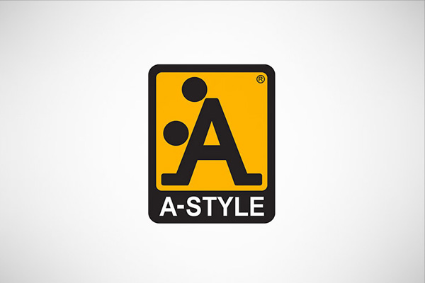
At first glance, A-style’s logo might look pretty innocent. The letter “A” pops out straight away but the longer you look at it, the more “rude” the logo is likely to become.
Exactly what you see in this logo probably depends on how dirty your mind is.
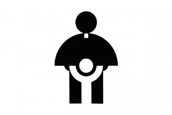
Let’s face it, when it comes to “certain things”, the Catholic Church already has a certain reputation.
One thing is for sure then: this logo is doing them absolutely no favours.
It’s a shame really, as if it wasn’t for the design FAIL, this would be a pretty minimalistic and elegant logo.
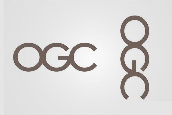
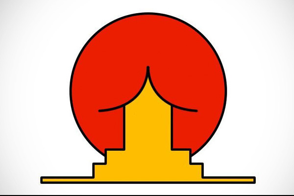
There’s actually nothing wrong with the logo for the Office of Government Commerce. That is, until you rotate it ninety degrees clockwise.
You can see the original (properly oriented) logo on the left, with the rotated version on the right.
If you can’t see what we’re referring to, keep looking. You’ll see it eventually.
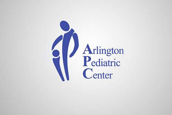
We’ll leave it up to you to figure out exactly what you think is going on in this photo. I believe the intention was simply a harmless image of father and son.
The Arlington Pediatric Centre has since reversed its decision to use this logo and now has something more, erm, suitable.
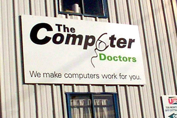
Utilising imagery to replace certain letters is a common theme in many logo designs. The thing is, if you get it wrong, you end up with something like this.
Again, you might not see it straight away so we’ll give you a clue. It has something to do with the image of the computer mouse replacing the letter “U”.
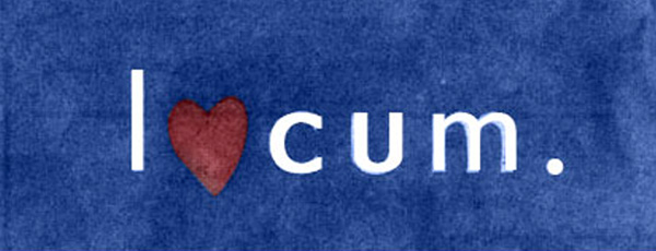
Language barriers are a common problem in logo design; nothing better represents this fact than the logo above.
This was created by a Swedish company and clearly, they didn’t realise how this was going to look when translated into English.
It appears that they no longer use this logo. Hmm, somebody must have pointed it out to them.
We’re not 100% sure what this logo is actually supposed to represent. But we certainly know what it looks like.
Obviously, the logo wasn’t supposed to look this way, its yet another classic example of a logo design fail.
We just don’t understand how the designers didn’t see their error.
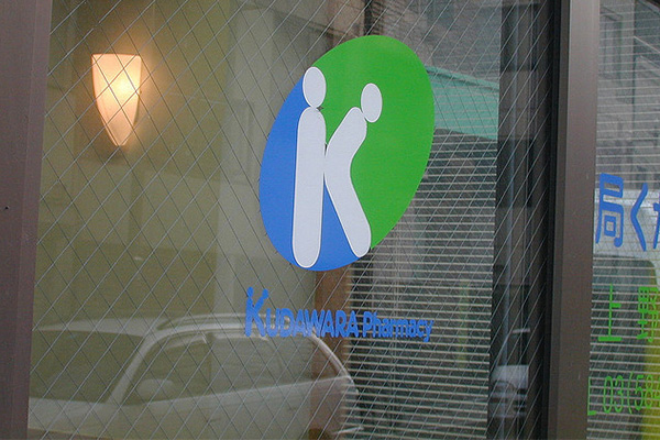
Making use of the initial letter of your company name to create an icon for your logo is another common tactic in logo design, and often, it works well.
In this instance however, the error of their ways is instantly obviously.
For a pharmacy, you’d expect something a little less adult-oriented!
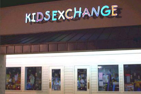
If you’re planning on removing the spaces between multiple words in your logo, you better make sure that they don’t accidentally change the meaning of your brand.
It looks as though the guys at Kids Exchange didn’t take this crucial step and the result was, well as you can see not good.
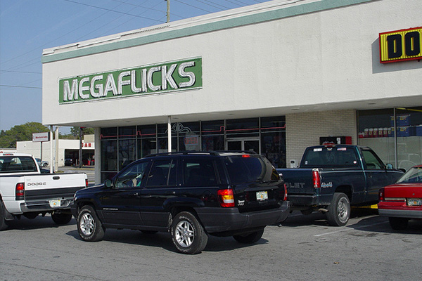
Megaflicks made a crucial mistake with their logo by not ensuring the letters were spaced far enough apart.
We’re pretty sure you can see what the result is above.
Make sure to adjust the kerning of your logo to avoid making the same mistake. If in doubt, increase the kerning to ensure legibility.
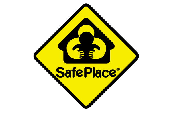
Somehow, Safe Place has managed to create what is perhaps the most ironic logo we’ve ever seen.
You’d expect something pretty safe from a brand with such a name. However, what they’ve actually managed to create is the polar opposite as you can see.
For whatever strange reason, Safe Place no longer uses this logo (wonder why!).
We have absolutely no clue how this design ever made it out of Photoshop but as you can see, it did, and it’s out in the real world.
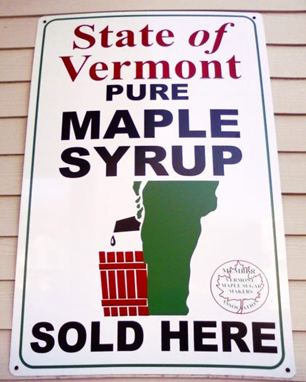
We don’t know about you, but we never realised that Maple Syrup was made this way.
We’re not sure we want to try it anymore.
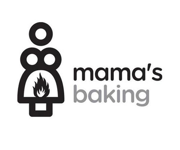
We think this is actually quite a nice looking logo, but we have to admit, it’s a bit on the strange side.
We can only assume that the image is supposed to represent “Mama”. However, we’re unsure what that fire is all about (and why it’s so unfortunately placed).
Either way, it seems that “Mama” herself hasn’t questioned it, as it’s still in use today.
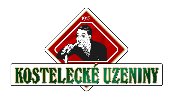
Kostelecké Uzeniny is a Hungarian sausage company, which is what we’re assuming they were trying to depict in this logo.
However, if you were unaware that they made sausages, you might jump to an entirely different conclusion based on that imagery.
Even if you did happen to know exactly what the company did, we still think it’s a bit of a weird choice of image.
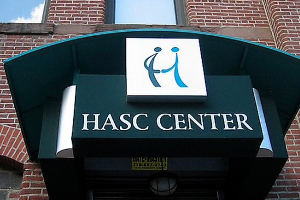
We’re unsure as to exactly what the Hasc Centre does, but we wouldn’t like to make a guess based on this logo.
It’s yet another one of those designs where we don’t understand how it managed to make it out of Photoshop, let alone end up being used in the real world.
Any Others?
Have you come across any ridiculously terrible logo fails that we haven’t included in this list?
If so, give us a shout in the comments section below and if we think it deserves a place, we’ll make sure to add it.