No matter what industry you're in, a business card is a fundamental marketing material that has the power to win a lot of new business when utilised correctly. It is one of the first things a potential customer/client will see in regards to your business and therefore, it's important that it makes a lasting impression.
Despite this fact, most people put very little effort into designing their business card and instead, opt to spend their marketing budget on other forms of marketing. While there is no problem with this (after all, there are many great forms of marketing), there is no excuse for a poorly-designed business card. What's more, if your business card isn't up to scratch, you're missing out on business, there's no two ways about it.
At FastPrint.co.uk, we regularly work with clients who are looking to revamp their business cards and luckily, we have a talented team of designers and print experts on hand who are always happy to advise and help in any way they can.
Over the years however, we've found that many clients have similar questions not only in regards to the printing process, but the design process too.
After consulting with our dedicated team of print and graphic design experts, we decided to put-together this guide and walk you through not only the business card printing process, but also the design process.
The Importance Of Branding
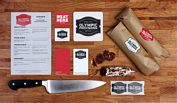
Source: OMFGCO.com
Before we start talking about the technicalities of the business card design and printing process in more detail, it's vital that we mention the importance of branding.
Although we might be able to guide you through many of the technicalities of designing and printing a business card (e.g. design/colour theory or file setup), a lot of the design decisions will inevitably be down to you. We can't create the design or concept for you, all we can do is offer guidelines to help you.
With business cards, branding is more important than with most other marketing materials as more often than not, a business card is the material by which a potential customer/client is first introduced to your brand.
While it might be nice to believe that designing a business card entails nothing more than creating a pretty design, you need to remember that your design must also reflect your brand.
If you take a look at the branding above for Olympic Provisions, you'll notice that the business card design (in the middle) is consistent with their existing brand image. It utilises the same colour scheme, typography and style. It wouldn't make sense if the company utilised a completely different colour scheme or style for their business card while maintaining a consistent identity for their other marketing materials, no matter how great the business card was as a standalone design.
As you make your way through this guide, make sure to keep your brand at the heart of every design decision. If you come up with a great concept, ask yourself whether that really aligns with your existing brand or not.
Now, let's get down to business (cards).
The Design Process
Let's start with the design process (as this will inevitably come before the printing process in most respects).
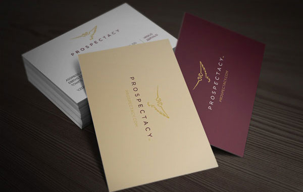
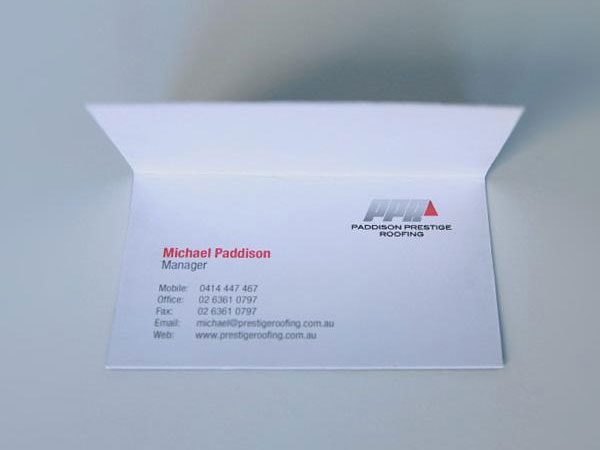
#1 - Choose A Size & Shape
Source: Behance
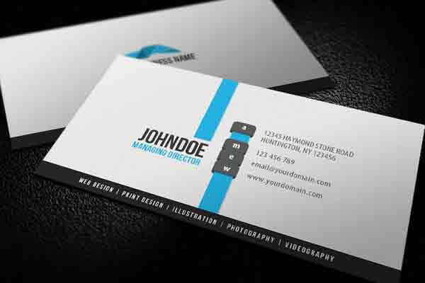
Traditionally, business cards come in a standard size and shape; a rectangular design (either horizontal or vertical) which is roughly 3.5" by 2" in diameter (like the ones pictured above).
While there is absolutely nothing wrong with this sizing and/or shape (in fact, there are a few benefits which we'll discuss later), you're certainly not bound to these constraints as these days, you can literally create any sized/shaped business card you like.
Usually, it's best not to stray too far from the traditional style business card shape/size (as this way your card will stay instantly recognisable) but there are a couple of subtle options that may help you stand out from the crowd.
Oversized/Undersized Business Cards

Source: ChrisPooner.com
Oversized and undersized business cards are becoming increasingly popular. Essentially, these are nothing more than slightly oversized or undersized cards (when compared to the traditional 3.5" by 2" design).
In the example above, you'll notice that the shape of the business cards is kept pretty traditional (still a standard rectangle) while the sizing is slightly elongated. In other designs, the sizing may go the other way and appear more square than rectangular.
It's a subtle option that leaves you with a relatively traditional-looking business card but it can work better for certain designs.
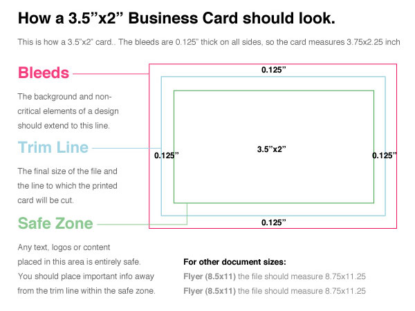
#2 - Set Up Your File
Source: Envato
Setting up your file for a print design (i.e. business cards) varies a little from a web project as there are a few extra things that you need to think about.
Firstly, you need to make sure to account for bleed and trim in your design. This is basically to ensure that your finished business card turns out as planned and that there are no unexpected white lines or text cut-offs.
The image above from Envato gives a good depiction of how bleed and trim work.
It's important to note that exact bleed/trim dimensions often vary depending on your chosen printing company so if possible, make sure to consult with them before setting up your project file. Often, they'll have ready-made templates for popular applications such as Adobe Photoshop and InDesign, so make sure to ask as this will you save you (or your graphic designer) some time.
Source: N/A
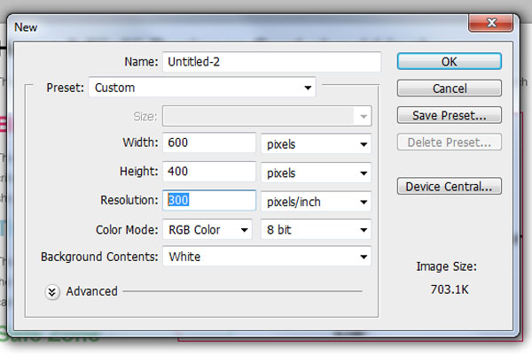
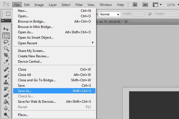
You also need to keep DPI in mind. If you're using Photoshop, you can set the DPI of the project file when you create a new document (pictured above) and it's similar in other programs too. This should be set to a minimum of 300dpi.
Also, any images that you're including in your business card design must be at least 300dpi or more (it depends on the printing company you're using usually).
Lastly, you need to ensure that any fonts or custom typography are embedded. You can learn more about this in our poster design/print guide here.
#3 - Know What Information To Include
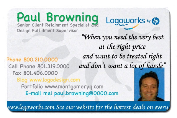
Source: ActiveRain.com
The primarily purpose of any business card is to give prospective clients/customers contact information related to your business. But what information should you include?
It's easy to get carried away with this step and many designers include just about every piece of contact information under the sun. This can be confusing and depending on your design, it can make your business card appear cluttered and poorly-designed.
There are a lot of things wrong with the business card pictured above but the inclusion of too much contact information is definitely one of them. If anything, this confuses the recipient as you literally have no clue which is the best contact method to use for the contact.
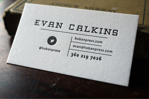
Source: Etsy.com
Therefore, the contact details that you include on your business card should be reflective of your business and the medium of contact that is most appropriate. For example, if you run a social media marketing company, it might be perfectly acceptable to include your Twitter profile and neglect a your physical address (like Evan's card above).
As a general rule of thumb though, all business cards should contain the following information:
•Name
•Telephone number
•Email address
•Website URL
Optional extras include:
•Twitter handle (e.g. @fastprint)
•Facebook URL
•Address
•Slogan
•Job title
It might also be wise to ensure that you include your logo and other 'brandable' assets. However, sometimes a text-only business card can work better.
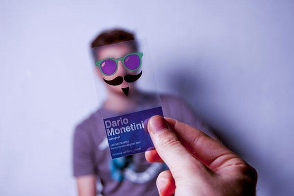
#4 - Make Sure The Design Is Unique
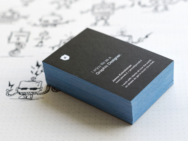
Source: Dribbble
If you really want to create a lasting impression with your business card, you need to make sure that your design is unique. Obviously, almost any business card design will be unique (even if it's just altering the contact information on a template) but the more unique and 'branded' you can make your card, the more of an impact it is likely to have on the recipient.
A lot of different factors combine to make a unique design, it could be the shape (oversized/undersized) of your card, the typography, the colour scheme, the minimalism or even the concept of the design itself.
You should let your own personality and design style drive the design. If you're a clean/simple person, your design should reflect that (like the card pictured above). If you're a vibrant, energetic and colourful person, it would make sense to create a colourful and slightly 'in your face' business card.
Don't be afraid to be unique, it will pay-off in the long-run.
#5 - Don't Be Afraid To Get Colourful
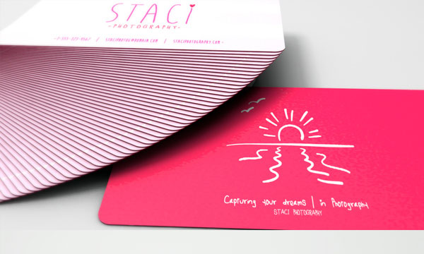
Source: Staciphoto.com
While a minimalistic design may be perfectly suited to some businesses, you certainly don't have to go down this route. Colour is an important aspect to consider when designing any form of marketing material but with business cards, it's more important than ever.
Often, dull and boring cards will get thrown away or forgotten about but a colourful/vibrant business card will ensure that the recipient remembers your business. However, the trick is to use colour in a smart and visually appealing manner.
You don't want to be including all the colours of the rainbow just for the sake of being memorable, you need to pick your colour scheme wisely. If you don't, your card will appear cluttered and poorly designed. It might still be memorable, but it won't be for the right reasons.
If you take a look at the business cared above (Staci Photography), you'll notice that a vibrant neon pink colour has been used to cover the entire side of the card. It's a colourful yet minimalistic and clean design. You can imagine this making a lasting impression on the recipient.
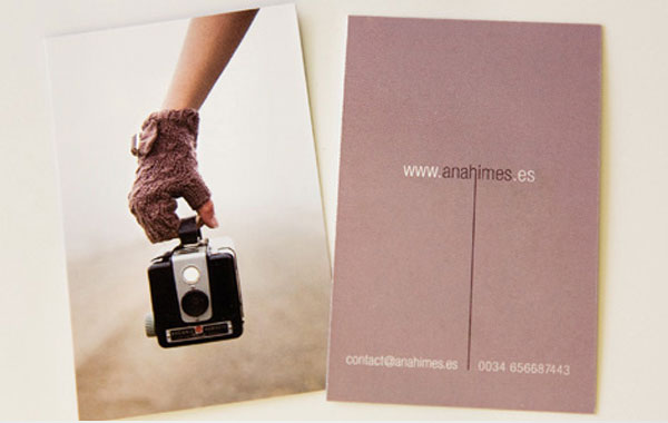
Source: CardView.net
Imagery can also be a great way to add colour to your business card in a classy and sophisticated manner. Take a look at the business card above (Ana Himes); you'll notice that one side of the card features a beautiful image. You'll also notice that the colour of the glove in the image is consistent with the block colour used on the other side of the business card.
It should also be noted that your choice of colours should reflect your current brand. Don't use completely unrelated colours if it's inconsistent with your current brand identity.
You can read a great post on colour theory by SmashingDesign.com here. You can also use a colour scheme generator (like this one) if you're struggling to find complimentary colours for your business card.
#6 - Make Use Of A Fun Concept
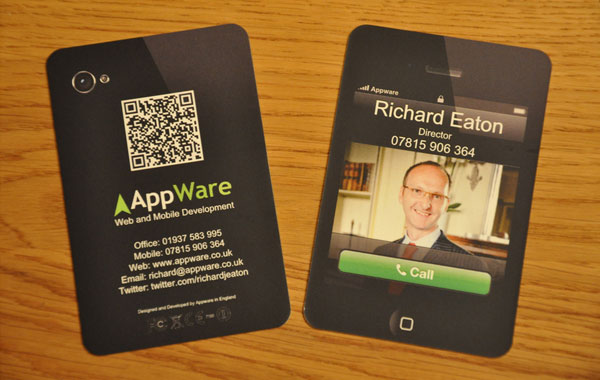
Source: AppWare.co.uk
Making use of a fun design concept is another way to ensure that your business card is unique and makes a lasting impression. These concepts do require a little bit of creativity (so you'll need to get your creative thinking cap on) but if you can create one that works, chances are that prospective clients are going to remember you for all the right reasons.
You can create a business card around literally any concept you can think of, so long as it represents your brand. For example, take a look at the business card above from AppWare (a UK-based app development company); you can see that it has been designed to mimic an iPhone app. This is a concept that ties-in with the nature of the business and is also slightly amusing.
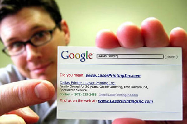
Source: WebDesignerDepot.com
Here's another great example of a fun and quirky business card concept for a printing company based in Dallas. Anyone familiar with a Google search results page will instantly recognise the design of this card so it'll certainly grab attention.
Plus, it still has all of the information you'd expect from a business card (i.e. phone number, email address etc). It also has one extra piece of information that is cleverly embedded into the design concept itself: the keyword to type into Google to find the printing company in question.
#7 - Use A QR Code
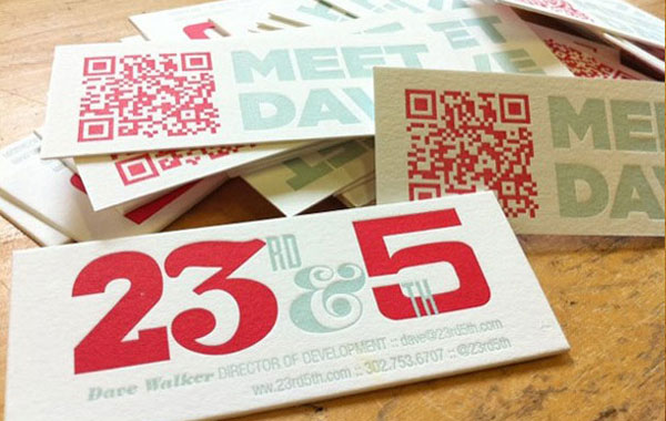
Source: 23rd5th.com
The whole point of your business card is to introduce a potential customer/client to your business and also, to provide them with the necessary contact details in the hope that they will contact you and hire your services (or buy a product from you).
The problem is, a business card doesn't contain much information about your business in general. It's for this reason that most modern day business cards will feature a web address so that the prospective client/customer can find out more about your business and what you do.
Despite this, very few people will actually log on to their computer and type in your website address.
A QR code is essentially a scannable code which allows recipients to quickly access your website and view more information about your business. It's great for lead generation but often, it can look quite ugly as part of a business card design.
What a lot of people don't realise is that QR codes can be incorporated into the design in many ways (e.g. change of colour, styling etc). The business card above is a great example of a beautiful business card where the QR code actually compliments the design. A QR code not only makes your business card more memorable, but it actually gets prospective customers/clients interacting with your brand.
You can read our full in-depth explanation of QR codes, how they work and how to implement them into your designs here.
#8 - Don't Use Borders & Ensure Readable Text

Source: N/A
One of things you should try and avoid when designing your business card is the use of borders. Although borders might look great, they can cause a serious headache during the printing process.
Earlier, we mentioned the requirement for bleed and trim. The reason bleed is needed within the trim line is that sometimes, cards may be trimmed a couple of millimetres either inside or outside of that line.
On a regular design, this isn't a serious problem and your business card will look largely the same. However, if you have a border, the results can be disastrous. The image at the beginning of this section shows how your business card design might look on the computer screen when sent for print.

Source: N/A
The image above shows how your business card may look should there be a few millimetres discrepancy during the trimming process.
It's also important to ensure that any text on the card is readable. It may look large when you're designing it on your computer screen but when printed, business cards are notoriously small, so make sure the font sizes are large enough.
It might pay to print a test copy of your design in your chosen sizing just to check that everything is readable.
The Printing Process
Ok, so we've tackled the design process, but there's still a lot of technicalities to consider when converting that design to a finished printed product.
#1 - Saving The File
Source: N/A
When saving files for the web, things are pretty straightforward as usually, a JPG or PNG file will do the trick. When submitting business cards to be printed though, there's a lot more to think about.
First of all, saving your design as a JPG or PNG is never a good idea and no matter which printing company you're working with, this is almost certainly not the best way to submit your files.
Source: Deviantart
Both JPG and PNG are compressed file formats and therefore, saving a file with this extension will cause a loss of quality (as is demonstrated in the image above). You can see that the image appears fuzzy and the text is virtually unreadable.
Most printing companies will have their own preference when it comes to the file type they prefer but usually, it's either a TIFF file or PDF. A vector-based PDF is often the best option if you've been designing your business card in Adobe InDesign (as this application uses vector-based imagery as standard).
It's also important to make sure that all fonts are embedded if you're using custom fonts. If you fail to do this, there's a chance that your font may get automatically replaced by the 'next best alternative' when the printing company opens the file on their system.
You can refer to our previous poster design and printing guide to see exactly how to do this in Adobe Photoshop and InDesign here.
#2 - Choose Your Material
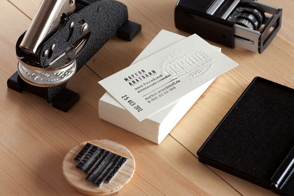
Source: Behance
Unlike a poster or flyer (which is usually printed on standard matt or glossy paper), there are a lot of different material options for a business card and all of these can have a profound effect on the result of the finished product.
The first thing you're going to need to decide upon is the weight of the paper your business card will be printed on. Typically, business card paper is measured in gsm (Grams per Square Metre) click here to read more. Most printing companies offer a number of choices between 200gsm and 400gsm.
Essentially, the higher the paper density is, the better-quality your business card will be. Therefore, if your company is a high-class premium brand, a high-density paper is probably more suited. If you take a look at the business card pictured above, you'll see that it is printed on relatively high gsm paper which gives it a high-quality look/feel.
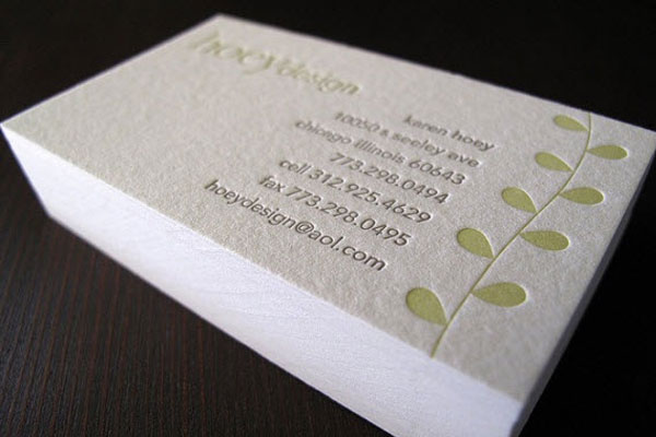
Source: Flickr
You also need to consider the texture and finish of the paper you choose. You'll be able to pick from matte, glossy, smooth or rough. Often, a matte-finish on rough textured paper will give your business card a more premium or eco-friendly feel to it (such as the card above from Huey design).
A glossy smooth design can look just as great though, it all depends on your personal choice and the choice which is best suited to your particular design.
#3 - Choose The Type Of Printing Process
Source: BoredPanda.com
When it comes to the printing process, there are a few here and your choice will depend largely on pricing/budget.
Typically, there are two main choices available for the majority of business card print runs; these are offset and digital printing.
Most printing companies will make use of a digital printing process as it is cheaper and offers a faster turnaround (compared to offset printing). Some printing companies will use inkjet printing and some will use laser printing, it varies (but the quality is largely the same).
Unless you're having a high quantity of business cards printed, digital printing is likely going to be your best option as there are no mechanical processes or setup fees like there are with offset printing. The business card pictured above would likely have been printed using a digital printing process.
Source: BoredPanda.com
Offset printing is best suited to high volume print runs. It utilises a lengthy process that involves images being burned onto plates, rubber and so forth. Because of this, the cost per card can work out quite high for short print runs due to set-up costs, so it's only recommended for high volume runs.
Offset printing can be cheaper if you're planning a high volume print run and typically, the image quality is a little better when compared to digital printing. Offset printing allows images to be printed on a variety of different materials too.
For most modern day business card needs though, digital printing is the way to go.
#4 - Converting from RGB to CMYK
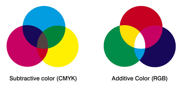
Source: DesignThePlanet.com
Whether you're printing a business card, flyer, poster or banner, most printing companies will work in CMYK rather than the RGB colour mode.
Note: If you're unfamiliar with CMYK and RGB, we recommend that you read our recent post explaining the differences between the two colour modes here.
With business card printing, converting from RGB to CMYK may not always be required and if you've been designing your card in Adobe InDesign, it's likely that you'll already be working in the CMYK colour mode by default, so no conversion will be necessary.
We recommend that you consult with your chosen printing company and ask them whether they require files to be submitted in CMYK rather than RGB, just to be sure.
For more a detailed explanation on converting your files to CMYK in Adobe Photoshop, InDesign and Illustrator, you can read our full in-depth guides here (for Photoshop), here (for Illustrator) and here (for InDesign). We also have a Microsoft Word guide here.
Conclusion
Although we've arranged this guide in a (mostly) chronological order, there are some things you might need to switch around depending on your design.
It goes without saying, but you also need to make sure you choose a high-quality and reputable printing company for the job. A batch of inconsistent business cards printed on flimsy paper using low-quality ink is never going to impress anyone, so avoid this at all costs. Make sure you ask to see samples of their produce before you place an order.
Clearly, there's a lot to think about but we can assure you, if you make sure to consider every step of the process whilst keeping your existing brand in mind throughout, you'll soon have a winning business card design on your hands.
If you're struggling for inspiration, take a look at these creative and inspiring business cards [LINK TO 16 CREATIVE AND INSPIRING BUSINESS CARD DESIGNS POST] or if you prefer, here's a few fantastic examples of modern business card designs [LINK TO 13 MODERN BUSINESS CARD DESIGNS POST]. If you think a humorous concept might be more suited to your business, take a look at these funny business cards. [LINK TO 11 FUNNY BUSINESS CARD DESIGNS POST]