These days, almost everything you buy comes in some form of packaging. If you're buying a new TV, it'll come in a large cardboard box. If you're buying a drink at the supermarket, it'll come in a can or a bottle. Most of us come into contact with packaging every single day of our lives but the thing is, we're rarely "wowed" by the packaging we come into contact with.
In fact, most packaging is simply created to be as functional as possible. Sure, there are branded designs out there but the number one priority when creating a packaging design for most companies is the functionality and logistical aspect of it.
Occasionally though, a company chooses to completely ignore the conventional rules of packaging design and instead, create something that really has the "wow" factor. These packaging designs are often pretty bizarre but creative nonetheless.
If you're thinking of redesigning your product packaging, Fastprint have rounded up a list of some of the most creative and bizarre packaging designs ever produced to give you a bit of inspiration. Enjoy.
#1 - Coca Cola
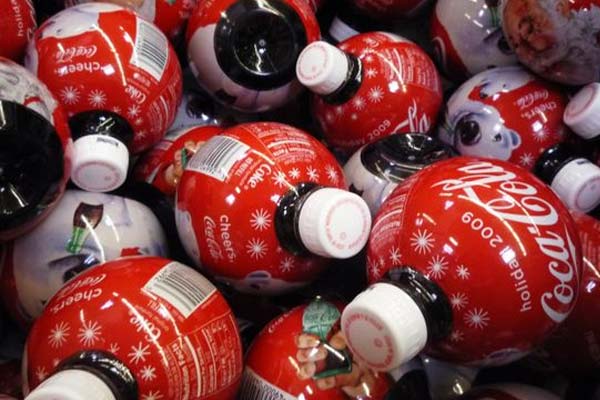
Coca Cola is certainly no stranger to exciting, creative and sometimes bizarre packaging designs but these "holiday" designs from 2009 are probably one of the most memorable.
Coca Cola launched these designs for the holiday season and marketed them as ornamental bottles. I'm sure most of you can see the similarities between these bottles and the baubles that you most likely have on your Christmas tree each year.
They're certainly eye-catching bottles and being limited edition, they flew off the shelves. Not only was this a great sales tactic for Coca Cola but also a great marketing tactic. Bloggers all around the world took to the web to write about these cool Coca Cola bottles and some bloggers even turned their empty bottles into cool lights.
Sprite and Diet Coke were also sold in these bottles (both owned by the Coca Cola Corporation).
#2 - TejMilk
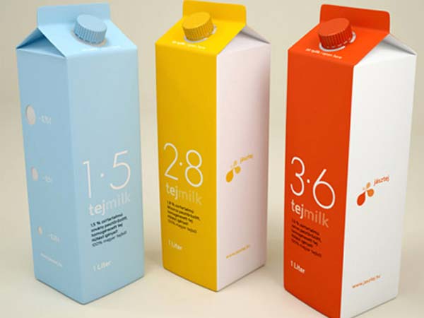
Of course, the best way to stand out from the competition on the supermarket shelf is through a creative packaging design; something TejMilk took full advantage of when creating their brand.
TejMilk is a Hungarian company and as you can see, the packaging design is extremely creative yet also pretty minimalistic. The bottles are colour coded according to their fat content. You can also see that the fat content is quite prominent in the actual graphic design of the packaging; notice the "1.5", "2.8" and "3.6" numbers on each bottle.
I personally think this is a great design and if I saw this in the supermarket, it's likely it would stand out amongst its competition.
#3 - Egg
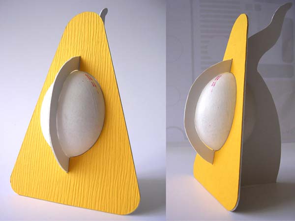
Most eggs come in either 6, 10, 12 or 24 packs and for some people (myself included), this is far too many eggs. What happens if you only want one egg for example?
Well, one designer has come up with a unique packaging design for one egg as you can see above. The design itself is eye-catching and also extremely functional. The bright yellow combined with the natural white of the outer egg shell gives the packaging design an overall "eggy" colour scheme.
Sure, it's a bit bizarre and the chances of such a product appearing in a local supermarket any time soon are quite small, but it's a design to be applauded nonetheless.
#4 - EarBudeez
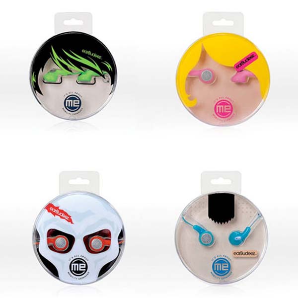
With such a large market, there's a lot of competition in the headphone space. A quick visit to a website like Amazon.com will see you presented with hundreds (if not thousands) of different headphones, all of which feature varying designs.
However, one problem with headphones is that most of them are quite generic and not very personalised. Audiovox noticed this problem and decided to create the EarBudeez range of headphones pictured above.
As you can see, the unique design of the packaging is aimed at different personalities. The transparent nature of the packaging utilises the headphones as part of the design. It's a very clever yet slightly bizarre packaging design, but I personally love it!
#5 - Pizza
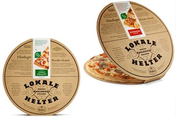
Obviously, regular square cardboard packaging is a lot cheaper and easier to produce than round packaging but one company still decided to go against the norm and opt for a perfectly round pizza box (pictured above).
It's a pretty creative and eye-catching design as you can see. I'm also pretty sure that if I saw this in my local supermarket, it would instantly stand out amongst all of the other boring brands utilising the same square pizza boxes.
#6 - Hanger Tea
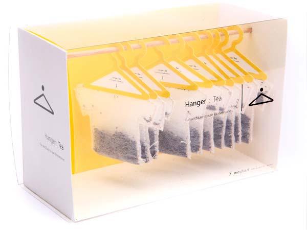
The design above was submitted to a tea-packaging design competition (yes, such a thing does exist) and clearly, it's a brilliantly wacky and unique concept.
The Hanger Tea packaging design turns the ordinary tea bag into a visual masterpiece reminiscent of your wardrobe. Each tea bag is hung individually on a teabag hanger. Every tea bag is also shaped like a t-shirt.
It's a beautiful design but more than likely a logistical nightmare.
#7 - Popup Popcorn
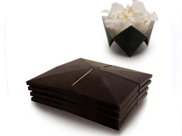
The thing is, the packaging is pretty bog-standard. In fact, if you've ever bought popcorn from a supermarket, you'll more than likely have ended up tipping it out of the packaging and into a bowl once you got home.
Popup Popcorn solves this problem with the most ingenious solution ever. The Popup Popcorn packaging literally opens up into its own handy bowl-like design, allowing you to reach for the popcorn with ease.
#8 - Wine
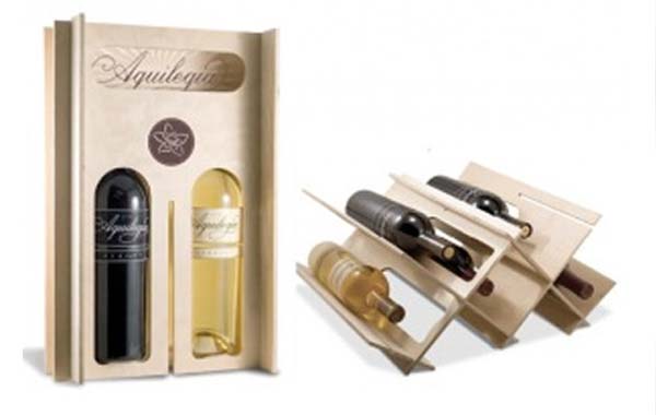
The thing is, when you buy a bottle of wine it usually comes without any packaging at all. It's just a bottle with a label on it. This makes storing the wine for long periods of time a bit of a problem. Unless you've got your own wine cellar or a wine rack, you're going to end up with bottles all over the place.
This unique and creative wine packaging design solves this problem by actually transforming from a box into a wine rack. As you can see from the image, you can open up the wine packaging to create your very own wine rack that's perfect for storing up to seven bottles of wine at a time.
It's just a concept at the moment, but I'd certainly love to see this product made available to a mass market.
#9 - Doritos
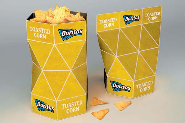
The problem with Doritos (and any other potato chips for that matter) is that getting them out of the packet usually results in a greasy messy hand. This unique packaging design solves this problem by creating a clever re-sealable box to keep your Doritos in.
Not only this, but the packaging design revolves around the triangular design that the Doritos chips are famous for. In fact, it's this triangular design that helps the packaging to work so well.
It's definitely a beautiful feat of engineering and once again, a product I'd love to buy should it be made available.
#10 - Kleenex
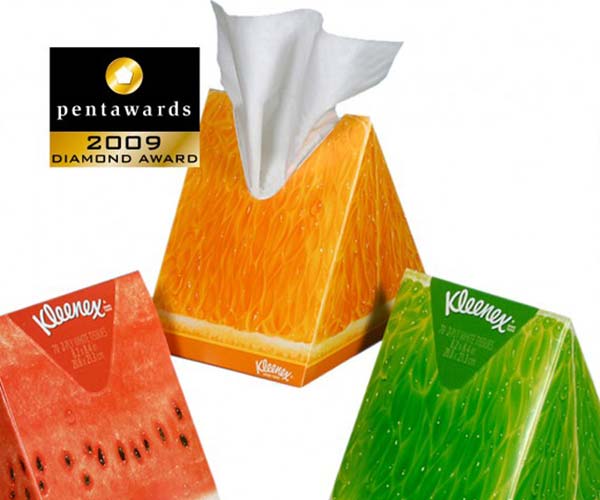
Much like the Doritos packaging above, these Kleenex boxes also make use of a triangular design concept to help them stand out from the competition.
The reason behind the triangular design becomes apparent when you look at the actual graphical element of the packaging. You can see that each packaging is designed around a fruit. The reason for this is simple; this is what the fragrance that the Kleenex tissues inside the box have.
The bright packaging certainly stands out on the shelf which is always a great thing when it comes to packaging design. They also let the consumer know what fragrance the tissues have with just once glance.
#11 - Soy Mamelle
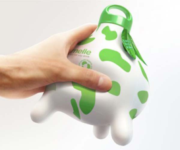
The packaging for Soy Mamelle is extremely smart and actually communicates it's desired message in two parts. The first part of the message is communicated via the unique shape of the packaging. As you can see, it's designed to look like a cow's udder.
Although Soy Mamelle has no connection to regular milk (and therefore a cow), the udder design communicates the fact that soy milk is virtually identical in taste and flavour to cow's milk.
The second part of the message is communicated via the graphic design of the packaging. The colour scheme and text on the packaging creates an image of health and vitality, therefore helping to promote the health benefits of soy milk.
It's a clever and eye-catching design that is certainly unique. I doubt there's many "udder" milk bottles out there that are this unique (forgive the pun).
#12 - Evian
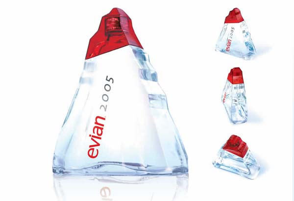
You might be forgiven for thinking this is a new brand of perfume if you saw it on the shelf but you'd be wrong. This Evian bottle was named "Origine" and as you can see, it's shaped like a mountain. The reason for this is simple, Evian is actually sourced at a natural spring on an icy mountain.
Although the bottle looks great, it was a rather heavy item and certainly wouldn't be a viable bottle design for every bottle of water ever sold. Still, it looks great and definitely deserves it's place on our list of the most creative packaging designs.