Source: Behance.net
If you're thinking about designing your own sticker in order to market your business (or perhaps just as a personal project), you'll likely have realised there's a lot more to the design process than first meets the eye.
When used appropriately and designed well, stickers can be a brilliant marketing material for just about any business. The problem is, most people don't have a clue where to start when it comes to designing stickers and more often than not, even graphic designers without sufficient experience in sticker design can make a mess of the design process.
If you're planning to use your sticker for marketing/promotional purposes, it's not just about creating a pretty sticker, you also have to keep a number of other things in mind. You need to think about the message you want to communicate, the actual copy of your sticker, the sizing/shape, the typography and of course, the actual printing process (which can often be the most daunting part of the process if you haven't designed for print before).
It might sound pretty complicated but don't worry, we're here to guide you through the process. We've designed stickers for hundreds of happy clients here at FastPrint.co.uk and our team of designers are well-versed in the art of sticker design.
We consulted with them and created the following guide to walk you through the process of designing and printing the perfect sticker.
#1 - Choose Your Size & Shape
Source: Behance.net
Before you start thinking about any other aspect of your design, you need to make a decision as to the size and shape of your sticker. In most cases, this will almost solely depend on the intended use of the sticker.
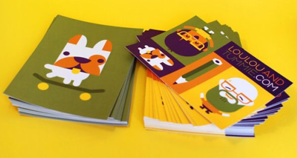
Perhaps the most common shape for a sticker is a regular rectangular and square design (like the stickers from LouLou & Tummie above). These are often the most cost-effective stickers to produce as they don't require any additional die-cutting process or custom shaping.
Source: Flickr.com
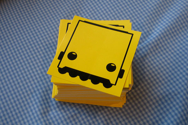
Here's another fantastic sticker design that uses a regular square shape for the design. As you can see, it's a pretty simple yet beautifully designed sticker which just goes to show that you can do a lot with a regular square/rectangular design; it's all down to the creative process
Source: Stickermule.com
If you are looking to create a more custom-shaped design like the sticker above, the best option is to simply print your sticker on clear vinyl. By doing this, you'll be able to create an entirely customised design even though technically, your sticker will still be a regular square/rectangular shape (it's just that part of the sticker will be entirely transparent).
These can also be printed in reverse if you're planning to stick them on windows or another transparent surface (please give us a call if you're looking to do this, we're always happy to help!).
Source: Behance.net
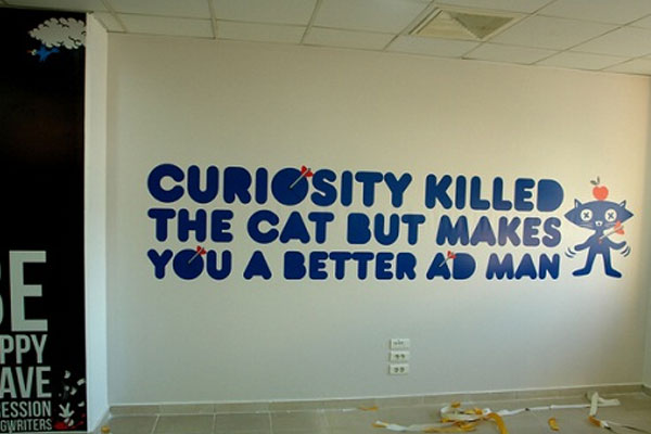
It's important to realise that you aren't bound to sticker designs that are just a few centimetres in diameter either. Most modern day printing companies will allow you to create stickers up to a few feet in size and length. This can be great if you're looking to create a wall sticker like the one pictured above.
At FastPrint.co.uk, we can create stickers up to four feet wide and virtually any length you desire, so please give us a call if you're looking to create a large sticker.
#2 - Make It Bright & Colourful
Source: Dribbble.com
It doesn't matter where you plan on using your sticker, the aim is usually to grab people's attention. If you're creating a promotional sticker for marketing purposes, this will almost always be the case, no matter what form your sticker happens to be in (e.g. regular adhesive sticker, vehicle sticker etc).
The problem is that stickers are usually viewed from quite a distance. If your sticker ends up being stuck to someone's laptop cover, car bumper, a lamp post or any of the many other possibilities, the target audience for your sticker will be anywhere from a few feet to a couple of hundred metres away.
It's for this reason that, in most cases, you should make sure your sticker is bright and colourful. Making your sticker colourful will ensure that it grabs the attention of its target audience and gets the attention it deserves.
It's important to remember that making your sticker bright and colourful doesn't necessarily mean that you need to use every colour of the rainbow in your design though. Often, just one or two colours will work best (you can learn more about colour theory in this fantastic article).
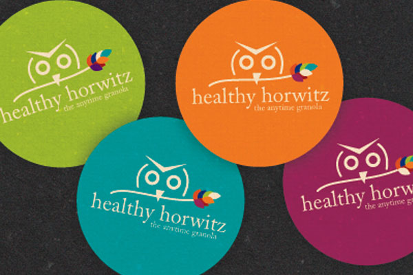
If you take a look at the Healthy Horwitz stickers, you'll see that the designers have opted for just one main bright block colour for each of the designs. You can see how these would stand out beautifully from a distance and grab the attention of passers-by.
Source: Dribbble.com
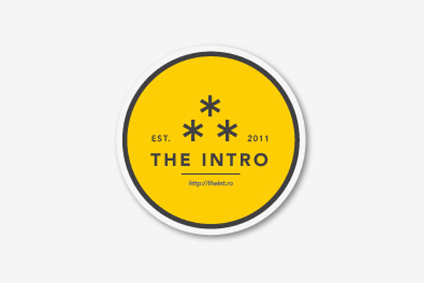
Here's another beautifully colourful yet rather simple sticker from theint.ro. Again, it only uses two main colours (yellow and dark grey) but still, the design is bright, clean and colourful.
If you use too many colours in your design, you run the risk of creating a cluttered and quite frankly ugly design, so make sure to stick to just two or three main colours.
#3 - Use Bold Typography
Source: Stickermule.com
One hugely important thing to focus on when designing your sticker is the choice of typography you opt for. It's likely that your sticker will communicate a message and if so, you need to ensure that this message is readable to the intended audience of your sticker.
If you were creating a flyer or a leaflet, it would be perfectly acceptable to include paragraphs of text written in a relatively small typeface but with stickers, this would be a big mistake. The aim of stickers isn't to give the audience your life story, it's simply to create brand visibility and attract attention (in most cases at least).
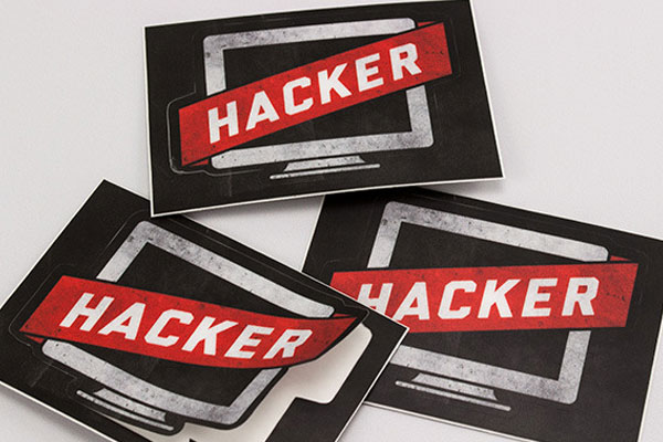
You need to ensure that you choose both a bold and clear typeface that will be readable from a distance. Take the Hacker sticker design above for example; you can see that the designer has utilised a bold and highly-readable typeface. The impact and readability of the text has further been increased through the use of solely uppercase type and a large font size (thus increasing readability from a distance).
Source: Dribbble.com
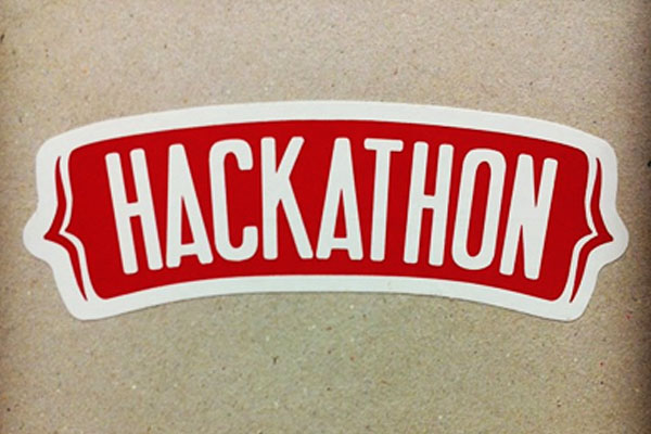
Another trick to further increase the boldness and readability of your sticker text is to use contrasting colours. If you take a look at the Hackathon sticker above for example, you'll notice that the word 'Hackathon' is printed in white text on a dark red background. These two colours are highly contrasting and therefore, the text appears to stand out even further.
Sans serif typography can often appear more bold and readable when printed in small font sizes, so keep that in mind. However, don't use sans-serif fonts just for the sake of it, especially if it doesn't fit in with your brands existing visual identity.
#4 - Use Text Sparingly
Source: Stickermule.com
As we briefly mentioned in the last point, the aim of a sticker isn't to tell the audience your life story or inform them about every single product you offer (you can let a leaflet/brochure take care of that) but instead, to attract attention for your brand and increase brand awareness.
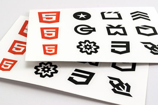
If you look at any sticker design out there, you'll notice that text is used extremely sparingly. In fact, a lot of sticker designs don't utilise any text at all. For example, take a look at the HTML5 stickers above.
These are nothing more than simple icons and no text has been used at all. The reason for this is simple; the intended audience of these stickers will already recognise the HTML5 icons and therefore, no text is needed. More of an impact is created without any text.
Source: Behance.net
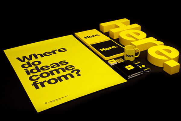
In some cases however, text will be necessary and can actually help to attract attention for your stickers. For example, take a look at the sticker design(s) above which were created for Design Month. The aim of these stickers was to attract attention for the month and as you can see, the text really helps this. It asks a simple question "Where do ideas come from?". This is enough to grab people's attention and get them thinking. It also invokes a sense of curiosity and makes them want to know the answer.
Clearly, this small amount of text (five words in total) has much more of an impact than a whole paragraph telling people about where ideas might come from. Less is more when it comes to sticker design.
#5 - Incorporate Your Brand
Source: Gigaom.com
Although it's important to take into account colour schemes, typography and so forth, it's also important that your brand stays at the heart of your design.
Just because uppercase typography and certain contrasting colours might have the greatest impact when it comes to getting noticed, you should never incorporate colours or typography that don't reflect your brand or adhere to your already-existing brand identity.
One of the main aims of a promotional sticker is to increase brand visibility so if your sticker doesn't represent your brand, it's not going to have the desired impact or create a return on your investment.
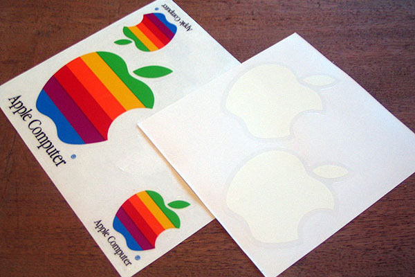
As an example of this, take a look at the Apple stickers above. Essentially, these are nothing more than stickers of the white Apple logo that virtually all of us will recognise. These stickers have no text at all and no bright colours, yet they reflect the brand perfectly. Why? Because Apple is known for their minimalistic design approach and in some respects, a blatant disregard for the rules.
Source: Ytse-jam.deviantart.com
Obviously, we're not all running the biggest company in the world (i.e. Apple) so what about the rest of us? Well, it's important to use a colour scheme that reflects your brand and that is also consistent across all other visual media (leaflets, banners, website etc). It's also usually a good idea to include your logo in the sticker as this is likely the most recognisable part of your visual identity.
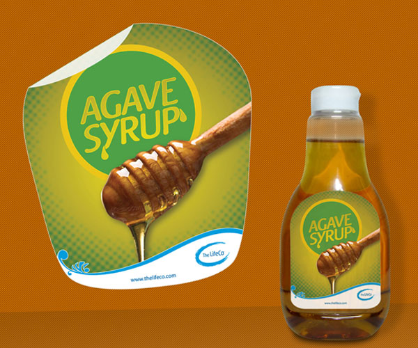
The sticker design above from Agave Syrup represents these points perfectly. Not only does it show their logo, but it's also consistent with their brand identity across other mediums (as represented by the bottle).
If you need help creating a great logo for your business, check out our ultimate guide to logo design from start to finish.
#6 - Incorporate A Call-To-Action
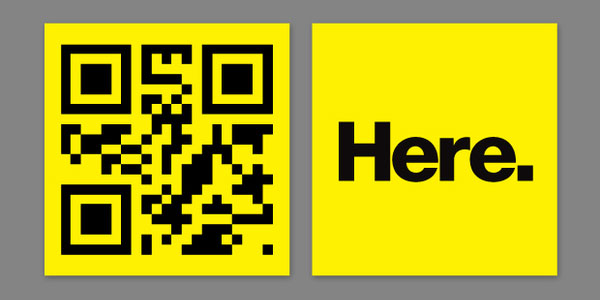
Source: Behance.net
Call-to-actions are often used throughout a variety of different marketing mediums and typically, you'll see them on banners (both online and offline), leaflets, websites (i.e. landing pages)and sometimes leaflets/brochures. However, a lot of stickers don't use an effective call-to-action and for many, this is a mistake.
If you're unfamiliar with what a call-to-action actually is, it's essentially an image or line of text that actively prompts the recipient/viewer to take a specific course of action. It could be giving your business a call, visiting a website or following a social media profile.
Most people tend to think of call-to-actions as lines of text such as "Call now for your free no obligation quote" but truthfully, call-to-actions can be much more subtle than this. It's these kind of subtle and non-obtrusive call-to-actions that are best used in sticker designs.
If you take a look at the sticker above (taken from the Design Month designs once again), you'll notice that there is no obvious call-to-action. In reality, it's the QR code that acts as the call-to-action as it prompts the recipient/viewer to scan the code. It might not be obvious, but it's still there.
Not sure what a QR code is? Take a look at our recent blog post explaining what QR codes are and how they work.
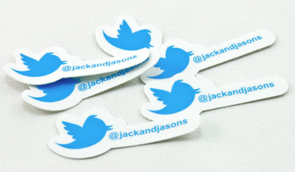
Source: Stickermule.com
It's the same for the sticker design above. At first glance, all you see is the Twitter logo and the Twitter handle but in reality, this is acting as a call-to-action. The Twitter handle is discreetly prompting the recipient/viewer of the sticker to follow them on Twitter (or at least visit their Twitter profile).
A number of things can act as a great call-to-action on your sticker; it could be your phone number, Twitter handle, address or even a QR code. Just don't make it too obvious, you don't want to use your sticker as a "hard sell" as this will alienate your audience.
#7 - Make It Humorous
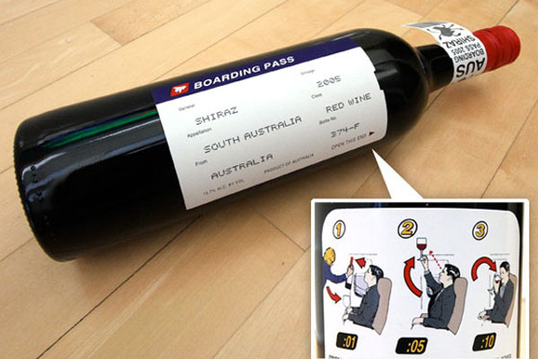
Source: Notcot.com
One tactic that almost never fails to grab attention is to use humour in your marketing materials. People love to laugh and if you can use subtle humour in your sticker design, it's much more likely that they're remember your business for all the right reasons.
If you take a look at the clever and beautifully designed wine bottle above, you'll start to see what we mean by subtle humour. You can see that this wine bottle sticker has been designed to resemble a flight boarding card but instead of flight information, the boarding card contains information related to the wine (e.g. country of origin etc).
If you've ever purchased wine from the supermarket then you'll likely have felt perplexed at the many different wines on offer, all of which have seemingly similar stickers. You can imagine how this unique humorous wine sticker would help to ensure that this particular wine stands out from the crowd and gets the attention it deserves.
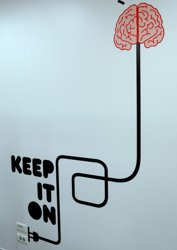
Source: Behance.net
Here's another great example of subtle humour used in a sticker design. This large wall sticker has been placed strategically next to a power socket to make it look as though the power socket is powering the 'mind'. It also has the caption "Keep it on" in large, uppercase letters (see point #3) which further adds to the humour (and helps it to stand out).
Using humour in this way can be a great way to ensure that your sticker makes a lasting impression and ultimately, generates a good return on your investment. It might not be suitable for every brand though, so make sure it aligns with your existing brand identity.
#8 - Always Keep Things Simple & To-The-Point
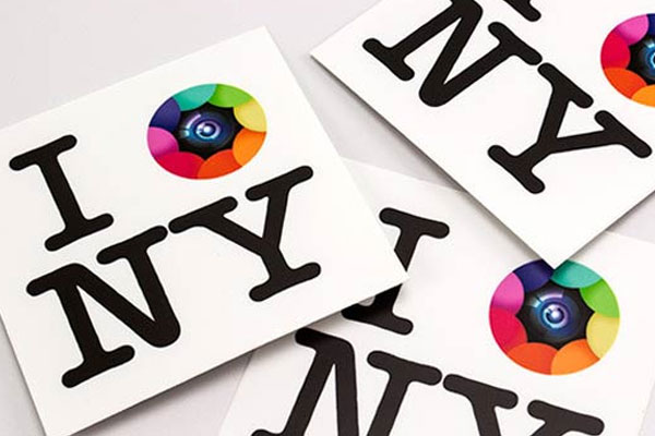
Source: Twitter.com/kapture
One thing you might have already noticed from just about every sticker that we've showcased so far in this guide is that they're all pretty simplistic and to-the-point. For almost all stickers, this is something that you need to keep in mind during the design process.
It's easy to overcomplicate your design and while a plethora of information might be appropriate for leaflets, brochures or flyers, stickers should almost always be as simple and as minimalistic as possible. In many cases, your company's logo might be all that's needed to communicate the desired message and increase brand awareness (take the aforementioned Apple stickers for instance).
If you take a look at the sticker above from Kapture, you'll see another great example of how keeping things simple and to-the-point can actually create a greater impact. Most people are aware of the "I [heart] New York" logo and this simple yet clever design plays on that fact. It replaces the [heart] with the Kapture logo.
The golden rule with sticker design is to communicate your message as simply and effectively as possible. The less text you can use, the better (in most cases).
How To Print Your Sticker
Now you've designed the perfect sticker for your business, there's only one thing left to think about: the printing process. Although this might be the final hurdle, it can be the most complicated part of the process for many.
Luckily, we're here to guide you through the process.
#1 - Choose Your Sticker Material
Source: Princessleia.com
When it comes to actually printing your stickers, you have a few different options in terms of the material they're printed on. Almost all stickers will be printed on some form of PVC/vinyl but the exact properties of that vinyl can make a huge difference to the end result.
One choice you have is whether the material on which you print your stickers has a matte or glossy finish. Almost all printing companies will give you a choice here (including ourselves at FastPrint.co.uk) and ultimately, the decision is down to you. The stickers above have a glossy finish (as you can see from the slight shine they have). Matte stickers will have less of a shine.
It's almost entirely down to personal preference when it comes to matte vs. glossy but in some cases, a matte finish can give a more premium look and feel to your stickers.
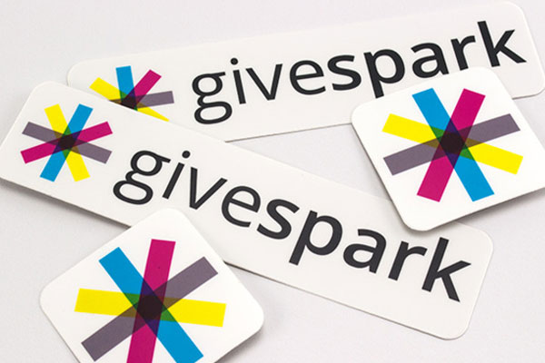
Source: Stickermule.com
Another option available to you is printing your stickers on a clear sheet of vinyl. As we mentioned earlier in the guide, this can be a great option if you're looking to create a custom-shaped design but don't want to pay a premium for a die-cutting process.
You can see an example of how this can be used on the Givespark stickers above. Although the stickers appear to have a white background, they are actually printed on clear vinyl (the white is caused by the paper-backing). This can be useful if you're planning to use your stickers on a transparent surface (e.g. plastic or glass).
It's also possible to print designs in reverse if you want to place your sticker on the inside of a window yet you want it to be visible from outside. This can be a little more complex but feel free to give us a call if you're interested in doing this (we're always happy to help!).
#2 - Set The Correct Size + Resolution
Source: N/A
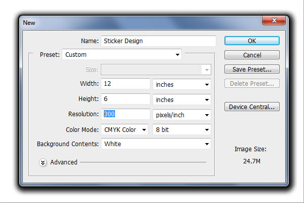
It's also important to ensure that you correctly set up your file size and resolution as failure to do this can often result in an unintentional outcome.
Most printing companies (including ourselves) require a resolution of 300DPI. If you're using Photoshop, InDesign or Illustrator, it's likely that any new project will be set to 72DPI by default, so make sure you change this before going ahead with your sticker design. You can do this when you set up a new project (as pictured in the Photoshop screenshot above).
You also need to set the correct size for your project too. Luckily, this is pretty straightforward; so long as you know how big you want your stickers to be, you can either set this in inches, centimetres or millimetres (whichever you prefer). So long as you ensure that you're set to 300DPI, there shouldn't be a problem.
Source: N/A
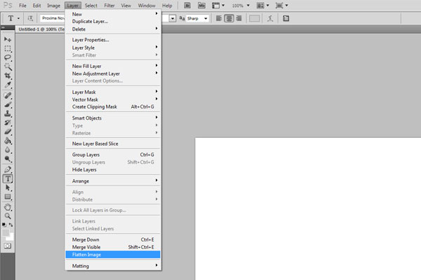
It's also important to remember that most printing companies will require that you either flatten or outline your fonts (depending on whether you're using Photoshop or Illustrator). In Photoshop, you need to both rasterize your text/fonts and then flatten the entire image. To do this, simply go to the "Layer" menu and then click "Flatten Image" (as pictured above).
In Adobe Illustrator, you'll need to go to the "Type" menu and click "Create Outlines".
#3 - Setup Your Bleed/Trim Correctly
Source: N/A
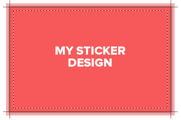
Lastly, you need to ensure that you set up your bleed and trim correctly. At FastPrint.co.uk, we require that all stickers have a 3mm bleed (the area outside the trim) to account for any discrepancies. We also require that you keep any text within a safe area which is located 3mm inside the trim line.
You can see a representation of the bleed, trim and safe areas on the image above. If you use a different printing company, the requirements for bleed and trim may vary so make sure that you consult with them before going ahead with your design.
The reason for these requirements is to ensure that none of your text is accidentally cut-off during the trimming process. The bleed ensures that you're not left with an undesirable white/clear line around the edge of your sticker design should the trimming process be one or two millimetres out.
Conclusion
It might seem like a lot of information to take-in but if you work through this guide in order, you're almost certain to end up with not only a great sticker design but also a design that has the desired impact.
One other important thing to note is that in order to obtain the desired outcome when printing your stickers, you should make sure you opt for a reputable printing company with plenty of experience in sticker printing (we've got years of experience at FastPrint.co.uk).
It's also important to remember that although this guide should act as a rough guideline for your design, the success of your own sticker will ultimately be down to your own creativity, so make sure to spend enough time (or perhaps money, if you're hiring a professional design) on the design/concept to make it worthwhile.