With corporations, organisations and individuals all around the world spending hundreds of thousands (or even millions) of dollars on the perfect logo design, it can be a pretty lucrative skill to teach yourself in today's market.
The thing is, creating a successful logo design isn't as straightforward as a lot of people think it is; this is due to the fact that there's a lot more to a successful logo than first meets the eye. Usually, when you see a brands logo, you don't consciously think about the design process or the impression it was intended to make on you. Subconsciously however, that logo is likely having a rather profound effect on the way you perceive that particular brand. This is the genius of logo design.
When a logo is designed well, it's more than just a design. It actually has the ability to communicate everything a consumer needs to know about a brand and also, directly influence buying decisions.
Now, there's a lot of logo design advice on the internet but to be perfectly honest, a lot of it is either ill-advised or unsubstantiated (or both). What's more, most online articles only talk briefly about certain elements/principles of logo design which, when taken out of context, are only mildly useful at best.
In this post however, I'll be walking through the entire process of logo design from start to finish. I'll be talking about what a logo is, what it does, what factors make a successful logo design and also, the entire design process.
So, if you want to learn how to design a logo properly, read on and enjoy.
What Exactly Is A Logo?
Source: Crowdspring.com
Logo's have been around for thousands of years in one form or another but up until relatively recently, logo's were rather primitive. If you rewind back to the 1800's, logo's were nothing more than a literal mark/symbol used by brands to let people know who the maker of a particular product was. It wasn't until the 20th Century when corporations began to trademark their identities that the modern day logo was born.
Before you can begin the logo design process, you need to truly understand what a logo is and the role it plays for a company in a modern, commercialised world. It's important to understand that there's more to a successful logo than meets the eye and although it might just seem like a pretty mark on the face of it, it's actually a whole lot more.
According to
Wikipedia, a logo is a graphic mark that is commonly used by commercial entities, organisations or individuals to aid and promote instant public recognition. As Wikipedia also states, logos can either be entirely graphical or alternatively, they can be composed of the name of an organisation (or a combination of each).
However, a logo not only has to promote instant public recognition but also has to reflect and communicate every aspect of a brand to a company's target demographic. It's also important that a logo helps to establish trust in a brand. But how exactly does a small simplistic logo design do all of this? Well, it's all down to the design.
A number of factors including colour, typography, shapes, imagery and other styling choices all come together to form a logo that is not only recognisable but also, says everything it needs to say about a brand and establishes a certain level of trust.
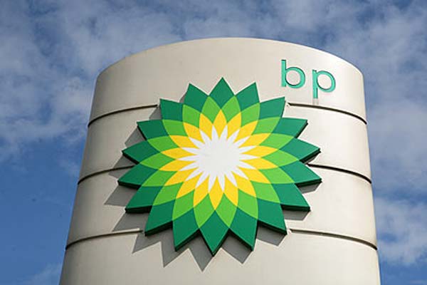
Source: herinst.org
The problem is, this isn't as simple as it sounds and some of the world's largest brands have spent millions of dollars to create the logo's we all know and love. For example, British Petroleum (BP)
spent an estimated $211 million on their logo redesign back in 2008, making it one of the most expensive logo's ever produced. But what actually makes a good logo design?
What Makes A Good Logo Design?

Source: Stocklogos.com
As mentioned above, a successful logo is not only memorable but somehow manages to say everything it needs to say about a brand whilst also establishing a certain level of trust between the organisation and the consumer. But what factors do you need to be actively thinking about in order to create a good logo design?
Generally, there are five factors that you should be taking into account in order to create an effective logo. These are:
- To ensure its memorable.
- To ensure its simple.
- To ensure its versatile.
- To ensure its timeless (to an extent)
- To ensure its appropriate.
Let's take a look at each of these five factors individually and explore each one in more detail.
Memorable
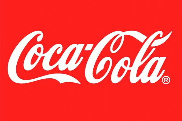
Source: Fontmeme.com
If you take a moment to think about some of your favourite brands (whatever they may be), chances are that you'll instantly be able to picture the logo in great detail. In fact, if someone asked you to draw that logo from memory, you'd probably be able to draw a relatively accurate version of the logo within just a few seconds.
For example, if I asked you to draw the Apple logo or perhaps the Coca Cola logo (forgetting the fact that it's pictured above, of course), it's likely that 99% of people would instantly be able to picture the logo and draw it quite accurately.
The reason for this is that these logos have been designed with memorability in mind. The designers have consciously made an effort to ensure that the logos are memorable and that they easily stick in people's minds. But how exactly do they do this?
Colour
Perhaps the first thing you'll notice about the Coca Cola logo pictured above (or most other memorable brands for that matter) is the colour of the logo. Colour plays a vital role in producing a memorable logo as colour is generally thought to be more memorable than black and white imagery. But what colours work best?
Truthfully, it depends on your brand and the image you want to portray but in order to make your logo as memorable as possible, the general rule is to use only two main colours. It's also important to ensure that these two dominating colours are highly contrasting (such as the red and white used in the Coca Cola logo) as this further helps the logo to stand out.

Source: Marketingeventsawards.com
Typography
Your choice of typography can also go a long way when trying to create a memorable logo and once again, if you think about some of your favourite brands, you'll realise that they've paid quite a lot of attention to this area of the design.
One brand that always springs to mind personally when I think about typography is the well-known McDonald's logo (pictured above). This logo is nothing more than a letter "M" but the unique typography helps the logo to stick in people's minds (along with the bright colour choices).
It's the same story with the aforementioned Coca Cola logo. The unique choice of typography has played a vital role in creating such a memorable and iconic logo. So remember, stay clear of Times New Roman when designing your logo!
Simplicity
Source: Thinkmarketingmagazine.com
It's important when designing a logo that you don't overcomplicate things. Most designers have a tendency to overcomplicate their designs but when it comes to logo's, simplicity is an extremely important part of the puzzle.
One of the reasons for ensuring that your logo is as simple as possible is because the more simplistic your logo is, the more memorable it's likely to be (which as discussed in the previous point, is fundamental when creating a successful logo).
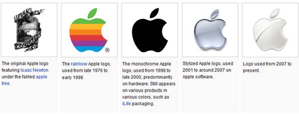
To illustrate this point, take a look at the image above. This image shows the evolution of one of the world's most memorable and simple logo's; the Apple logo. Just a couple of months ago,
Apple overtook Coca Cola as the world's number one brand and the simplicity of their current logo most definitely played a vital role in creating such a brand.
If you look at the five iterations of the Apple logo above, which one is the most memorable? Is it the first logo or the most recent logo? For most, it's sure to be the most recent logo as the initial logo featuring Isaac Newton sitting under a tree was just too complicated. The current Apple logo is much more simple, elegant and memorable.
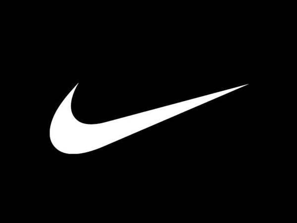
Source: Ijvcanada.blogspot.co.uk
The concept of simplicity is also proven by the Nike logo pictured above. The logo itself is nothing more than a tick (or "swoosh") but it's a logo that is instantly recognisable to most of the population.
So what should you keep in mind throughout the design process to ensure that your logo stays simple? Basically, it's all about eliminating any unnecessary parts of the design. Are you using too many colours that are cluttering your design? If so, get rid of them and minimise them to just two (as previously mentioned in the memorability point). Are you trying to incorporate too much text? If so, think about the most simple way to communicate what you're trying to say and if possible, represent that concept using graphic imagery instead.
There's an old design principle named the
KISS principle which stands for "Keep it simple, stupid". It's always good to remember this when designing your logo.
Versatility
Source: Webneel.com
It's easy to get carried away when designing a logo but it's always important to remember that your logo will need to work in the real world. Most companies use their logo on just about every marketing material they ever produce including business cards, billboards, leaflets, flyers, stickers and so forth. Logo's are also used on companies websites, products and TV ads too.
Clearly then, an extremely important factor to consider when designing a logo is versatility. By focussing on this, you'll be able to ensure that it works across a range of different mediums.
But what exactly do you need to think about to ensure that your logo is as versatile as it needs to be?
Ask yourself these questions:
- Is my logo just as effective when printed on something as large as a billboard?
- Is my logo just as effective when printed on something as small as a sticker?
- Is my logo just as effective when printed in one colour as it is in full colour?
- Will my logo work when printed in inverse colours?
- Will my logo face any problems during the printing process?
- Can my logo be scaled to any size and maintain its quality?
The last one on the list is pretty easy; all you have to do is design your logo as a vector image but with the others, they might require a little more thought and/or testing. For example, test how your logo looks when the colours are inverted and test how it looks in black and white.
It's a good idea to actually design your logo in black and white to begin with as this way, you'll automatically focus on shape and form rather that the
psychological effect that colour may be having on the design. You can add the colours later in the design process.
Timelessness
Source: Rohitcgartist.blogspot.co.uk
One thing's for sure; designing an effective and memorable logo isn't a cheap process. As mentioned earlier, brands around the world spend millions of dollars creating and updating their logo designs and to be honest, this is only the case because they didn't put enough effort into creating a timeless logo in the first place.
When you're investing time and money in creating a logo, you really don't want to have to update it every couple of years and therefore, ensuring your logo is timeless (to an extent), should be a conscious consideration during the design process.
Basically, you're aiming to create a logo that will still look just as fresh as it does right now in 5, 10, 50 or even 100 years if possible. But how exactly do you do this?
The answer is by making sure not to follow design trends. Design trends come and go and if you follow current trends (such as the current "flat" design trend), chances are that your logo won't stand the test of time all too well.
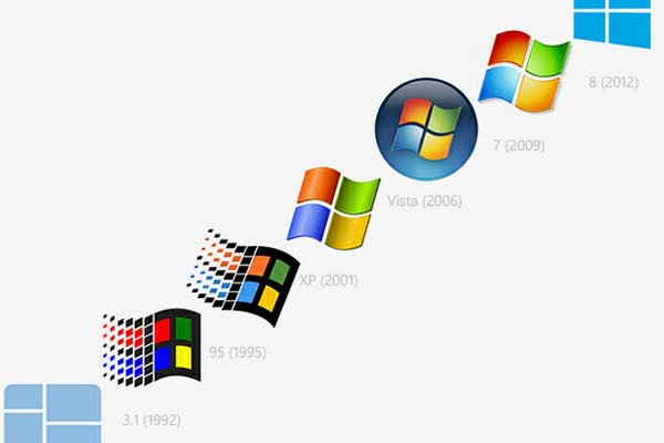
One brand that is constantly following design trends is Microsoft. You can see from the image above that they've had seven logo redesigns in just 20 years. That's a logo refresh every 2 - 3 years on average.
Source: Blankyouverymuch.com
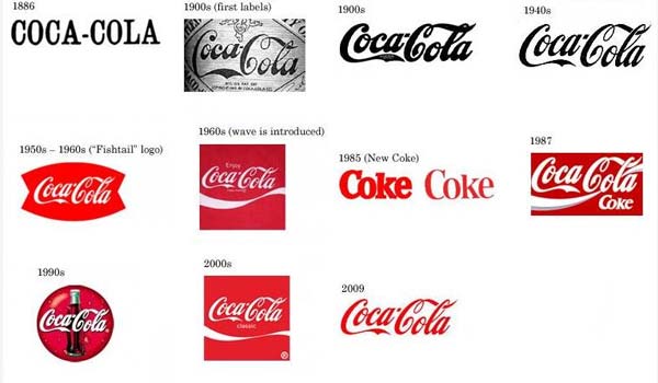
Compare this with the Coca Cola logo and you'll notice that the fundamental design of the logo hasn't changed since the early 1900's; this means that the Coca Cola logo has been around for approximately 110 years. It is truly a timeless logo.
Pepsi on the other hand has completely revamped their logo on countless occasions over the same time period as you can clearly see from
this comparison. They regularly change the font, design style and colour scheme which ultimately, has allowed Coca Cola to obtain a higher percentage of the market share over the years.
Appropriateness
Source: Goodereader.com
When designing your logo, it's important to ensure that your logo is appropriate for the intended audience of the corporation that it's being designed for.
If you think about it, every business has a target market (e.g. women aged 18 - 25 or children aged 2 - 10) and to ensure that your logo design is a success, you need to design it with this audience in mind. This means that colours, style, typography and so forth should be chosen so that the final design appeals to the intended audience.
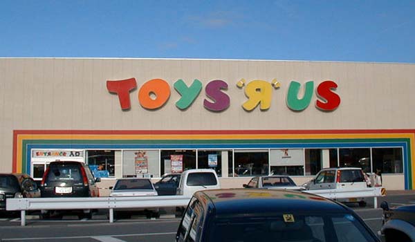
A good example of appropriateness playing a fundamental role in logo design is clearly visible in the Toys R Us logo pictured above. Toys R Us is a brand that sells children's toys around the world which means that ultimately, children are their customers.
It's for this reason that the Toys R Us logo has been designed using a rather childish font and colour scheme consisting of multiple colours. The final logo might not appeal to you and I, but it clearly appeals to children.
However, if you were designing a logo for a solicitors, funeral parlour or cloud computing company for example, this logo design wouldn't be appropriate at all. You'd have to take a completely different approach to the design.

Source: Ibm.com
For example, take a look at the IBM logo above. IBM is a company whose products are primarily aimed at business/corporate customers and as you can see, this is clearly represented in the logo design style.
The logo utilises a corporate-looking serif font and portrays an image of trustworthiness to the consumer. Typography plays a vital role in the appropriateness of a logo design as generally, serif typefaces are more corporate and serious looking than playful sans-serif typefaces.
Colour, boldness and imagery can also have a profound effect on the appropriateness of a logo design; as can the inclusion/exclusion of a trademark logo.
The Process Of Creating A Logo
Although you now know what elements a good logo consists of, you might think that you're ready to delve head first into the logo design process. Unfortunately, there's still a lot of ground to cover before you get to this stage.
The truth is that if you don't follow a logical and well thought-out design process, you're going to have a tough time creating an end-result that actually adheres to the aforementioned design principles. Almost all logo designers embark on a similar process when designing a logo, no matter what corporation, organisation or individual the logo is for.
This design process consists of the following stages:
1.Briefing
2.Brand Research
3.Logo Research
4.Initial Sketch & Conceptualisation
5.Analysis
6.Production
7.Presentation
Let's discuss each of these steps in a little more detail.
Briefing

Soruce: Frontlinedisplay.com
The initial briefing is one of the most important elements of any graphic design project, be it logo design or otherwise. Unfortunately though, briefing can often be rushed and in many cases, a rushed brief can lead to an unsatisfied client and also, a more difficult job for the designer.
If you're unsure what the briefing process entails, it's essentially the process of gathering the initial information from the client (usually face-to-face) and understanding exactly what they want from the logo.
Although you're the one with the design expertise, you need to understand exactly what the client is looking to achieve, what their particular brand values are and a variety of other pieces of information. Here are the most important things you need to make sure to understand during the briefing session:
- Client profile and brand values
- Aims and Objectives
- Target market/demographic
- Primary Competitors
- Budget
- Project Timeline
The trick here is to get as much detail as possible. For example, if your client happens to give a relatively vague response when asked about their target market/demographic, make sure to delve further and ask more direct questions. Ask them about age groups, genders, income levels, ethnicity and so forth. The clearer picture you can get of the demographic, the easier the design process will be.
Similarly, you need to understand the clients aims, competitors, budget, key deliverables and project timeline too. Failure to understand these things will once again lead to disparities between yourself and the client which in most cases, makes the design task more difficult. Plus, there's nothing worse than an unhappy client asking for endless design revisions.
For further help creating a brief for a logo design project, take a look at
this guide. It goes into a lot more detail about each part of the briefing process.
Brand Research

Source: Lehman.edu
During the initial briefing process with the client, you should start to understand certain elements of their business and their core brand. However, there is still a lot of work to be done before you can start any element of the actual design process.
You need to understand the clients brand and business operations as much as you possibly can and to do so, you're going to have to do your fair share of research.
For example, let's assume that you were asked to design a logo for a new health and weight loss brand similar to Weight Watchers. Obviously, you'll obtain some of the information you need from the initial briefing session with the client including (hopefully) a list of primary competitors, target demographic and a general overview of their business.
However, during the Brand Research stage of the design process, you need to take this even further. For our example project, you'd likely need to research the health and weight loss industry itself as much as you possibly could. You'd want to find out about the history of the industry, the demographics of the industry, how much the entire industry is worth and so forth. You'd also want to delve deeper into the competitor research to better understand each brands position within the market.
Source: Ediets.com
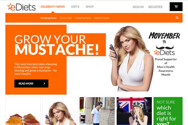
For example, Weight Watchers has a number of primary competitors including Jenny Craig but also, a few lesser known competitors such as eDiets.com (pictured above). It's likely the lesser known competitors won't be mentioned by the client during the briefing stage, yet could still provide vital information for a logo designer such as yourself.
Basically, the more information you can obtain during this stage, the easier the design process will be. As a logo designer, it's extremely important to have a clear understanding of who you're designing the logo for. Remember, although the your client is technically the brand you're working for, you're not actually designing the logo for them. You're designing the logo for their target demographic.
That in itself is a common mistake that logo designers make.
Logo Research
Sources: Multivu.prnewswire.com New.pentagram.com
Now you know enough about the brand, it's competitors, the market and so forth, it's time to start the next stage of your research; logo research.
So far, you've only focussed on the business side of things during the Brand Research stage but now, you need to research actual logo styles based on the information you've acquired so far. By the end of this stage, you should have a pretty good idea of the style and overall look and feel of the logo you're going to create. But how do you go about doing this?
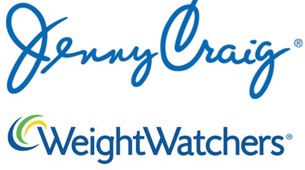
The most simple way to carry out your research is to look at the logo's of other similar businesses and analyse the style. For example, in our health/weight loss related example, you might want to look at competitors logo's such as Weight Watchers, Jenny Craig and eDiets; all of which have a slightly different style and are also aimed at slightly different demographics as you can see from the image above.
You should be looking at typography, colours, imagery, style and the overall look and feel. Usually, logo's will have similar qualities when they're aiming at similar demographics. For example, you can see that although the typography couldn't be more different, the colour's used are very similar (blue and white primarily) with the Weight Watchers and Jenny Craig logo's.
If you
take a look at how different colours represent different emotions, you can see that blue presents an image of authority, success and confidence; all of which are perfectly suited to a weight loss brand. It's at this stage that you'll start to make design decisions based on your findings.
For example, blue may be a good choice for our new weight loss brand but similarly, you may opt for a completely different colour that is more suited to the brand guidelines of the organisation you're working for.
Although the final design decision is ultimately down to you (the designer), Logo Research is an extremely important part of the process as it can often influence design decisions greatly.
Initial Sketch And Conceptualisation
Source: Graphicdesignblog.co.uk
You'll be glad to hear that you've finally completed the initial research stages of the design process at this point and that now, it's time to get creative and actually start designing the logo (well, the initial concept at least).
Obviously, nearly all logo designs are produced on computers these days but right now, you shouldn't be anywhere near a computer. The first part of the actual design process should always be carried out using a traditional pencil and paper (or whatever drawing implements you choose).
If you've carried out the research so far thoroughly enough, you should now have a good idea of what your logo is likely to look like. It doesn't matter if you don't have the perfect concept or idea yet though as that is what the sketch and conceptualisation process is for.
During the sketching process, you should let your imagination run wild (to an extent). Don't be afraid to sketch down a few concepts/ideas (much like in the image above) and don't be afraid to fail.
Source: Brandspankingnew.net
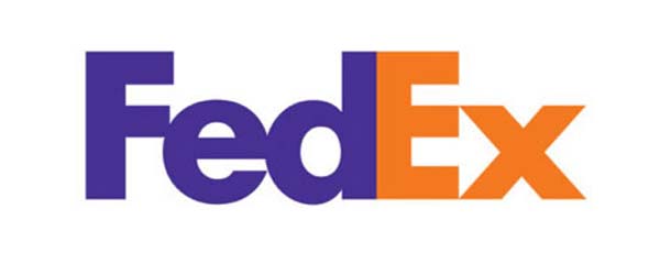
If you're focussed on a simple graphic style for your logo (such as the Coca Cola logo for example), go ahead and play around with the typography and style of the font when sketching your designs. If, on the other hand, you're looking to create a conceptualised logo (such as the well-known FedEx logo above), sketching on paper is just as important.
Generally, conceptualised logo's have a greater effect on the end viewer and tend to be more memorable but clearly, not all logo's have to feature a concept like the FedEx logo. In fact, some of the most memorable logo's in the world (e.g. Coca Cola, Pepsi, BP etc) don't feature such a concept.
The important thing to remember during this process is not to throw any of your designs away. Even if you have a page full of rejected concepts, keep them and take them forward to the next stage of the process.
Analysis & Mock-up
Source: Graphicsfuel.com
By this stage, you've probably got a few logo designs/concepts sketched out and it's likely that one or two of them are standing out as serious contenders.
During the Analysis & Mock-Up stage, you'll be choosing which design/concept is the best and then producing a digital mock-up of that logo to show the client.
Although this might sound easy (like I said, you've probably already got a favourite in mind), it can actually be one of the more difficult parts of the design process. The reason for this is that you're already biased and have likely already chosen a favourite design/concept.
While this is good (it shows you have an eye for design), it can also be a negative thing. For example, in some cases, you might have produced a terrible design on paper but a great concept might have been there. In other cases, a couple of your designs might be average but when the positives of each are combined, you're left with a perfect logo design.
So, take your time with this stage and don't rush it. Have a few hours rest and forget about the project as when you come back, you'll see your designs in a fresh light and the analysis stage will be a lot easier.
Only then should you produce your digital mock-up (ideally in black and white at this stage).
Presentation (optional)

Source: Bestdelegate.com
It's likely that by this stage, a good few weeks have passed since your initial briefing with the client and they're probably expecting to see results pretty soon. Luckily, you have a fully formed digital mock-up to show them so give them a call, grab your iPad and head down to their office to show them your creation.
Obviously, the ideal outcome here is to show the client the mock-up and hear the words "well, that seems perfect" but as you know, this is very rarely the case in the graphic design world. It's likely that your client will have some feedback on your design, be it mostly positive or negative.
Either way, it's important to remember that although they're your client and they're paying you, you're the one with the logo design expertise and you likely have a better understanding of logo design concepts than they do (hence them hiring you). Therefore, any critique they give should always be taken with a pinch of salt, although it is often wise to take at least some of it on board.
It's for this reason that this stage is optional, as some graphic designers prefer to only show the client the finished product, rather than bring them into the design stage before the design is fully-formed.
Ultimately, it's your choice.
Production

Source: Pentabletreviews.blogspot.co.uk
The final part of the design process is essentially to produce your final logo. During this stage, you'll be working with your mock-up and transforming it into the final design.
To do so, you'll need to focus on refinements, adding colour, shading and so forth. You might also want to take any feedback on board from the client when finalising the design.
Remember, although you'll be adding colour and possibly other attributes to your final design, make a conscious effort not to overcomplicate it. Your logo design should be as simple as possible in order to maximise memorability.
Actually Getting The Job Done
Source: Itunes.apple.com
We've talked a lot about design principles in this guide but when it comes to actually getting the job done (i.e. designing your logo using digital software), you're going to need to actually acquire the software and any additional tools you need.
What's more, there are a lot of different design applications that are competing for your custom as a graphic designer; so which one should you choose?
Honestly, there are only a few choices for professionals and these are
Adobe Illustrator, Adobe Photoshop and possibly GIMP. Personally, I'd recommend that anyone serious about logo design uses Adobe Illustrator. Illustrator has a beautifully streamlined interface and offers a lot of functionality. It makes designing logos in a vector format easy as well.
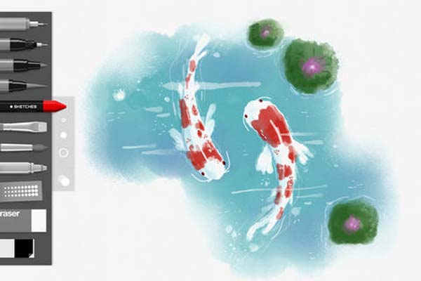
There are also a number of iPad apps including Tayasui Sketches (pictured above) that can help get the job done. Tayasui Sketches is great for sketching out your designs in a digital format.
Source: Sussex.ac.uk
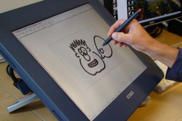
On the hardware side of things, a Windows PC or a Mac is perfectly acceptable for logo design as both allow the installation of graphics design software such as Adobe Illustrator.
A traditional keyboard and mouse is also usually enough on the hardware side of things but some logo designers might prefer a graphics tablet (such as the industry-leading Wacom tablet) as an input method. This can be great for creating illustrated logos and/or custom typography designs.
Conclusion
Phew, that was a long one wasn't it!? It might seem like a lot of information to take in right away but trust me, when you begin your next logo design project, I'm sure there'll be at least a few aspects of this post that will come in handy.
If you follow the design principles and advice laid out in this post, I'm confident that you'll end up with a beautifully well-designed, simplistic and ultimately memorable logo design that will represent your client's brand (or your own brand) perfectly.
However, it's important to remember that the exact design process varies from designer to designer and that usually, each designer has a slightly different way of doing things. So, whilst this guide should serve as a base for your logo design project, don't be afraid to experiment and do what feels right for you.
Now I want to hear what you have to say:
What’s the #1 takeaway point you got from today’s post?
Leave a comment below right now.