Source: www.pmdhealthcare.co.uk/marketing-support/design-print.html
As a print designer, you'll likely be no stranger to the issue of inaccurate colour-matching between the on-screen version of your design and the printed version. Most of the time, your designs will probably look absolutely perfect on your computer screen but when you receive your expensive pack of five-thousand brochures back from the printing company, you'll start to notice inaccuracies in the colour reproduction.
Sometimes, this can just be a minor problem and it might not cause much of an issue but if you're working with a high-profile client, you need to make sure you're getting things as accurate as possible. They'll expect things to be perfect.
As one of the UK's leading printing companies specializing in banners and stickers, we get asked a lot about colour-matching by our clients and although we're always more-than-happy to give advice (seriously, give us a call!), we recently realised that we were telling most clients the same things. We also know how mind-boggling the process of colour-matching can be.
It's for this reason that we decided to create a straightforward guide to colour-matching your print projects. We cover everything you need to know in the guide so without further ado, here it is:
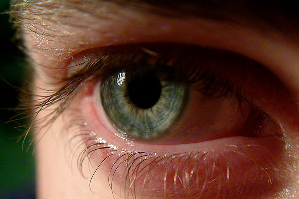
#1 - Check Your Vision
Source: www.flickr.com/photos/samjuk/1129245762/sizes/z/in/photolist-2HMF
Before we get started with any of the more technical stuff, we need to cover the basics. A lot of people get bogged down with making a host of technical alterations (many of which we'll be discussing further on) but it's important to realise that if your eyesight isn't up to scratch, no amount of technical adjustments are going to help.
For most people, one eye will be slightly more sensitive to certain colours that then other, so it pays to visit the opticians regularly and keep on top of any problems. Usually, you'll be prescribed a prescription to correct any differences and ensure that you're able to judge colour as accurately as possible.
If you are given a prescription for glasses or contact lenses, make sure to wear them when working on a project. If you fail to wear the glasses you're prescribed, you'll lose your ability to correctly judge not only colour, but also brightness and contrast in some cases. You'll likely find it much more comfortable to wear glasses when designing too (if needed) as it will eliminate eye-strain.
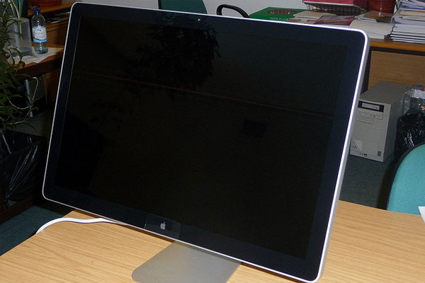
#2 - Buy A High-Quality Computer Monitor
Source: www.flickr.com/photos/pahudson/3633580726/sizes/z/in/photolist-6x63Xy
Although it might be tempting to purchase that £49 monitor on sale at your local computing store, it's usually wise to give it a miss and invest in a higher quality monitor.
The problem with the lower-end monitors is that they often don't reproduce colour with great accuracy. A lot of them also come with their own in-built colour profiles that although might appear vastly-improved to an untrained eye, very rarely help when trying to accurately match colours for a printed project. You might also have a problem with colour-banding on some of the cheapest models.
Basically, using a cheap monitor will make it a lot harder to judge how your printed project is going to turn out as it'll be pretty much impossible to match colours properly.
We recommend investing in a high-quality LED display (not LCD) and also making sure that any in-built colour profile is turned off. You want to keep things as natural and true-to-life as possible.
Apple displays are probably some of the best displays you can purchase if you're a designer as they're high-quality, have a high-resolution and tend to judge colour quite accurately.
#3 - Improve Your Workspace
Source: www.flickr.com/photos/kansirnet/8267071176/sizes/z/in/photolist-dAwUeW
Even with the greatest computer monitor on the planet, you might still not be allowing yourself an accurate viewing experience due to the set-up of your workspace. There are a variety of workspace-related factors that can directly impact how you perceive colour on your monitor so if possible, you need to try and avoid them.
One of the biggest problems is glare. We're sure that almost all of you will have experienced glare on your monitor at one point or another but if you find that this is a problem, try switching the orientation of your desk away from sunlight and/or changing your viewing angle. It also helps to opt for an anti-glare monitor if possible.
Another problem that you might not realise is affecting your ability to judge colour accurately is the lighting around your workspace. If you're working in overly-dull or bright conditions, your eyes will naturally adjust and this too will cause problems with colour-matching.
Even if you can avoid all of these factors, you still need to make sure that you're viewing your monitor straight-on. Most monitors don't reproduce accurately when viewed off-centre, so make a conscious effort to set-up your workspace as ergonomically as possible to avoid this.
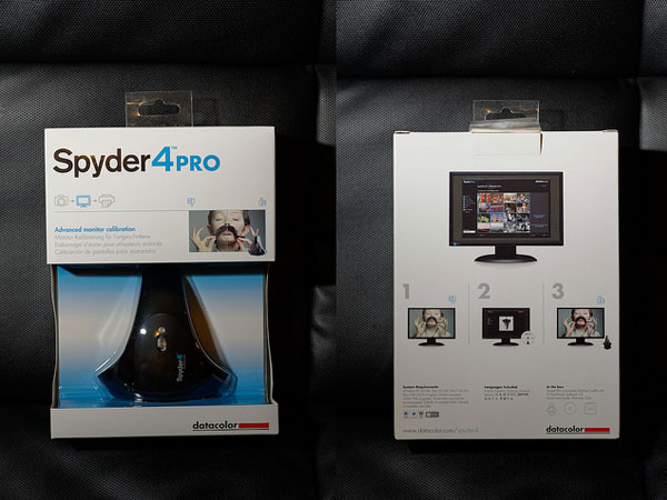
#4 - Properly Calibrate Your Monitor
Source: www.flickr.com/photos/tsaiid/10644936625/sizes/z/in/photolist-hdE5N6
Now you've got all the basics set up, it's time to get a little bit more technical. The next stage of the process is to properly calibrate your monitor to ensure that the colour on the display is as true-to-life (or more importantly, true to your printed projects) as possible.
There are a couple of ways to do this. Obviously, you can simply judge your monitor with your vision but honestly, this isn't going to give you very accurate results. The easiest and most accurate way is to use a colour calibration device.
There's quite a few colour calibration devices on the market but one of the best available at the moment is the Spyder 4 (pictured above). This device works by measuring the level of light being emitted by your screen along with the level of ambient light around your workspace; it then automatically adjusts the colour range of your monitor to compensate for both factors.
Most of these tools are usually pretty straightforward to use and come with detailed instructions. These days, most colour calibrator devices are pretty much plug-and-play and do all of the hard work for you.
If you're not prepared to invest in one of these devices (they can be picked up for £50 - £70 in most cases), it might be worth using the in-built colour calibration options that your home printer may have. Not all printers have these, but it's worth checking if they do.
#5 - Use The Right Colour Profiles
Source: pencil-x-paper.deviantart.com/art/31-3-2013-CMYK-371299846
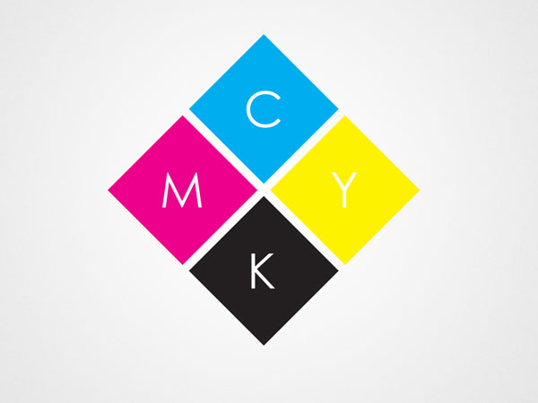
Another common mistake when designing for print is actually creating the design using the wrong colour profile. Typically, most monitors/computers will display colours using the RGB or sRGB colour profile by default, but this is rarely the best colour profile to use when designing for print.
If you're planning to send your project to a professional printing company, it's likely that their printers will use a CMYK (Cyan, Magenta, Yellow and Black) colour profile rather RGB (Red, Green and Blue). This will cause problems if you've created your design using the RGB colour profile and you'll likely experience a noticeable difference between how the design looked on screen and the final printed product.
If you're using any form of Adobe software (Photoshop, Illustrator etc), you'll have the option to use a number of other in-built colour profiles, including Adobe's own AdobeRGB profile. You can also select the CMYK profile. This is true for a lot of other professional design and image editing software too.
It's important that you choose the colour profile based on the output device that you intend to use. If you're unsure, consult with your printing company to see which colour profile is the most appropriate; they'll usually be happy to help and give advice.
#6 - Use The Pantone Colour Library
Source: www.colorguides.net/gpc002.html
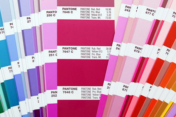
If perfect colour-reproduction is required for your project across a variety of different mediums, then you might want to consider using the Pantone colour library.
Pantone is essentially a library of various colour swatches that can be used as fixed colour references during the design process. If you're working on branding (which will usually require accurate colour reproduction across a multitude of different mediums) or have a high-profile client, using the Pantone system is often the best way forward.
Almost every professional design application (e.g. Photoshop) supports the Pantone colour profile, thus making it easy to get to grips with. If you need to show a client the exact colour of their design when printed, you can order sample chips from Pantone that are 100% colour-accurate. These can be quite expensive however, and they also need to be replaced on a regular basis as the colours fade quite quickly (due to light).
There are other colour libraries out there but Pantone is probably the most well-known. Feel free to explore other colour libraries too though.
#7 - Make Use Of Soft-Proofing
Source: N/A
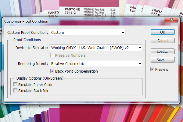
One of the most accurate ways to judge the outcome of a printing run is to print a hard-proof. A hard-proof is essentially a one-off print that serves as a verification tool for you or your client. It is printed before starting the mass print-run.
The problem is, this can be expensive and time-consuming but luckily, you can simulate the proofing processon-screen using the soft-proofing method.
Photoshop is one of the many professional design applications to offer this feature. To start, navigate to the Proof Setup option which is located under the 'View' menu on the Photoshop menu bar. Here, there are a number of presets to choose from including Working CMYK and Apple RGB, but you can also create your own custom soft-proofing profile; this is great if you have a particular printer in mind and want to test the results before printing.
You can also simulate paper colours and black ink. Other design applications may offer more/less options than Photoshop, so make sure to take a look.
It's important to make sure to change the proofing profile you're using if you ever change your output device. For example, you might change the profile to CMYK when creating a project for a professional printing job, but you need to remember to switch back to the original profile when you're using your home inkjet printer.
#8 - Discuss The Project With Your Printing Company
Source: blog.instituteartistmanagement.com/posts/lecturetalks/page/3/
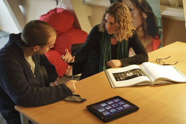
So far, we've talked about everything you can personally alter to ensure that your projects are perfectly colour-matched, but you can only go so far. If you're planning to send your project to a professional printing company, it pays to discuss your project with them and let them work things out on their end as well.
This is paramount if you're attempting to recreate the colour profile of an existing printed material, as the printing company will need to do a certain amount of colour-matching themselves. By providing a reference material for the printing company to work with, you'll be able to further increase the colour reproduction accuracy for your printed project.
This is due to the fact that colour reproduction can be affected by the printers exact mix of base colours (e.g. Cyan, Magenta, Yellow and Black) along with the paper stock used.
It should be noted that although most printing companies will be more than happy to work with you on this, you still need to make the effort to reproduce the colour as accurately as you can by yourself. This will make the printing companies job a lot easier.
Conclusion
Although it might seem like a lot of effort just to match a few colours, we can promise you that the results will be worthwhile. Your designs will look better than ever as they'll look the way you truly intended them to look, even when they're printed by a third-party printing company.
What's more, most of the points on this list will only need to be set-up once, so although they might appear time-consuming (and possibly time-wasting), you can rest assured that once you have the right monitor, the right workspace layout, the right colour profile and have calibrated your monitor, things will be a lot more simple next time you start a design (until you buy a new computer/monitor of course).