Source: Creativebloq.com
Packaging is something that all of us come into contact with every single day. It doesn't matter if you're out shopping at your local supermarket, preparing lunch at home, eating out at a restaurant, shopping for a new outfit or even just buying a bottle of water during a lunch break, product packaging is an unavoidable part of everyday life.
Most consumers never really think about product packaging in a conscious way (unless you're a packaging-obsessed marketing professional that is), but you can be certain that your subconscious mind is constantly analysing every piece of product packaging it comes into contact with (whether you want it to or not) and secretly deciding whether or not you should make a purchase.
If you're reading this post, I can only assume that you're a business owner selling your own range of products. I'm also assuming that you already realise the importance of effective product packaging and that you're considering a rebranding exercise in the near future.
If so, you've come to the right place as this, without a doubt, is the most comprehensive guide to rebranding your product packaging anywhere on the net. In this guide, I'll be walking you through the entire process of packaging rebranding (and that's not an understatement either!).
Unlike most of the other guides on the net, I won't be offering a few vague tips and expecting you to fill in the blanks on your own. Instead, I'll be focussing on the whole process and covering everything from the importance of packaging, when/why you should rebrand, the rebranding process itself and every last detail you need to think about.
It's a long one but trust me, it'll be well worth it! Let's get started.
The Importance Of Packaging
Today, brands all around the world pump millions of pounds a year into perfecting their product packaging designs but it hasn't always been this way. If you rewind a few decades, product packaging was viewed in an entirely different way.
It was once thought of as simply a container for a product, nothing more. The top priority for most brands was simply to minimise the cost of this packaging as much as possible to ensure that they maximised the amount of profit on the goods that they were selling.
Packaging is now viewed in an entirely different light and for most brands, it's a fundamental part of their sales strategy. Brands all around the world now understand the huge value that packaging holds and the role it can play in the process of generating sales.
The main reason packaging is so important is this: According to a global shopper study, around 70% of shopper purchase decisions are made in store. Let's think about that for a moment.
That means that despite the millions of pounds spent on product marketing (TV, online, radio etc) every year by the world's largest brands, a consumers decision as to whether or not to actually buy a product is not made prior to visiting a store but instead, at the store itself.
This means that although you might be able to inform potential customers about your products(s) via a multitude of marketing/advertising techniques and thus influence their want/need to purchase your product to an extent, their final decision to buy will not be made until they physically visit a store.
The problem here is that in most stores (especially supermarkets and huge department stores), there are a variety of brands and products on offer within a relatively small area.
Source: Superpunch.net
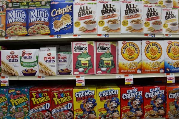
Let's take cereals for example. I must see a cereal commercial on TV every single day (probably multiple times too) but once I get to the store, there must be 10 - 20 different brands of cereal right next to each other on the same shelf (like in the image above). I'm presented with a multitude of different colours, fonts, slogans, brands, box sizes and so forth.
So, even if I had a predefined cereal choice in mind to buy upon arriving at the store, chances are that I'm also going to consider other brands that are presented in front of me when I'm actually there.
At this point, the product packaging/branding is often what defines a sale. It's all down to how the packaging and branding communicates (more on communication later) with the consumer. If it communicates well and fulfils their desires, they're going to buy it. If not, they won't. It's as simple as that.
The same is true for a multitude of other products; drinks, DVD's, stationary, electronics products (e.g. iPad's, mobile phones etc) and so forth.
Why Should You Rebrand Your Packaging?
Obviously, this is all well and good but the fact of the matter is that if your business is already selling a product, it's likely that you already have some form of packaging in place. I mean, unless you're in the fresh fruits and vegetables industry (or something similar), how can you possibly sell your product on a large scale without packaging?
The answer is; you can't. So, if you already have packaging, why would you possibly need to worry/think about rebranding at all? Here are a few reasons:
To reflect an overall company rebranding (and improve consistency):
Source: Chriswoods.co.uk
Sometimes, it's not just the packaging that you'll be looking to rebrand but instead, the entire companies branding. Rebranding a company is a surprisingly common occurrence and over the years, many of the world's biggest brands have either entirely rebranded or at least changed some of their brand guidelines.
If you're planning to rebrand your company, it's likely that a lot of different things will change. Often you'll change your colour scheme, styling, logo and so forth and clearly, you'll want to rebrand your product packaging to reflect the rebrand (in order to keep things consistant).
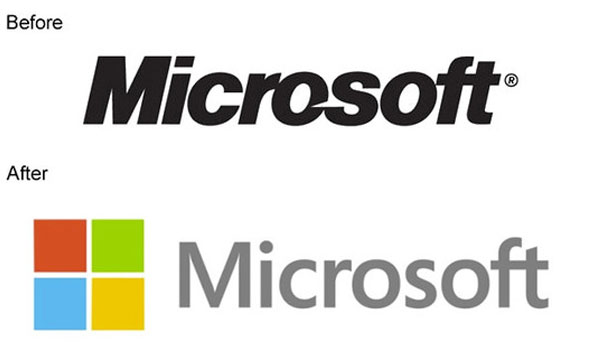
One of the companies to recently rebrand is Microsoft. Microsoft has a lot of different products/services and before the rebrand, the consistency of the Microsoft brand was becoming rather fragmented. There were different logos/styles and packaging designs for Microsoft computers than there were for other services/products (such as Xbox) and so forth.
So, Microsoft made the decision to radically redesign their brand and of course, this meant a packaging redesign too. You can see the new Microsoft logo vs. the old Microsoft logo above. This is the logo that is now present on all Microsoft packaging.
Source: Microsoft.com
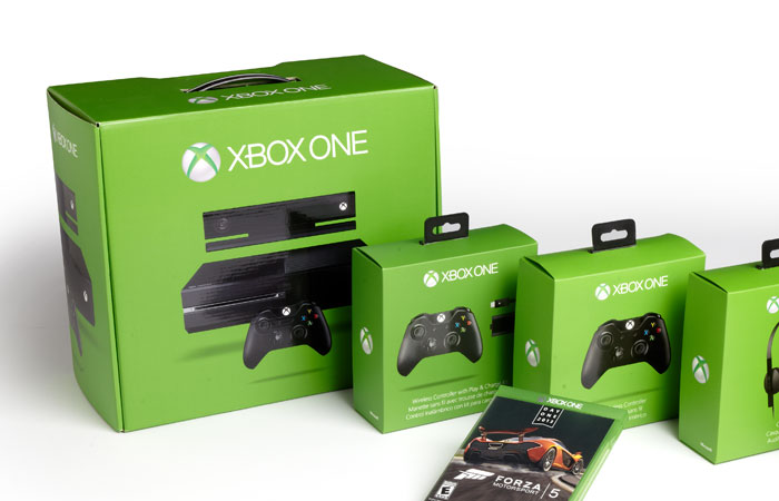
Microsoft packaging for all Microsoft products now adheres to the same style of design too, making Microsoft products instantly recognisable on the self. For example, if you take a look at the upcoming Xbox ONE packaging above, you can see that it has the same "flat" and simplistic design style that the Microsoft logo and other product packaging shares (along with the latest Windows 8 operating system).
This is a vital thing for every business to think about. If you don't have a consistent design across all product packaging, you're likely to see less sales. This is because shoppers learn to recognise the styling of brands and subconsciously, often lookout for these styles, logos and whatnot as they trust them.
To attract a new audience:
Source: Cultofmac.com
Attracting a new audience is one of the most common reasons for rebranding product packaging.
If you think about it, your product packaging will always appeal to a certain type of consumer. If your product is packaged in a pink box with pictures of the product being used solely by females, it's likely that your product will appeal almost entirely towards a market of female consumers. Very few males would buy it.
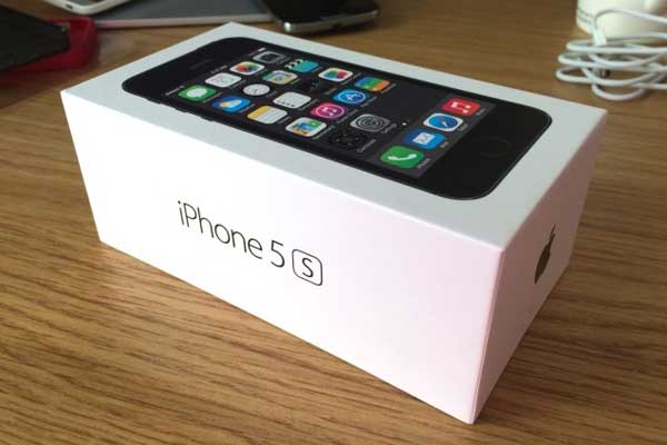
On the other hand, if your product is packaged in a beautiful matt white box made out of high quality materials (much like the Apple iPhone box pictured above), your product is going to appeal to a completely different type of consumer. In the case of Apple's iPhone, the consumer is one with a love for simplicity, elegance and quality who is prepared to pay a premium for a product with said attributes.
Occasionally though, you might want to broaden or change the audience your product(s) is aimed at. One recent example of this that springs to mind is McDonald's packaging rebrand/redesign.
Up until a few years ago, McDonald's was no different to any other fast food restaurant. Their food was unhealthy (it is fast food after all) but very few people really realised how unhealthy it actually was and therefore, it wasn't a problem for McDonald's.
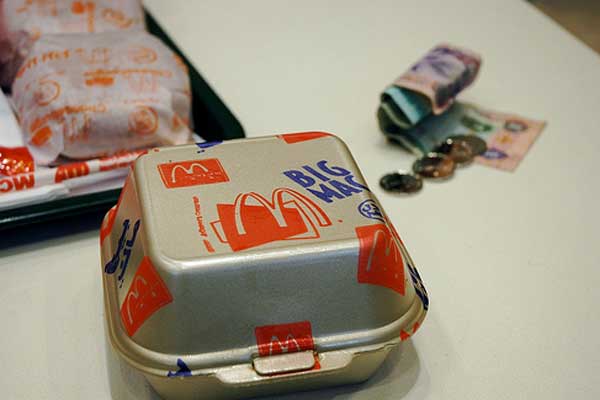
Source: 2ndgreenrevolution.com
McDonald's packaging reflected this fact. If you take a look at the old Big Mac packaging above, you'll notice that there are many differences when compared to today's packaging. There's no information about calories/protein/fat etc and very little reference to health/nutrition in general.
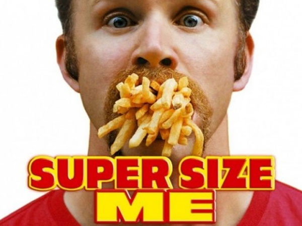
In 2004 though, a movie called Supersize Me was released. In the movie, Morgan Spurlock documented an experiment. He ate solely McDonald's food for an entire month and documented the decline of his health throughout. It was an eye-opener and clearly, McDonald's custom suffered because of the movie.
It opened people's eyes to the ill-effects McDonald's food was having on their health and many boycotted the fast food chain. Consumers had become more health-conscious and for the first time ever, this was reflecting their buying decisions on a large scale. Because of this (along with an increasingly health-conscious popular regardless of the movie), McDonald's needed to appeal towards this demographic.
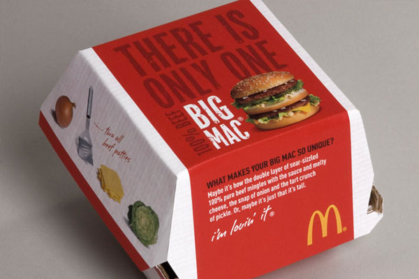
Source: Ilooklikeanthonymichaelhall.com
So, McDonald's branding/packaging department stepped into action and created the packaging we know today (pictured above). If you look closely at this packaging, you'll see much more emphasis on nutrition/health. It talks about the ingredients on the side of the box (lettuce, 100% beef etc) and on the bottom, it contains nutrition/calorific information. It also has beautiful imagery of fresh ingredients which further emphasises the products nutritional benefits.
This packaging redesign allowed McDonald's to appeal to a new audience of health-conscious individuals; individuals that previously might not have even stepped foot in a McDonald's restaurant.
To counteract negative publicity:
Source: Thenextfamily.com
Strangely, this is another reason for packaging rebranding that can be demonstrated by the McDonald's fiasco mentioned in the previous point. Upon the release of the Supersize Me movie, McDonald's received more than their fair share of negative press which clearly, had a negative effect on sales.
Consumers were outraged at the amount of fat, salt and other substances present in McDonald's popular fast food items and McDonald's had to act quick. Whether the claims portrayed in the Supersize Me movie were accurate or not was irrelevant as the bad press was hurting McDonald's sales nonetheless.
This was another reason for the packaging change that McDonald's made shortly after the release of the movie. Not only did they change their product packaging, they also changed the way the brand was presented in a number of ways. For example, if you look at McDonald's website, you'll see that ingredients, produce, sustainability and nutrition are all at the forefront of their brand message.
Although McDonald's is a pretty extreme example (very few brands receive such negative publicity from a single instance), negative publicity does affect a lot of businesses (even some of the best).
Source: Softwarewithstyle.com
For example, with the release of the Apple iPhone 4, there was a lot of negativity surrounding the Apple brand due to antenna problems with the phone. Apple being a company not used to such negative criticism famously handled the incident in an exceptionally poor manner.
If your business has received negative publicity, you've probably gone out of your way to correct the problem(s). Even if you've done this though, people often only remember the negative press and sometimes, your product packaging simply becomes a branded embodiment of this negative perception. Essentially, your product packaging could be holding your brand back due to the negative perception of potential customers.
Changing your packaging branding/design can change all of this and represent your company in a new light. Psychologically, the rebranding of product packaging can serve as a metaphor for a greater change. It says "hey, we might have had problems before but we've fixed them now, give us another shot!".
To increase relevancy:
From time to time, people's wants and desires change. The world is moving faster than ever and in the last few years, more companies than ever have been forced out of the market due to irrelevancy. Take Blockbuster for example. Blockbuster was once the leading video rental company around the world but just a few months ago, the company was on the verge of bankruptcy as their offering just isn't relevant any longer.
People are now streaming content online rather than physically obtaining content in a physical format (i.e. DVD etc). NetFlix, LoveFilm and other competitors packaged the same content (a movie or TV show) in a more relevant way whilst Blockbuster's packaging stayed the same (i.e. a physical DVD disc).
Perhaps a more relevant example of increasing the relevancy of a product through product packaging came during the rebrand of Tesco's Value range around a year ago.
Tesco (a leading supermarket in the UK) had an extremely profitable range of "value" products that had been successful for decades. In recent years though, Tesco noticed not only that they were losing market share to their competition but also that this was due to the fact that their product packaging just wasn't relevant anymore.
Source: Movehut.co.uk
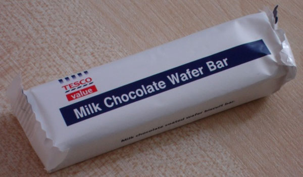
Pictured above is an example of the old Tesco Value range product branding. All of the products were packaged in the simplistic white, red and blue basic packaging. The main selling point of these products was their extremely low cost. However, Tesco realised that cost wasn't the only thing people cared about anymore.
They realised people didn't just want low priced products but instead, they wanted good value for a good price. They cared about a certain level of quality and the old Tesco Value packaging didn't really portray quality in any way; it was all about necessity.
Source: Packagingnews.co.uk
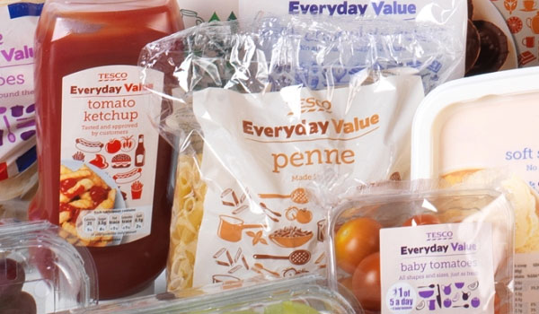
So, Tesco rebranded their packaging to the packaging pictured above and also changed the name of the brand slightly from "Value" to "Everyday Value".
As you can see, the new rebranded packaging is much more colourful and portrays a higher level of quality compared with the previous branded packaging. The packaging doesn't look so much like a "cheap" brand anymore but instead, a mid-range brand available at the same low prices.
What's more, this colourful packaging certainly stands out on the shelf a lot more (something we'll talk about in a lot more detail a little later).
What Makes Effective Packaging?
There are a number of different attributes that combine to create effective packaging and you need to be aware of these when rebranding your own businesses product packaging.
To an extent, the effectiveness of product packaging will always be subjective. You might do everything by the book but chances are, there will still be a handful of people that simply do not like your rebranded product packaging and whom the product still does not appeal to.
This is always going to be the case so don't get disheartened. The important thing is that you're working towards a packaging rebranded that is attractive to the majority, not the minority.
Effective product packaging will also depend on exactly who your product is aimed towards. As I mentioned earlier in the guide, if your product packaging is pink with photos of females using the product on the box/container etc, it's unlikely that you're going to appeal to males. I guess that's pretty obvious though.
It doesn't matter what brand/product your rebranded packaging is for, here are the five fundamental criteria you need to keep in mind.
Your product packaging should:
- Stand out from other competitors on the shelf.
- Communicate your USP and any other key messages effectively.
- Actively engage with shoppers (and more specifically, your target demographic).
- Be functional
- Have the ability to turn a potential customer into a customer (i.e. close the sale).
We'll be going through each one of these points in detail in the next section of the guide so keep reading. If you can understand how to apply each of these criteria to your own product rebranding, you'll almost certainly be well on your way to creating an effective piece of product packaging that will "tick all the boxes".
Visibility
Visibility is perhaps the single most important product packaging attribute as basically, if your product doesn't get noticed, there's no possible way a consumer will purchase it (hence the expression: unseen = unsold). Getting your product packaging noticed is also the first part of the battle when competing for sales in-store.
You might think that getting noticed in-store isn't that important. I mean, you've been spending thousands on marketing campaigns, right? Obviously, marketing is an essential tactic for any business but if you refer to the beginning of this guide, you'll remember our statistic: 70% of shoppers make final purchase decisions in-store, not prior to visiting.
Therefore, you need to ensure that your product stands out from the countless number of competitors sharing the same shelf space as you. But how do you do this?
The key is contrast. Your product packaging/branding needs to contrast against its surrounding (i.e. a sea of competitors products). Unless, you're Apple (a company selling via its own branded stores), you'll have very little control over how/where your product is displayed in-store so ensuring that your product packaging contrasts against virtually every other competitive product out there is key.
There are a few fundamental ways to do this:
Colour:
Colour is perhaps the most obvious and important attribute to focus on when rebranding your product packaging with visibility in mind. When looking at a shelf of products, colour is the first thing most people will notice.
Perhaps the most well-known example of colour being used for this effect is in Coca Cola products. Coca Cola actually started out shipping their hugely popular soda drink in clear glass bottles. They did this for decades until one day, they had a bright idea. They rebranded their packaging around the colour red.
If you look at the drinks aisle at your local supermarket (much like in the image above), you'll likely notice that in and amongst the various bottles, there will be a sea of red represented by the Coca Cola brand.
Instantly, Coca Cola is ahead of its competitors, even if (in a hypothetical world) the consumer hadn't been exposed to any of the drinks brands on offer via various marketing mediums beforehand.
As a general rule of thumb, the brighter the colour, the more your product is likely to stand out. However, it's important to analyse the competition as there are some industries where a more low-key colour scheme could stand out more.
Shape:
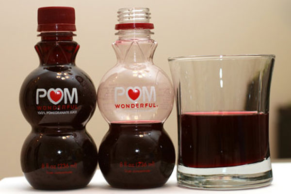
Source: Wicproject.com
Another hugely important aspect to focus on when attempting to maximise on-shelf product visibility is the actual shape of your packaging. Within most product categories, there tends to be one generic shape that becomes the norm and for maximum effect, it's a good idea to stray from this norm.
For example, just about every box of cereal you see on the shelf if likely to be packaged in a boring rectangular box. Yes, this makes transportation of the products much easier and cheaper (along with stacking at the supermarket) but there are still subtle changes you could make.
The same goes for the drinks industry. Most drinks come in a pretty bog-standard bottle but Pom, one drinks brand in the UK, went against the norm and created the extremely unique bottle shape you can see in the image above. This gives them instant visibility on the shelf and helps them to stand out from the hundreds of other drinks on the same area of shelving.
You can apply this technique to product packaging for just about any industry, you just have to get creative.
Design:
Source: Personal.psu.edu
Obviously, aside from colour and shape, the other hugely important part of your packaging rebrand is the actual design of the packaging. Yes, colour and shape will clearly contribute towards the design to an extent, but the actual graphic element of the design is just as important (if not more important).
The actual design of your packaging is where you'll be able to communicate the bulk of your brand message with your potential customers. You can use typography and other visual imagery to further ensure that your product stands out from the competition.
There's a lot of different routes you can go down with the actual graphical design of your packaging. You could go minimalistic, you could rely heavily on typography/logo's (much like Coca Cola) or you could take a completely different approach. Just make sure it stands out, is well-designed (i.e. is designed by an experienced packaging designer) and is likely to resonate with your target demographic.
Creating a design that is future-proof is a good idea too, so make sure you don't just jump on the bandwagon of a short-lived design trend (e.g. flat design).
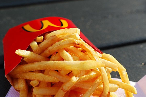
Lastly, make sure your design compliments the branding of other marketing materials. For example, make sure to use the same colour scheme as other branded materials (much like the McDonald's red/yellow fries packet above). If you fail to do this, you'll end up with a fragmented and sloppy brand identity.
Communication
Once you've managed to grab the attention of the shopper, it's likely that they'll pick up your product to take a better look.
If you've designed your product effectively, the person that will have picked up your product will be within your target demographic. For example, if your product was a healthy snack, your design should have appealed to a health-conscious individual who's likely to care about what your product is all about.
However, you're not home and dry just yet. The reason the potential customer has picked up your product is because the initial design managed to attract their attention, not because they're ready to make the purchase. Now they're looking to see if your product is right for them, so you need to communicate the right message.
There are a number of ways you can communicate with consumers but one of the most common methods is through the utilisation of text on your packaging.
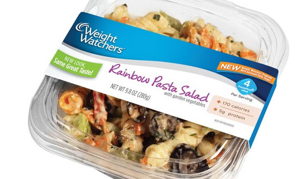
Source: Blisstree.com
Take a look at the Weight Watchers Rainbow Pasta Salad packaging above for example. You can see that a lot is communicated through the text on the packaging. Most notably, you can see the calorie count along with the protein count.
For someone looking to eat healthily or lose weight, this information will almost certainly influence their buying decision and therefore, the product has communicated effectively with its target demographic.
Other common text communications can include things like "Made in the USA", "300G for the price of 200G" and so forth. It's about communicating a reason for the consumer to buy your product.
It's not just the written text that helps communicate your message though, the visual appearance of the product can also help to do so. This is extremely important with food/drink produce as buying decisions are often made based on the appearance of the food itself. You've likely heard the expression: a picture is worth a thousand words. When it comes to product packaging, it's true.
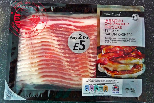
Source: Thereviewaddict.com
Take a look at the bacon produce above for example. You can see that not only is a beautiful photo used on the packaging but also, the packaging is designed to showcase the product itself. It does this by using transparent packaging and helps to communicate the message that the product is of exceptionally high quality.
You can communicate anything you like using a combination of text, design, imagery and even shape (as discussed in the previous point). However, you should always ensure that there is a hierarchy to the messages contained on your packaging. The most important messages should be the most prominent visually with the less important messages taking a backseat in the design.
You should also ensure that only the most important messages are communicated in your product. Too many messages can, in some cases, overwhelm the customer and create a cluttered brand identity.
Engagement
On the face of it, engagement might sound very similar to communication. After all, any messages (textual or visual) are engaging with the customer on some level, right?
Although this is true, engagement is very different from communication. It's also one of the most difficult things to master when rebranding your product packaging which is why so many brands don't get it right.
Engagement is essentially the process of invoking some sort of emotional reaction in a shopper that then persuades he/she to actually purchase the product. This is a difficult process as you need to make them really want your product without them actually trying it. You only have a piece of packaging to pull off this great feat.
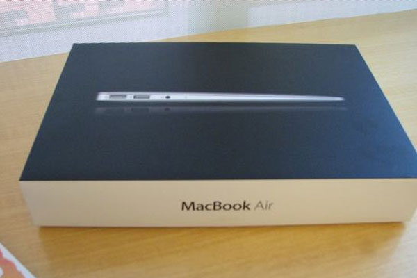
Source: Pcmag.com
One brand that is widely regarded as the best in the industry when it comes to customer engagement is Apple. As you probably already know, Apple manufactures a range of premium electronics products including the iPhone, iPad and Macintosh computers. If you've ever purchased an Apple product, you likely received it in packaging that looked something like that in the image above.
First of all, you'll notice that the minimalistic approach to this packaging really helps it to stand out against other products (as mentioned in the "visibility" point). Aside from that though, the products packaging oozes with the Apple brand and also, oozes quality.
The image of the MacBook Air computer on the front of the box makes you want to open it up and use the product. There are no distractions and no communicative text, there's just the photo of the gorgeous MacBook Air and nothing else. This in itself helps create a sense of a premium prestigious product which in turn, engages with the customer.
It's packaging like this that makes customers fall in love with a product. Their purchasing decisions are no longer ruled by their head but instead, they're ruled by their heart thanks to the beauty of the product.
If you can pull this off when rebranding your product packaging, you'll be sure to see a massive surge in sales.
Functionality
The functionality of product packaging is something that often gets overshadowed by the other criteria mentioned so far in this guide. Most brands pay very little attention to packaging functionality, instead opting to spend their time, money and effort tapping into a customers buying triggers through other mediums (visibility, engagement and communication etc).
Clearly, all of those criteria are exceptionally important (hence them being mentioned in this guide) but functionality can add yet another USP to your product and in some cases, help enhance its visibility on the shelf.
The main function of your packaging will always be to safely house the product it contains so don't neglect this whatever you do. This will always be your number one priority but once you've got this covered, you can focus your attention on creating a smart, functional packaging design that also reflects your brand.
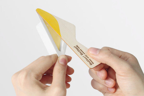
Source: Hongkiat.com
Take a look at this packaging design for butter above for example. This has been featured on numerous design blogs and it's easy to see why. Not only does the packaging look fantastic (thus creating a great visual presence in store) but it's also extremely functional. As you can see, the packaging doubles as a knife to help spread the butter.
You might be thinking that this is just a gimmick but in reality, this is a problem that a lot of consumers face. Not only does this functional packaging design help to create a talking point in-store and "wow" the customer, but it also helps to define the brand.
The fact that no other brand has done this before automatically gives the consumer the perception of an innovative brand. Also, the fact that the design solves a common problem helps to portray the brand as a customer-focussed brand that truly cares about making their customers lives easier.
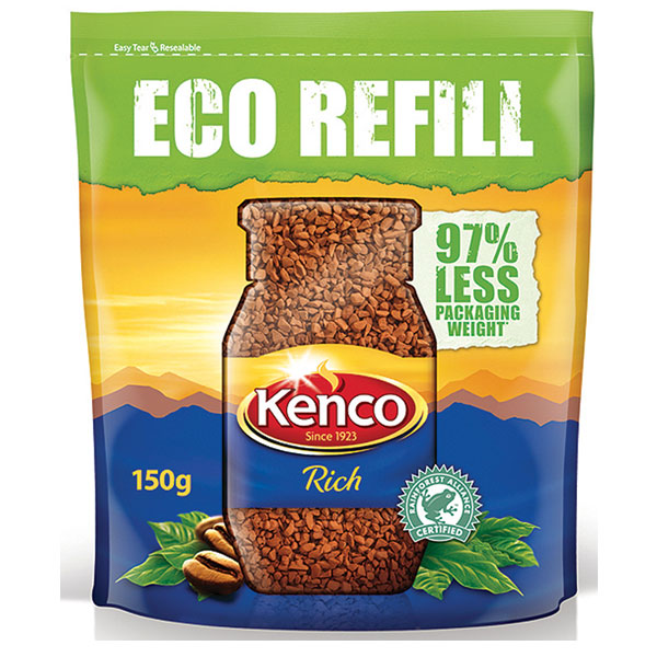
Source: Packaging-gateway.com
Again, functional design is achievable in just about any product industry. You can focus on things like minimising the materials used in your packaging like the eco refill coffee pack above for example.
Doing this helped to establish Kenco itself as an environmentally friendly brand and gave them the edge over the competition. Notice the communication on the packaging too ("97% less packaging weight").
Closing Of The Sale (research and testing)

Source: Cnmeonline.com
Earlier in this guide, I mentioned that packaging visibility is not only an important part of the packaging rebranding process but also, that it's the first part of the battle. Getting the consumer to actually notice your product in store might be the first part of the battle but after that, you've still got to pull off the second part; actually closing the sale.
Now, all of the factors mentioned so far in this guide (communication, engagement, functionality etc) are essentially the factors that will determine whether a sale is closed or whether the customer puts your product back on the shelf and opts for a competitor's product instead.
The problem is, this is all theory. Sure, everything mentioned so far (standing out using colour/shape, communicating your desired message as effectively as possible etc) should ensure that your packaging rebrand is as effective as you hoped. But how exactly do you know for a fact whether or not your packaging is going to be effective in the real world?
The truth is, you don't, which is why you need to embark upon one last step before going ahead and actually implementing your rebranded product packaging to the masses. You need to research and test your rebrand.
This is actually pretty straightforward and it's something that all "big" brands will do. Smaller brands often neglect this part of the rebranding process though, so I thought I'd make sure to draw attention to it.
Essentially, the way to test your rebrand is invest in some qualitative research (which is basically a fancy word for saying: see what people actually think of your product in its intended setting)
The best way to do this is to replicate a shop shelf (complete with competitors products) just as it would be set up in-store with your rebranded product packaging in and amongst the competitors. Then, ask consumers what they think based on three main factors. These are:
Is it visible?
Let your research group on consumers glance at your shelf for a few seconds and then ask them which (if any) products jumped out at them. If your rebranded packaging has worked, the majority should hopefully say your product. If not, you may still have work to do.
Is it engaging/communicating effectively?
Ask your research group what they think to your product. Do they like the packaging? Do they understand the USP of your product right away? Would they choose your brand over the other competitors and if so/not, why is that?
Asking these sorts of questions will help to decipher whether or not you're on the right track with your packaging rebrand. Based on their response(s), you can refine/alter things as necessary.
Is it compelling?
This is perhaps the most important question of all; is your offering compelling enough for them to actually purchase your product rather than a competitor's product?
Only if the majority answer is yes is your packaging rebrand a success. If the majority of participants choose a competitor's product, question them about it. Why do they prefer that product? What don't they like about your branding?
Again, asking these questions will help you to refine your packaging rebrand.
It's important you use a non-biased qualitative research group to ensure that they're giving their honest opinion. If you use family/friends for this task, they won't give you honest critique and you won't be able to make the necessary adjustments to maximise the efficiency of your branding.
Conclusion
Source: Creativebloq.com
Rebranding your packaging is certainly no easy task. It's a task that requires a lot of work, dedication, vision, investment and testing. Even once you've launched your packaging rebrand, chances are that you'll constantly be refining and perfecting the rebrand for months/years to come.
A lot of companies look at rebranding as an expense. Obviously, there is a relatively large expensive incurred for any packaging rebranding process but it's important that you don't look at rebranding your packaging as simply an added expense. It's more than this; it's an investment. If you pull of your packaging rebrand, you're going to see a huge return on your investment and increased profits in the long-run.
It can also help you to better establish your brand in a competitive marketplace and increase market share, both of which will also contribute to increased long term revenue.
The important thing is not to scrimp on your packaging rebranding process. Be prepared to invest a substantial amount of money and be prepared to make a lot of changes. Listen to what people say (designers and qualitative research groups included) and be prepared for harsh criticism.
It's only by listening to this criticism and responding to any negative comments that you'll experience a successful product packaging rebrand. If you don't take people's comments on board or neglect the advice given in this guide, be prepared for failure.